


This article mainly introduces the method of using CSS3 to write grayscale filters to create black and white photo effects. The filter in CSS3 is very powerful. The article also introduces the method that is compatible with IE. Friends who need it can refer to it
The filter function in CSS3 allows us to process images easily and conveniently without using PhotoShop or a lot of JavaScript and PHP codes. This property is already supported by the newer Firefox, Safari, and Chrome browsers, and we can simulate this effect through comprehensive alternative technologies-even IE browsers.
In this article, we will use the standard test image Lena Söderberg (Translator’s Note: Lena’s beautiful photo is used as a standard test image for image compression) as a demonstration, and use CSS to convert it into a black and white image. Below I will explain how to use this feature of CSS to adjust hue, blur, brightness, contrast, and some other effects. Rendering: 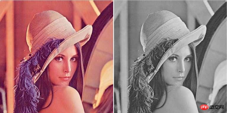
CSS3 grayscale filter
Using CSS3 to dilute the color of an image couldn’t be easier. We can write this CSS statement as a class, so that when we encounter a picture with the desired effect, we can directly add a class.
img.desaturate { filter: grayscale(100%); }Of course, when current browsers use CSS3, they need to add their own experimental prefixes for browser functions, so the first thing we have to do is write the browser prefix:
img.desaturate { filter: grayscale(100%);
-webkit-filter: grayscale(100%);
-moz-filter: grayscale(100%);
-ms-filter: grayscale(100%);
-o-filter: grayscale(100%);
}If you want to use it on a certain picture, it’s very simple, just add a class:
<img src=lena-söderberg.png alt="Lena Söderberg" style=width:512px;height:512px class=desaturate>
That’s it. ## Add an SVG filter effect. This feature is currently only available in Chrome 18, and other browsers will soon add support. To get the same effect in Firefox 4, we may need to use SVG filters. I created a new separate file saturate.svg with the following code:
<svg version="1.1" xmlns="http://www.w3.org/2000/svg">
<filter id="greyscale">
<feColorMatrix type="matrix" values="0.3333 0.3333 0.3333 0 0
0.3333 0.3333 0.3333 0 0
0.3333 0.3333 0.3333 0 0
0  0  0  1 0"/>
</filter>
</svg>
Don’t be intimidated by this SVG code - although the matrix sequence above is a bit complicated. I recommend you copy and paste this code directly into a common "small file". I will write another article to introduce the above matrix changes in detail, so I won’t go into details here. Coupled with the above SVG file reference, the CSS code we want to insert into the HTML page is as follows:
img.desaturate{
filter: grayscale(100%);
-webkit-filter: grayscale(100%); -moz-filter: grayscale(100%);
-ms-filter: grayscale(100%); -o-filter: grayscale(100%);
filter: url(desaturate.svg#greyscale);
} Compatibility for IE:
Until now Our code is compatible with future browsers and the latest versions of Chrome and Firefox 4. In order to add IE 6-9 to the compatibility list, we need to use Microsoft's clumsy but effective filter filter:
img.desaturate{
filter: grayscale(100%);
-webkit-filter: grayscale(100%); -moz-filter: grayscale(100%);
-ms-filter: grayscale(100%); -o-filter: grayscale(100%);
filter: url(desaturate.svg#greyscale);
filter: gray;
}If you still want to make the older version of Webkit kernel browser compatible:
img.desaturate{
filter: grayscale(100%);
-webkit-filter: grayscale(100%); -moz-filter: grayscale(100%);
-ms-filter: grayscale(100%); -o-filter: grayscale(100%);
filter: url(desaturate.svg#greyscale);
filter: gray;
-webkit-filter: grayscale(1);
}If you want to achieve this visual effect in all browsers (assuming your visitors support JavaScript) you can use jQuery or Greyscale.js to modify your image to decolorize it.
The CSS code we wrote above allows us to turn the image into black and white without using PhotoShop. Using CSS to implement this feature can be very easy to modify: for example, you can see that when we change the decolorization parameter from 100% to 50%, the image will have the effect of a blend of primary colors and black and white.
Other effects:
In addition, some other filter effects can be added to black and white photos:
-webkit-filter:blur(5px);  //模糊,此处为5像素
-webkit-filter:sepia(0.5);  //叠加褐色,取值范围0-1,此处表示50%的褐色
-webkit-filter:brightness(0.5);  //亮度,取值范围0-1,5倍亮度(数字为0时为正常样式,为1时表示的是100%亮度,无法看到图片)
-webkit-filter:hue-rotate(30deg); //色相(按照色相环进行旋转,顺时针方向,红-橙-黄-黄绿-绿-蓝绿-蓝-蓝紫-紫-紫红-红)此处为叠加黄色滤镜
-webkit-filter:invert(1);  //反色,取值范围0-1,0为原图,1为彻底反色之后,0.5为灰色
-webkit-filter:saturate(4);  //饱和度,取值范围0~*,0为无饱和度,1为原图,值越高饱和度越大
-webkit-filter:contrast(2);  //对比度,取值范围0~*,0为无对比度(灰色),1为原图,值越高对比度越大
-webkit-filter:opacity(0.8);  //透明度,取值范围0~1,0为全透明,1为原图
-webkit-filter:drop-shadow(17px 17px 20px black); //阴影
The above is the entire content of this article , I hope it will be helpful to everyone’s learning. For more related content, please pay attention to the PHP Chinese website!
Related recommendations:
CSS to achieve a three-dimensional horizontal button menu effect
How to use CSS3 Realize the 3D flip book effect
CSS3 dynamic prompt effect when the mouse moves into the picture
The above is the detailed content of Use CSS3 to write grayscale filters to create black and white photo effects. For more information, please follow other related articles on the PHP Chinese website!


![[Web front-end] Node.js quick start](https://img.php.cn/upload/course/000/000/067/662b5d34ba7c0227.png)


