

This time I will bring you the css3 chat bubble style. What are the precautions for making the css3 chat bubble style? The following is a practical case, let’s take a look.
In the chat scenario, the chat content needs to be modified with bubbles, as shown below. Let’s explain them one by one below.
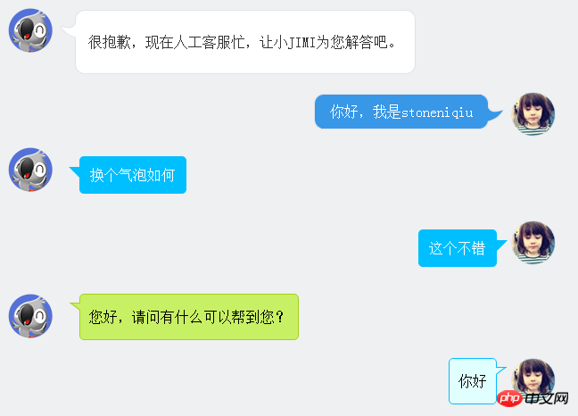
The first style is JD customer service. The rounded corners and hooks of the bubbles are all made of pictures. A table is used to form a rounded frame. The lm style spells out the hook.
很抱歉,现在人工客服忙,让小JIMI为您解答吧。 | ||
| 你好,我是stoneniqiu | ||
Style:
 .jimi_lists {
    margin: 0 -10px 20px 10px;
    position: relative;
}
 .jimi_lists .header_img.jimi3 {
    background: url(../img/jimi_50_3.png) no-repeat 0 0;
}
 .jimi_lists .header_img {
    width: 50px;
    height: 50px;
    position: absolute;
    top: 0;
    left: 0;
}.fl {
    float: left;
}
 .jimi_lists .msg {
    margin-left: 59px;
    margin-right: 40px;
    margin-top: 2px;
    float: left;
    display: inline;
}
 .jimi_lists .lt {
    background: url(../img/msg_bg_lr.png) no-repeat 0 0;
    width: 26px;
    height: 10px;
}
 .jimi_lists .tt {
    background: url(../img/msg_bg_tb.png) repeat-x 0 -23px;
    height: 10px;
}.jimi_lists .rt {
    background: url(../img/msg_bg_lr.png) no-repeat -35px 0;
    width: 10px;
    height: 10px;
}.jimi_lists .lm {
    background: url(../img/msg_bg_lr.png) repeat-y -94px 0;
    width: 26px;
    vertical-align: top;
    position: relative;
}.jimi_lists .mm {
    padding: 0 5px;
    background-color: #FFF;
    word-break: break-all;
    word-wrap: break-word;
    color: #333;
    line-height: 20px;
}.jimi_lists .lm span {
    background: url(../img/msg_bg_lr.png) no-repeat 0 -14px;
    display: inline-block;
    width: 26px;
    height: 16px;
    position: absolute;
    top: 5px;
}.jimi_lists .rm {
    background: url(../img/msg_bg_lr.png) repeat-y -113px 0;
    width: 10px;
}.jimi_lists .lb {
    background: url(../img/msg_bg_lr.png) no-repeat 0 -43px;
    width: 10px;
    height: 10px;
}.jimi_lists .bm {
    background: url(../img/msg_bg_tb.png) repeat-x 0 -25px;
    height: 10px;
}.jimi_lists .rb {
    background: url(../img/msg_bg_lr.png) no-repeat -35px -43px;
    width: 10px;
    height: 10px;
}.customer_lists {
    position: relative;
    margin: 0 12px 20px 20px;
}.customer_lists .msg {
    float: right;
    margin-right: 73px;
    _margin-right: 38px;
    margin-top: 2px;
}.customer_lists .lt {
    background: url(../img/msg_bg_lr.png) no-repeat -47px -0;
    width: 10px;
    height: 10px;
}.customer_lists .tt {
    background: url(../img/msg_bg_tb.png) repeat-x 0 0;
    height: 10px;
}.customer_lists .rt {
    background: url(../img/msg_bg_lr.png) no-repeat -63px 0;
    width: 26px;
    height: 10px;
}.customer_lists .lm {
    background: url(../img/msg_bg_lr.png) repeat-y -126px 0;
    width: 10px;
}.customer_lists .mm {
    padding: 1px 8px;
    background-color: #3897E7;
    word-break: break-all;
    word-wrap: break-word;
    color: #FFF;
}.customer_lists .rm {
    background: url(../img/msg_bg_lr.png) repeat-y -129px 0;
    width: 26px;
    vertical-align: top;
    position: relative;
}.customer_lists .lb {
    background: url(../img/msg_bg_lr.png) no-repeat -47px -36px;
    width: 10px;
    height: 10px;
}.customer_lists .bm {
    background: url(../img/msg_bg_tb.png) repeat-x -106px -4px;
    height: 10px;
}.customer_lists .rb {
    background: url(../img/msg_bg_lr.png) no-repeat -63px -36px;
    width: 26px;
    height: 10px;
}.customer_lists .rm span {
    background: url(../img/msg_bg_lr.png) no-repeat -63px -14px;
    display: inline-block;
    width: 26px;
    height: 16px;
    position: absolute;
    top: 5px;
}.customer_lists .header_img_hover {
    position: absolute;
    background: url(../img/avatar_mask_01.png);
    top: 0;
    width: 50px;
    height: 50px;
}.customer_lists .header_img {
    position: absolute;
    top: 0;
    right: 14px;
    width: 50px;
    height: 50px;
}
 .clearfix:after {
    content: " .";
    display: block;
    clear: both;
    visibility: hidden;
    height: 0;
}View Code
The second type mainly uses: before pseudo-class to draw the triangle, and then Put together with positioning.
                     换个气泡如何


                    这个不错
Style:
  .bkbubble.right p:before, .bkbubble.left p:before {
      width: 0;
    position: absolute;
    top: 12px;
    border-style: solid;
    content: "";
  }
  .bkbubble.left {
      text-align: right;
  }
 .bkbubble.right p:before {
     left: -12px;
    border-color: transparent #00bfff;
    border-width: 0 12px 12px 0; }
 .bkbubble.left p:before {
     right: -12px;
    border-color: transparent #00bfff;
border-width: 0 0 12px 12px ; }More triangles: http://www.cnblogs.com/lhb25/p/css-and-css3-triangle.html
What if the border color and background color are required to be different? The above method will not work, because using :before to draw a triangle uses the principle of border. In other words, in the above method, the small triangle on the edge of the bubble cannot show two colors, because it only has one border. color. Then we have to find a way to make a triangle with a border.
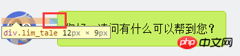
您好,请问有什么可以帮到您?
1. First draw a small rectangle.
.lim_operator .lim_tale {
    left: -1px;
    background-color: #c8f064;
    border-color: #a5d01b;
    margin-left: 70px;
}.lim_tale {
    position: absolute;
    width: 12px;
    height: 8px;
    overflow: hidden !important;
    top: 10px;
    z-index: 2;
    border-top-style: solid;
    border-top-width: 1px;
}
#2. Draw a diagonal line.
There are no slashes in css. Here, a round arc is used to spell it out. On a large circle, if you cut off an arc, it becomes a diagonal line.
.lim_operator .radiusborder {
    position: absolute;
    background-color: #EFF0F2;
    top: -29px;
    left: -94px;
    height: 160px;
    width: 160px;
    border-top-style: solid;
    border-top-width: 1px;
    border-right-style: solid;
    border-right-width: 1px;
    border-top-right-radius: 154px;
    border-color: #a5d01b;
}The principle is equivalent to using before to draw a colored background, then using after to draw a white background, and then overlaying and staggering the top 1-2px, so it appears A triangle with a border and a background. This is how web WeChat does
.expression:before {
    content: '';
    position: absolute;
    left: 16px;
    top: 100%;
    margin-left: -7px;
    border: 7px solid transparent;
    border-top-color: #CFCFCF}.expression:after {
    content: '';
    position: absolute;
    left: 16px;
    top: 100%;
    margin-left: -7px;
    margin-top: -1px;
    border: 7px solid transparent;
border-top-color: #FFF}I believe you have mastered the method after reading the case in this article. For more exciting information, please pay attention to other related articles on the php Chinese website!
Recommended reading:
JavaScript's var and this, {} and function
How to use the gradient of ss3
The above is the detailed content of css3 chat bubble style. For more information, please follow other related articles on the PHP Chinese website!


![[Web front-end] Node.js quick start](https://img.php.cn/upload/course/000/000/067/662b5d34ba7c0227.png)


