

This time I will show you how to use the gradient of ss3, what are theprecautionswhen using the gradient of ss3, the following is a practical case, let's take a look.
"CSS Revealed" is a very good book, full of useful information and surprises. The following are mainly notes on some effects created using gradients. Please use the latest modern browser to view.
First of all, we need to review the next css statement:
linear-gradient([ [| to ] ,]? [, ]+)
This is a linear gradient. The first parameter is the gradient direction, which is optional. It can be an angle, and the value of angle is a degree, such as 45deg, 90deg. You can also use to side-or-corner. For example, to left (from right to left), to bottom (from top to bottom); the second and third parameters are gradient colors. So the simplest way to write it can be:
background: linear-gradient(aquamarine,orange)
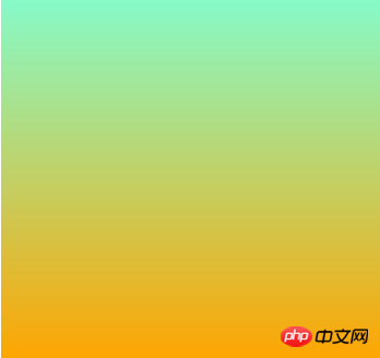
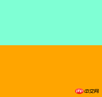
The default is a gradient from top to bottom. But if we don't want gradients, we want color bars. The trick is not to leave a gap between the two colors, because if you leave a gap, a gradienttransition effectwill appear. So we can set 50% each. This 50% represents the color position. Can also be a unit of length.
background: linear-gradient(aquamarine 50%,orange 50%)
What if we need multiple colors, such as blue, white and red.
background: linear-gradient(90deg,aqua 0 ,aqua 33%,white 0 ,white 67%,crimson 0 ,crimson )
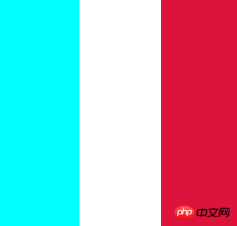
Notice that the three zeros and the last crimon color have no color scale. The first aqua 0, aqua 33% means aqua accounts for 33%, while the second white is white 0, white 67%. It seems to account for 67%, but it actually starts from 33%.
If the position of a certain color mark is smaller than its previous position, the position of the color mark will be set to the maximum value of all previous color mark positions.
So the second 0 represents 33%, and the third 0 represents 67%. You can change 0 to a value smaller than these two values, and the effect will be the same. The last color will be filled in automatically without a color scale. So if we just want to draw a line, the gradient color can use a transparent color:
linear-gradient(white 2px, transparent 0)
But if we want to achieve a repeating effect, we also need the cooperation ofbackground-size. The default background-size is 100% 100%. But if the size is defined, it is equivalent to dividing the entire area into repeated small pieces.
.grid { width: 225px; height: 225px; background: #58a; background-image: linear-gradient(white 2px, transparent 0),linear-gradient(90deg,white 2px,transparent 0); background-size: 75px 75px, 75px, 75px; }
The first gradient is to divide 225px into thirds horizontally. Then the second gradient is divided into thirds vertically. This is the effect seen by the naked eye, but it is actually the result of nine 75px*75px squares.
background-image: linear-gradient(white 2px, transparent 0),linear-gradient(90deg,white 2px,transparent 0),linear-gradient(hsla(0,0%,100%,.3) 1px,transparent 0),linear-gradient(90deg, hsla(0,0%,100%,.3) 1px,transparent 0); background-size: 75px 75px, 75px 75px,15px 15px,15px 15px;
Then the implementation of this grid is simple. Then superimpose the gradient, and divide each 75 into 5 15s. The effect looks like ceramic tiles.
But how to draw a chessboard? Note that the lines are not continuous. As shown in the picture above, based on the background-size idea above, we know that such a chessboard is composed of multiple such squares.

And these two squares are composed offour triangles.One characteristic of linear gradient is that there will be only one color on one line in the background-size area.
background-image: linear-gradient(45deg, #bbb 25%, transparent 0),linear-gradient(45deg, transparent 75%,#bbb 0),linear-gradient(45deg, #ffbb33 25%, transparent 0),linear-gradient(45deg, transparent 75%,#ffbb33 0); background-size: 30px 30px; background-position: 0 0, 15px 15px,15px 15px, 30px 30px;
Notice that a set of background-position is also used. The first #bbb color occupies 25% of the 45-degree direction, and the second #bbb color occupies the last 25% of the 45-degree direction. . If you change the second triangle to red, then the position starting from 0,0 will be clear at a glance.
background-image: linear-gradient(45deg, #bbb 25%, transparent 0),linear-gradient(45deg, transparent 75%,red 0); background-size: 30px 30px; background-position: 0 0, 0px 0px,15px 15px, 30px 30px;

Change the position of the red triangle to 15px, and 15px will form a square. In the same way, superimpose a square to get the chessboard format. In the same way, we can put together a resting grid.

Let the triangle rotate 90 degrees each time without moving its position.
background-image: linear-gradient(45deg, red 0, red 25%,transparent 0), linear-gradient(135deg, orange 0, orange 25%,transparent 0),linear-gradient(225deg, yellow 0, yellow 25%,transparent 0),linear-gradient(315deg, green 0, green 25%,transparent 0)
With the above accumulation, it is simple to draw an oblique grid:
background-image: linear-gradient(45deg,transparent 49% ,black 0,black 51% ,transparent 0), linear-gradient(135deg,transparent 49% ,black 0,black 51% ,transparent 0); background-size: 30px 30px;

相当于是每个单元就渐变了两条斜线。
一直去拼这种单元可能让你有点烦,于是出来了repeating-linear-gradient。
background: repeating-linear-gradient( 45deg, transparent, transparent 1em, moccasin 0, moccasin 2em, transparent 0, transparent 3em, powderblue 0, powderblue 4em, transparent 0, transparent 5em, lavender 0, lavender 6em, transparent 0, transparent 7em, beige 0, beige 8em), repeating-linear-gradient( -45deg, transparent, transparent 1em, khaki 0, khaki 2em, transparent 0, transparent 3em, beige 0, beige 4em, transparent 0, transparent 5em, peachpuff 0, peachpuff 6em );
注意到颜色都是成对出现。这样才会出现我们的色条。注意这里使用了background-blend-mode: multiply;混合模式。不然效果没有这么好看。
思路和上面一样,使用径向渐变叠加和错位
background-image:radial-gradient(#fff 5px,transparent 0),radial-gradient(#fff 10px, transparent 0); background-size: 40px; background-position: 0 0, 20px 20px;
沙发这个效果比较复杂,使用了径向渐变制作圆点和阴影,线性渐变勾勒出线条。
background: radial-gradient(hsl(0, 100%, 27%) 4%, hsl(0, 100%, 18%) 9%, hsla(0, 100%, 20%, 0) 9%) 0 0, radial-gradient(hsl(0, 100%, 27%) 4%, hsl(0, 100%, 18%) 8%, hsla(0, 100%, 20%, 0) 10%) 50px 50px, radial-gradient(hsla(0, 100%, 30%, 0.8) 20%, hsla(0, 100%, 20%, 0)) 50px 0, radial-gradient(hsla(0, 100%, 30%, 0.8) 20%, hsla(0, 100%, 20%, 0)) 0 50px, radial-gradient(hsla(0, 100%, 20%, 1) 35%, hsla(0, 100%, 20%, 0) 60%) 50px 0, radial-gradient(hsla(0, 100%, 20%, 1) 35%, hsla(0, 100%, 20%, 0) 60%) 100px 50px, radial-gradient(hsla(0, 100%, 15%, 0.7), hsla(0, 100%, 20%, 0)) 0 0, radial-gradient(hsla(0, 100%, 15%, 0.7), hsla(0, 100%, 20%, 0)) 50px 50px, linear-gradient(45deg, hsla(0, 100%, 20%, 0) 49%, hsla(0, 100%, 0%, 1) 50%, hsla(0, 100%, 20%, 0) 70%) 0 0, linear-gradient(-45deg, hsla(0, 100%, 20%, 0) 49%, hsla(0, 100%, 0%, 1) 50%, hsla(0, 100%, 20%, 0) 70%) 0 0 ; background-color: #300; background-size: 100px 100px;
radial-gradient语法:
radial-gradient( [ [ circle ||] [ at ]? , | [ ellipse || [ | ]{2} ] [ at ]? , | [ [ circle | ellipse ] || ] [ at ]? , | at , ]? [ , ]+ )
看上去有点复杂,[]表示一个参数,[]?表示这个参数可选,| 表示这两个参数二选一,||表示这两个参数可以同时存在,','号表示这个参数结束。包含形状,中心点位置,扩展关键字和颜色。形状分圆形(circle)和椭圆(ellipse),位置可以是长度/百分比/简写的left、center等。颜色和线性渐变一样,比如渐变一个太阳:
background:radial-gradient(at 45px 45px,rgb(248, 242, 209),gold,#FFF);
不过这里的at不仅影响着渐变的中心点而且还影响着渐变的形状。 如果加上background-size我们可以得到一块饼干:想吃么 (*^^*) ……
而扩展关键字主要有下面几种情况
closest-side:指定径向渐变的半径长度为从圆心到离圆心最近的边
background:radial-gradient(circle closest-side ,aqua,gold);

closest-corner:指定径向渐变的半径长度为从圆心到离圆心最近的角
background:radial-gradient(circle closest-corner ,aqua,gold);
farthest-side:指定径向渐变的半径长度为从圆心到离圆心最远的边
background:radial-gradient(circle farthest-side at 30% 30% ,aqua,gold);

farthest-corner:指定径向渐变的半径长度为从圆心到离圆心最远的角
background:radial-gradient(circle farthest-corner at 30% 30% ,aqua,gold);
如果我们想画出色圈呢,这就要用到线性渐变中的技巧。
background:radial-gradient(white 0,white 10%,red 0, red 20%,white 0,white 30%,red 0,red 40%,white 0,white 50%,red 0,red 60%,white 0,white 100%);
小结:这些效果还是蛮有意思的,这一篇主要是学习了 linear-gradient,repeating-linear-gradient以及background-size、background-position来实现网格效果,最后还用到了radial-gradient,径向渐变的花样更多,所有的效果基本都是基于渐变叠加和重复,更多的效果可以参考下面的链接。
相信看了本文案例你已经掌握了方法,更多精彩请关注php中文网其它相关文章!
推荐阅读:
jQuery、Angular、node中的Promise详解
The above is the detailed content of How to use the gradient of ss3. For more information, please follow other related articles on the PHP Chinese website!


![[Web front-end] Node.js quick start](https://img.php.cn/upload/course/000/000/067/662b5d34ba7c0227.png)


