In the most popular flat design at the moment, long shadow is a tried and tested design skill. Today I will teach you how to create a long shadow, how to use PS and CSS3 to achieve the long shadow effect.
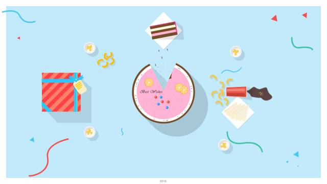
For example, the following one is a very classic long projection design:

##Photographers usually choose long shadows to bring dramatic effects to pictures. In nature, long shadows occur at dusk, when the sun is close to the horizon, and objects on the horizontal ground will have a long shadow effect when viewed from above. In interface design, we usually use the effect of simulating a 45-degree angle to simulate sunlight coming from the northwest corner, thus forming a sharp contrast with the theme of the design. There are many ways to create a long shadow using
photoshop. You can read about the four commonly used methods to create a long shadow effect. My favorite method is also the fourth, which is achieved by copying and moving layers. The effect, such as this picture I uploaded on behance,

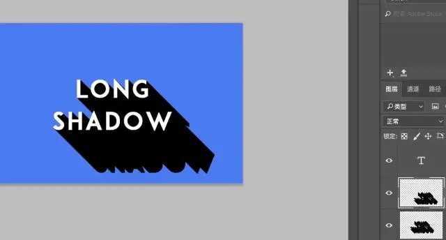
The general principle is that you copy the current layer, select the layer style, fill it with black, and then Move it below the original layer. Then you can use the mouse or filter to pan, move up one unit and move down one unit.

#Then, we duplicate this layer and translate it again. Then merge the two shadow layers

Then we repeat the action, that is, copy this layer once, move it down and move it 2 units to the right . Perform the merge again. Copy, move an even number of units, merge, and repeat.
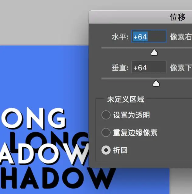
Of course it will be more convenient if you use Filter->Others->Displacement

This is roughly the effect, and then finally set it Transparency is good.

#The above is about design. How does the front end achieve such an effect through css code? The first thing everyone thinks of is
text-shadow
## flatcolors is a website that has many color schemes that you can use at any time. Let's set the background color for the body. I prefer blue. Next, we go to google font to select the font we like. It doesn’t matter if you think the default font is acceptable. Just choose Passion One
### and then introduce it in the css code. ###
@import url(‘https://fonts.googleapis.com/css?family=Passion+One‘);
Copy after login
###At this time, let’s type a few letters in our body, such as long shadow###
<body>
  <h1>Long Shadow</h1>
</body>
Copy after login
###Then we define some basic styles of h1;###
h1{
  text-align:center;
  font-size:6rem;
  padding-top:2rem;
}
Copy after login
###Next The core thing to achieve is to write the text-shadow code######The value of text-shadow can have the displacement of the x and y axes, plus the blur radius and color. ###
/* offset-x | offset-y | blur-radius | color */
text-shadow: 1px 1px 2px black;
Copy after login
###We only need to pan repeatedly, and then make the color approach the background color. ######This is the code###
text-shadow: 1px 1px rgba(18, 67, 100, 0.5) , 2px 2px rgba(20, 72, 107, 0.51) , 3px 3px rgba(22, 76, 113, 0.52) , 4px 4px rgba(23, 81, 119, 0.53) , 5px 5px rgba(25, 85, 125, 0.54) ...
Copy after login
###But it is definitely unrealistic to write it like this. You need to repeatedly calculate the step size and growth. Fortunately, we have preprocessing frameworks such as scss and less. We can complete color conversion and growth very conveniently. ######scss code implementation reference###
@function longshadow($color_a,$color_b,$stepnum, $opacity: 1){
$gradient_steps: null;
<a href="http://www.jobbole.com/members/lowkey2046">@for</a> $i from 1 through $stepnum {
$weight: ( ( $i - 1 ) / $stepnum ) * 100;
$colour_mix: mix($color_b, rgba($color_a, $opacity), $weight);
$seperator: null;
@if($i != $stepnum){
$seperator: #{','};
}
$gradient_steps: append( #{$gradient_steps}, #{$i}px #{$i}px $colour_mix $seperator );
}
@return $gradient_steps;
}Copy after login
###The execution effect of the function is similar to when I pass in a color a and a color b, where color a is the color where the shadow starts, and color b is the background The color, the step size is similar to how long you want your shadow to be, and the last one is transparency. Then it's calculation. We move one unit each time, then decrease the color by percentage, and finally organize the style. ######At this time we only need to use this function in the h1 style ###
@include text-shadow(longshadow(darken($bg,30%),$bg,50, 0.5));
Copy after login
###$bg: is the color of our background: #3498db. ######Related Reading:###
css to realize the moving cat face
css variable description and tutorial
Introduction to how to set DIV scroll bar properties and styles
The above is the detailed content of Create long shadow using CSS 3. For more information, please follow other related articles on the PHP Chinese website!


