


This article mainly introduces the relevant information about using CSS3 to make a simple progress bar(demo). Friends who need it can refer to it
This is just a small demo, a user-friendly Progress bar written in CSS3.
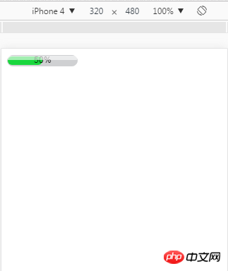
As shown in the picture:
The specific code is as follows:
<!DOCTYPE HTML PUBLIC "-//W3C//DTD HTML 4.01//EN" "http://www.w3.org/TR/html4/strict.dtd">
<html>
<head>
<title> new document </title>
<meta http-equiv="Content-Type" content="text/html; charset=utf-8"   />
<meta name="viewport" content="initial-scale=1">
<style>
.process-bar
{
    width:100px;
    display:inline-block;
    *zoom:1;
}
.pb-wrapper
{
    border:1px solid #cfd0d2;
    position:relative;
    background:#cfd0d2;
    border-radius: 8px;
}
.pb-container
{
    height:12px;
    position:relative;
    left:-1px;
    margin-right:-2px;
    font:1px/0 arial;
    padding:1px;
}
.pb-highlight
{
    position:absolute;
    left:0;
    top:0;
    _top:1px;
    width:100%;
    opacity:0.6;
    filter:alpha(opacity=60);
    height:6px;
    background:white;
    font-size:1px;
    line-height:0;
    z-index:1
}
.pb-text
{
    width:100%;
    position:absolute;
    left:0;
    top:0;
    text-align:center;
    font:10px/12px arial;
    color:black;
    font:10px/12px arial
}
</style>
</head>
<body>
    <p class="process-bar skin-green">
        <p class="pb-wrapper">
            <p class="pb-highlight"></p>
            <p class="pb-container">
                <p class="pb-text">50%</p>
                <p class="pb-value" style="height: 100%;width: 50%;background: #19d73d;border-radius: 8px;"></p>
            </p>
        </p>
    </p>
</body>
</html>The above is the detailed content of Simple sample code for how to make a progress bar using CSS3. For more information, please follow other related articles on the PHP Chinese website!


![[Web front-end] Node.js quick start](https://img.php.cn/upload/course/000/000/067/662b5d34ba7c0227.png)


