


This article mainly introduces the use of pure CSS to achieve the pie-shaped Loading waiting chart effect, which has certain reference value. Interested friends can refer to it
Written in front
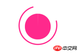
I came across a small exercise before, which is to use pure CSS3 to write a pie-shaped loading effect. I have never written this thing before. Xiaohua has no clue at all, and then I referred to Teacher Zhang Xinxu The CSS3 implements the loading of the egg pie pie chart, and there are other things. The same effect is achieved in a way that looks a little similar but seems different. The question requires something like this:
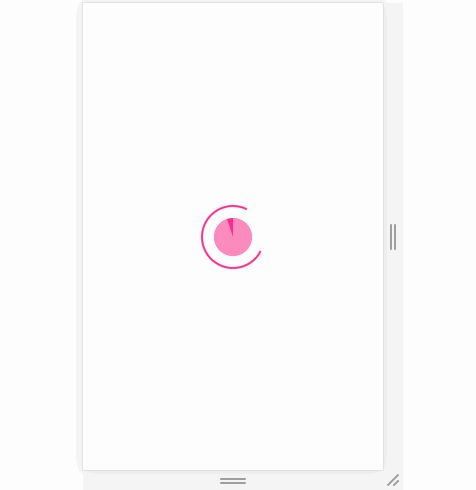
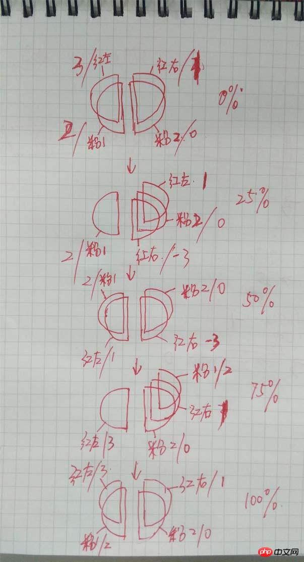
## It’s hard to understand, it doesn’t matter, Xiaohua will explain it bit by bit later~ (Red and pink represent colors, and the slash is the value of
z-index
)
animation time is set randomly. Anyway, it looks a bit weird when I turn it around.
The outer circle and the inner circle are positioned together through <p class="con-wrap">
<!--外圈-->
<p class="out-round"></p>
<!--内圆,里面有半圆四个-->
<p class="in-round">
<p class="lt-round"></p>
<p class="lt-mask"></p>
<p class="rt-round"></p>
<p class="rt-mask"></p>
</p>
</p>Copy after login
. In essence, after the outer circle has rotated 2 times, the inner circle will The red and pink circles have only completed one rotation each (the entire inner circle includes red from 1 to 0 and pink from 1 to 0), so the animation time of the inner circle should be twice as long as that of the outer circle! ! !
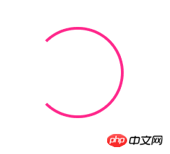
order-radius:50% to draw a circle, and then set Three borders are red and the other is transparent, that is, three-quarters of the circle border (ie, the outer circle) is drawn.
.out-round {
            width: 100px;
            height: 100px;
            border-radius: 50%;
            margin: 150px auto;
            border: 3px solid #FF298C;
            border-left: 3px solid transparent;
            animation: outRound 1s linear infinite running;
        }
The next step is the animation of the outer circle. The animation set for it is to rotate in one circle, infinite means unlimited times
@keyframes outRound {
            0% {
                transform: rotate(120deg)
            }
            100% {
                transform: rotate(-240deg)
            }
}rotate(120deg)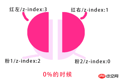 is the starting position of rotation, which can be adjusted according to the actual situation.
The outer circle is now complete. The inner circle below is more troublesome, but it should be imaginable according to the diagram.
 2. Inner circle
z-index
value of the two red semicircles controls the display priority of each semicircle. The css implementation part of the inner circle is:
/*左边两个半圆*/
        .lt-round, .lt-mask {
            position: absolute;
            width: 35px;
            height: 70px;
            border-radius: 35px 0 0 35px;
            transform-origin: right center;
        }

/*右边两个半圆*/
        .rt-round, .rt-mask {
            position: absolute;
            left: 50%;
            width: 35px;
            height: 70px;
            border-radius: 0 35px 35px 0;
}z-index value to change the displayed
, so as to achieve the effect of display and hiding to complement the left half of the circle):
1. Initial settings:
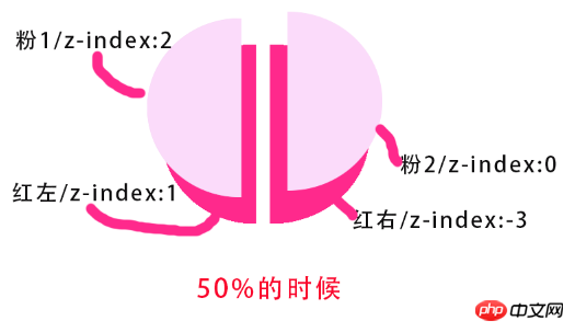
 红左 z-index:3
 粉1  z-index:2

 红右 z-index:1
 粉2  z-index:0
Picture:
Visual effect diagram (ignore the white line in the middle) :
2. When the red on the left rotates 180 degrees (counterclockwise rotation, so it is 360→180→0)
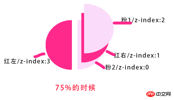
###Model diagram: #### ###########Visual renderings: ###############3. When the red on the left turns to 0 degrees (at this time, the red semicircles on the left and right are replaced by pink Coverage) ###### Model drawing: ######### ######Visual effect drawing: ###############4. Pink semicircle repeat The previous animation of the red semicircle (i.e. pink 360→180→0 on the left)######Model picture:###############Visual effect picture:###
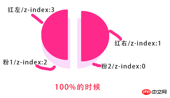
5.当左边粉色旋转到0度时,全部半圆回到了最初始的状态,整个动画即完成(在相同时间下外圈完成了2次的动画)。
模型图:
视觉效果图:
动画代码部分
1、前半程为左边红色旋转一周,后半程为粉色旋转一周。动画实现如下:
/*左边红色完成第一圈的旋转*/
@keyframes ltRound {
            0% {
                transform: rotate(360deg);
            }
            24.9% {
                z-index: 3;
            }
            25% {
                z-index: 1;
                transform: rotate(180deg);
            }
            50% {
                transform: rotate(0deg);
            }
            74.9% {
                z-index: 1;
            }
            75%, 100% {
                z-index: 3;
            }
        }

/*右边红色圆通过z-index来控制显示和隐藏,从而达到在适当时间配上左半圆的效果*/
@keyframes rtRound {
            0%, 24.9% {
                z-index: 1;
            }
            25% {
                z-index: -3;
            }
            74.9% {
                z-index: -3;
            }
            75%, 100% {
                z-index: 1;
            }
        }

/*左边粉色完成第二圈的旋转*/
@keyframes ltMask {
            0%, 25%, 50% {
                transform: rotate(360deg);
            }
            75% {
                transform: rotate(180deg);
            }
            100% {
                transform: rotate(0deg);
            }
}2.在全部代码未完成时,可以将动画时间设大一点,这样便于观察,搞完了再设回去就OK了。
3.由于动画是匀速变化的,但是z-index的值不能匀速变化,所以只能在某个很短时间内去改变z-index的值。这样才能达到效果(突然感觉这种实现好像也不是很好)
小结
没做兼容,在chrome中无异常,别的我就不太知道了
The above is the detailed content of How to achieve the effect of pie-shaped Loading waiting chart with CSS (picture). For more information, please follow other related articles on the PHP Chinese website!


![[Web front-end] Node.js quick start](https://img.php.cn/upload/course/000/000/067/662b5d34ba7c0227.png)


