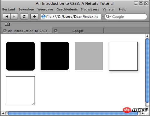
Webpage production Webjx article introduction: Webpage Teaching Network will show you 5 interesting new technologies in CSS in this article: rounded corners, individual rounded corners, opacity, shadow and adjusting element size.
CSS is a well-known and widely used website style language. In its version three (CSS3) plan, some new features have been added that can save time
Script House will show you 5 interesting new technologies in CSS in this article: rounded corners, individual rounded corners, opacity, shadow and resizing elements.
CSS is a well-known and widely used website style language. In its version three (CSS3) plan, some new features that can save time have been added. Although these effects are only supported by the latest browser versions, it is still necessary and interesting to understand them. Script House will show you 5 interesting new technologies in CSS in this article: rounded corners, individual rounded corners, opacity, shadows and resizing elements.
Related articles: Introducing 5 tips for using CSS3
1: Basic tags 
Before we start this tutorial, let’s create the basic tags that will be used throughout the tutorial.
Our xHTML requires the p element:
#round, use CSS3 code to achieve rounded corners.
#indie, use individual rounded corners.
#opacity, demonstrates the new CSS3 way of implementing opacity.
#shadow, shows how to use CSS3 to achieve the shadow effect without using Photoshop.
#resize, shows how to use some CSS to achieve the resize effect.
To summarize, our xHTML should look like this:
<!DOCTYPE html PUBLIC “-//
W3C
//
DTD
 XHTML 1.0 Transitional//EN” “http://www.w3.org/TR/xhtml1/DTD/xhtml1-transitional.dtd”>
<html
xml
ns=”http://www.w3.org/1999/xhtml”>
<
head
>
<meta http-equiv=”Content-Type” content=”text/html; char
set
=utf-8″ />
<title>An Introduction to CSS3; A Nettuts Tutorial</title>
<link href=”style.css” rel=”stylesheet” type=”text/css” />
</head>
<body>
<p id=”wrapper”>
<p id=”round”> </p>
<p id=”indie”> </p>
<p id=”opacity”> </p>
<p id=”shadow”> </p>
<p id=”resize”>
<img src=”image.jpg” alt=”resizable image” width=”200″ height=”200″>
</p>
</p>
</body>
</html>
Let’s create the basic CSS file:
body {
background-color: #fff;
}
#wrapper {
width: 100%;
height: 100%;
}
p {
width: 300px;
height: 300px;
margin: 10px;
float: left;
} As you can see above, we give each p element 300px width and height, and let them float to the left. The p of the entire page is left for us to add styles in the later work. Seeing this information means that the article comes from Script House www.jb51.net. If the article is incomplete, please go to Script House jb51.net to browse!
2: Rounded corners
Currently, there are many ways to create rounded corners, but they are all troublesome. The most commonly used method: First, you have to create a image with rounded corners; then, you have to create a lot of html elements and use a background image to display the rounded corners . You and I know the specific process very well.
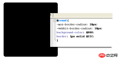
This problem will be solved very simply in CSS3, that is the property called "border-radius". We first create a black p element and set a black border to it. The border is the prerequisite for achieving the effect of the "border-radius" attribute.
Like this:
#round {
background-color: #000;
border: 1px solid #000;
}Now that you have created the p element, it looks just like you expected, 300px tall, angular, and black. Now let's add the code to implement rounded corners. It is so simple and requires only two lines of code.
#round {
background-color: #000;
border: 1px solid #000;
-moz-border-radius: 10px;
-webkit-border-radius: 10px;
}Here, we add two similar lines of code, -moz- is for Firefox browser, and -webkit- is for Safari/Chrome browser.
Note: So far IE browser does not support the border-radius attribute, so if you want IE to have a rounded corner effect, you need to add rounded corners separately.
border-radius This attribute is literally translated as the border radius. Just like Photoshop, the larger its value, the larger the fillet will be.
【Related recommendations】
2. Share 22 H5 and CSS3 help Tools
4. Detailed explanation of examples of selectors in CSS3
5. Integrate 20 common CSS/CSS3 properties
The above is the detailed content of Introducing several new technologies in CSS3. For more information, please follow other related articles on the PHP Chinese website!


