


I often see such sharp corners. I didn’t understand them before and thought they were all made with pictures. Later I was surprised to find that many of them were made with CSS. They are both beautiful and resource-saving. It’s really the best of both worlds!
So, how to achieve this effect using CSS? First, let’s write a simple code:
The code is as follows:
<p class="arrow"></p>
<style type="text/css">
.arrow {
width:0;
height:0;

font-size:0;
border:solid 10px #000;
}</style>Here, we can get a black square, which is actually composed of a border, because the width and height of p are 0,. So, let’s take a closer look at what the top, bottom, left, and right borders of p look like when its width and height are both 0. Next, we set the colors of each side of the border to different colors:
The code is as follows :
<p class="arrow"></p>
<style type="text/css">
.arrow {
    width:0;
    height:0;
    font-size:0;
    border:solid 10px;

border-color
:#f00 #0f0 #00f #000;
}
</style>We found that when the width and height of p are both 0, its entire border is composed of four triangles, with each side being a triangle. Then we can take advantage of this feature, Let’s make cute little sharp corners. We only need to set the color of the unnecessary three-sided border (triangle) to be the same as the background, so that you can only see the triangle you want, and then use positioning to adjust the position. The specific code is as follows:
The code is as follows:
<p class="s
end
">
    <p class="arrow"></p>
</p>
<style type="text/css">
body {

background
:#4D4948;
}
.send {

position:relative;
    width:150px;
    height:35px;
    background:#F8C301;
    border-radius:5px; /* 圆角 */

margin:30px auto 0;
}
.send .arrow {
position:absolute;

top:5px;
right:-16px; /* 圆角的位置需要细心
调试
哦 */
    width:0;
    height:0;
    font-size:0;
    border:solid 8px;
    border-color:#4D4948 #4D4948 #4D4948 #F8C301;
}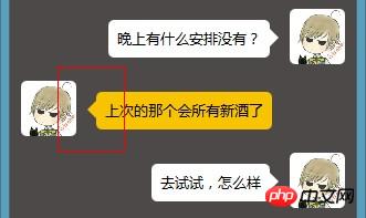
</style>You are done, the effect is as shown below:

[Related recommendations]
2. Browser implements high-performance css3 animation on mobile terminal
3. h5 +Css3 code example to achieve image fly-in and fade-out effects
4. Teach you how to use CSS3 to create 8 kinds of Loading animation
5. Teach you how to draw a standard circular pattern using CSS
The above is the detailed content of Use CSS to create small sharp corners and bubble effects in the chat box. For more information, please follow other related articles on the PHP Chinese website!


![[Web front-end] Node.js quick start](https://img.php.cn/upload/course/000/000/067/662b5d34ba7c0227.png)


