


This article mainly introduces the example of lowpoly animation effect of any image realized by CSS3. This is an effect combined with lowpoly (low polygon style) realized by using the animation properties of CSS3. It mainly uses the rotate rotation and translate movement of CSS3 transform attribute. ,scale scaling
This is an effect combined with lowpoly (low polygon style) achieved by using the animation properties of CSS3. It mainly uses the rotate rotation, translate movement and scale scaling of the CSS3 transform property. The CSS code part is very simple. , the only interesting thing is the use of the nth-of-type selector. UI designers don’t have to be afraid here. The CSS part can be reused and the parameters can be changed at will according to your own requirements (all SVG animation codes that cannot be reused are (It's a rogue thing). Then, the UI designer can perfectly achieve the following effects by using the AI tools he is familiar with.
Step-by-step disassembly:
1. Production of low-polygon style pictures
My original picture is as follows:
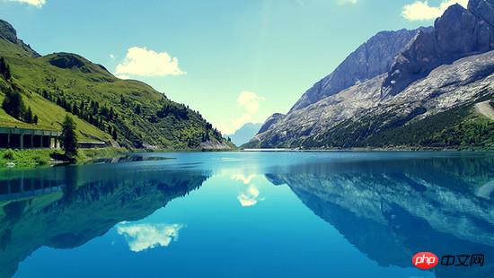
I randomly found a background picture from the computer, and then used an artifact Image Triangulator , I have to sigh, this tool is so easy to use, all the designers need to do is to add dots on the picture (for testing, I added vertices very roughly. If you need to get a very brilliant effect, you need to separate the light and dark areas. Edges are finely added).
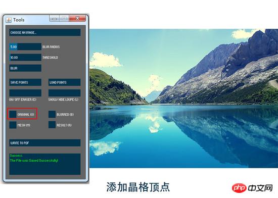
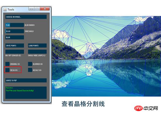
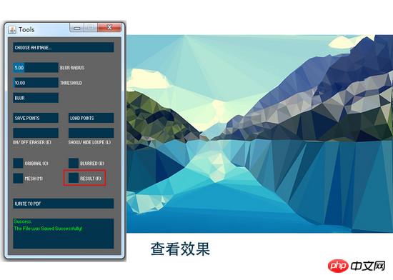
Then the exported pdf format file can be opened with AI.
2. Image processing
An important operation is required here in AI, "Release Clipping Mask". If this operation is not performed, the generated There will be a large number of path clipping mask tags
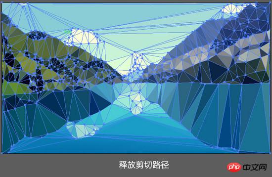
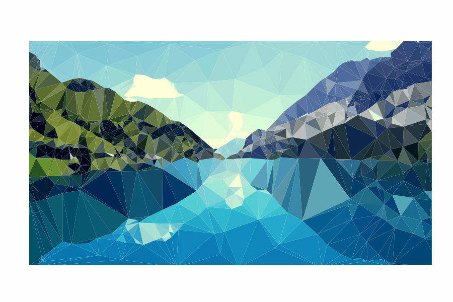
After releasing the clipping path and selecting the graphic, you can see that the picture is now composed of triangular color blocks.
Export the SVG code and you can see the densely packed polygon tags
Image Triangulator generates lowpoly-style images; AI processing, releasing clipping masks
It should be noted here that the PDF generated by this software has an unprocessed base map, and the SVG file There is antag, so you can add a few more points on the edge, or cut off part of it to prevent hollowing out on the edge.
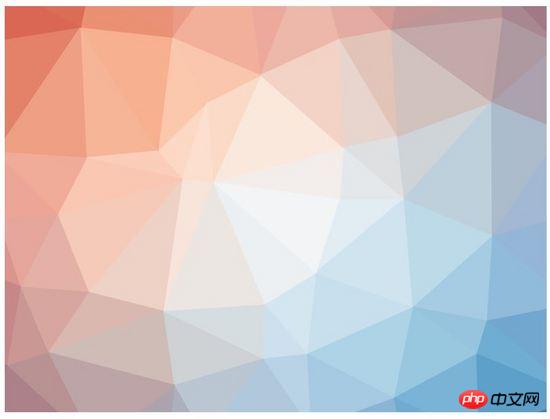
3. Processing of low-polygon background images generated online
If you only need a background image, it is recommended to use the website qrohlf.com/trianglify-generator/, You can customize the size, color and lattice size, and support generating SVG format. For example:
If the image generated using thisonline toolis not processed, it will have a
As of this step, our graphics processing part is over, and the rest is the realization of animation effects
Let me first talk about the preliminary idea of animation implementation. I want these generated polygonal fragments to change in rotation, displacement and size. This is also an effect that is easy to achieve with CSS, but what I need is different effects of scattering, different directions of displacement, different distances, and scaling. Different, but I am aJavaScriptscumbag who can’t write randomfunctions. Fortunately, CSS3 provides a powerful selector nth-of-type(an+b), using With it, I can give different animation property values to different polygon fragments.
A brief introduction to nth-of-type(an+b), n starts from 0 and adds 1 in sequence, so you will get the a+b, 2a+b, 3a+b ……element.
For example, I want my
polygon:nth-of-type(6n+1){transform: translate(x , y) scale() rotate();}
This is the animation effect of polygons in the order 6n+1 (ie 1,7,13,19...). Similarly, the next group is polygon:nth-of-type(6n+2), that is Select the 2nd, 8th, 14th, 20th...polygons and push them backwards until polygon:nth-of-type(6n+6)
Now attach all the codes andcomments
Let’s talk about all the codes below:
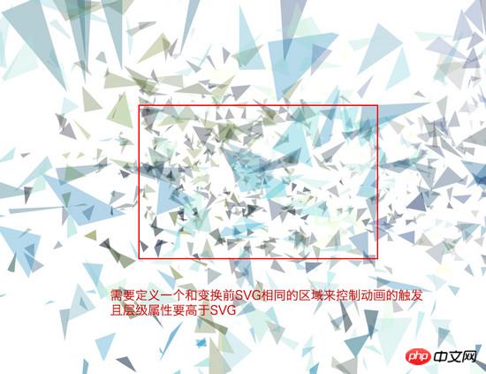
Since SVG breaks into full screen after executing the animation effect, if our animation is set to break when the mouse moves in, and restores when the mouse moves out The effect requires an area to trigger the action. This is the meaning of our definition of cover, and the hierarchical attributes are higher than the SVG attributes.
Regarding the triggering of animation effects, I use :hover when the mouse passes. If you need other triggersevents, you can ask for help from the front-end siege lion.
The overflow attribute of svg must be defined as visible to ensure that the part beyond the svg size is visible after the animation effect.
Regarding the setting of polygon animation attributes, this transition: all 1s ease means that all animation times are 1s and the easing effect is. transform-origin: 50% 50% defines the origin of the transformation as the center of each element.
Regarding 6 different sets of animation effects, I set the displacement translate, scaling scale, selection rotate and transparency opacity changes.
For the displacement of the X-axis and Y-axis, it is recommended to define a range yourself. The larger the value, the higher the diffusion. For example, my X and Y directions are both -800%~800%. In addition, regarding the angle of rotation, rotate(), in order to comply with the laws of physics, the farther the offset path is, the greater the angle of rotation, and vice versa.
If you want to set more different effects, you only need to change the coefficient a of n in nth-of-type (an+b).
If you are too lazy to modify it, the UI designer only needs to replace the

##Summary of knowledge points
1. About the production of low polygonal lowpoly style pictures (emphasis on yourself Create arbitrary graphics) 2. Use of CSS3 selector nth-of-type (an+b) [Related recommendations] 1. 2.Teach you to use CSS to draw a standard circular pattern
3.Use css to add a text hyperlink to the right of the text Arrow icon
4.Tutorial on the use of H5 and CSS3 form validation
5.CSS3 code tutorial to complete a square box rounded corner effect
The above is the detailed content of Detailed explanation of the process of CSS3 completing the lowpoly animation effect of images. For more information, please follow other related articles on the PHP Chinese website!


![[Web front-end] Node.js quick start](https://img.php.cn/upload/course/000/000/067/662b5d34ba7c0227.png)


