This is a translated article. The original text is: 3 New CSS Features to Learn in 2017. The translation is not very good. If you have any questions, please point out.
In the new year, we have a series of new things to learn. Although there are many new features in CSS, there are three features that I am most excited to learn.
Before this I wrote an article about Feature Queries the one CSS feature I really want. Now, it's here! Currently, all major browsers support feature query (including Opera Mini), except IE browser.
Feature Queries, using @supports rules, allows us to write CSS rules in its conditional area, only when the current user's browser supports a certain CSSproperty-value pair , the CSS code block will take effect.
To give a simple example, in the following code, only when the browser supports display: Flexbox styles are only applied when flexing.
@supports ( display: flex ) {
    .foo { display: flex; }
}In addition, we can also use some operators, such as and and not, so that we can create more complex feature queries. For example, we can identify whether a browser supports older versions of Flexbox syntax.
@supports ( display: flexbox ) and ( not ( display: flex ) ) {
    .foo {
        display: flexbox;
    }
}Feature Queries also supports JavascriptInterface: CSS.supports(), also used Take the above example to see how to use it:
if ( CSS.supports( '(display: flex)') ) {
    console.log('支持flex')
} else {
    console.log('不支持flex')
}

if ( CSS.supports( '(display: flexbox)' ) ) {
    console.log('支持flexbox')
} else {
    console.log('不支持flexbox')
}The CSS grid layout module defines a system for creating a grid-based layout. This is similar to the flexbox layout module, but the grid layout is specifically designed for page layout and therefore has many different features.
A grid system is composed of a grid container (Grid Containe, represented by display: grid creation) and grid items (Grid Item). In our CSS, we can easily and explicitly organize the layout and order of the grid items, independently of the layout in the markup.
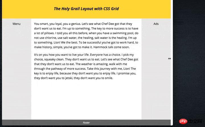
For example, I used the Grid Layout module to create a Holy Grail layout in the article Holy Grail Layout with CSS Grid.

Main HTML code:
<body class="hg">
    <header class="hgheader">Title</header>
    <main class="hgmain">Content</main>
    <aside class="hgleft">Menu</aside>
    <aside class="hgright">Ads</aside>
    <footer class="hgfooter">Footer</footer>
</body>Main CSS code:
.hgheader { grid-area: header; }
.hgfooter { grid-area: footer; }
.hgmain { grid-area: main; }
.hgleft { grid-area: navigation; }
.hgright { grid-area: ads; }

.hg {
    display: grid;
    grid-template-areas: "header header header"
                         "navigation main ads"
                         "footer footer footer";
    grid-template-columns: 150px 1fr 150px;
    grid-template-rows: 100px
                        1fr
                        30px;
    min-height: 100vh;
}

@media screen and (max-width: 600px) {
    .hg {
        grid-template-areas: "header"
                             "navigation"
                             "main"
                             "ads"
                             "footer";
        grid-template-columns: 100%;
        grid-template-rows: 100px
                            50px
                            1fr
                            50px
                            30px;
    }
}CSS Gate The grid module introduces a new length unit: the fr unit, which represents the portion of space remaining in the grid container.
We can allocate the height and width of the grid items through the available space of the grid container. For example, in the Holy Grail layout, I want the main container to occupy all the space except the containers on both sides. To achieve this effect, just write the following code:
.hg {
    grid-template-columns: 150px 1fr 150px;
}We can specifically define the gaps between elements in the grid layout. The grid-row-gap, grid-column-gap and grid-gap properties can do this. These properties accept a
For example, with a 5% gap, you could write:
.hg {
    display: grid;
    grid-column-gap: 5%;
}The CSS grid module will be available in browsers as early as March of this year ( Provides default support).
Refer to my record: How to enable CSS Grid Layout in each browser.
The last one is local CSSVariables. This module introduces the method of creating user-defined variables, which can assign a variable to a CSS property.
For example, if I have a theme color that is used in several places, then I can abstract the theme color into a variable andreference# when using it. ##This variable is easier to maintain than writing this color in multiple places. :root {
--theme-colour: cornflowerblue;
}
h1 { color: var(--theme-colour); }
a { color: var(--theme-colour); }
strong { color: var(--theme-colour); }
--theme-colour attribute value, you can use the following method: 1. The above is the detailed content of Share three examples of new CSS features. For more information, please follow other related articles on the PHP Chinese website!const rootEl = document.documentElement;
rootEl.style.setProperty('--theme-colour', 'plum');


