CSS contains three layout models: flow model, float model, float layer model, layer
flow model
The default layout model of the web page has two characteristics
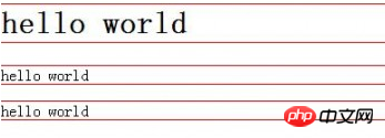
1. Block elements will be vertically extended from top to bottom in the containing element, because by default, the width of block elements is 100%. In fact, block elements will occupy their position in the form of rows.
<style type="text/css">
    h1,p,div{
        border:1px solid red;
    }
</style>
2. Under the flow model, inline elements will be displayed horizontally from left to right within the containing element.
<a href="http://>www.baidu.com</a><span>hello</span><em>shit</em><strong>world</strong>
www.baidu.com hello shit world will be displayed horizontally in the same line.
2. Floating model FLoat
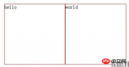
Any element cannot float by default, but it can be defined as floating with CSS, such as div, p, table, img and other elements can be defined For example, for floating, let the following two div elements be displayed side by side on the same line
div{
    border:1px solid red;
    width:200px;
    height:200px;
    float:left;//从左向右排列
}
<div>hello</div>
<div>world</div>
3. Layer model Layer
can realize the html element Precise positioning (not used very much, but some effects can be achieved by using layer models locally)
There are three types of layer models:
Absolute positioning: position:absolute
Drag the element out of the document flow, and then use the left, right, top, and bottom attributes to perform absolute positioning relative to its closest parent containing block with a positioning attribute. If no such containing block exists, it is relative to the body element, that is, relative to the browser window.
Move the div element 100px to the right and 200px down relative to the browser window
div{
    position:absolute;
    width:100px;
    height:100px;
    border:1px solid red;
    left:100px;
    top:200px;
}Relative to: position:relative
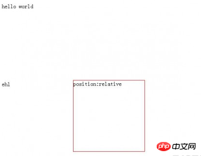
Move relative to the previous position, move The direction and amplitude are determined by the left, right, top, and bottom attributes, and the position before the offset is retained (eh1 is displayed at the position as shown in the figure, this is particularly important to pay attention to).
   .div1{
    position:relative;
    width:200px;
    height:200px;
    border:1px solid red;
    left:200px;
    top:200px;
}
<span>hello world>
<div class="div1">position:relative</div>
<span>eh1<span>
Fixed positioning: position:fixed
The coordinates of relative movement are the view (web page window within the screen) itself. Since the view itself is fixed, it will not change as the scroll bar of the browser window scrolls, unless you move the screen position of the browser window on the screen, or change the display size of the browser window, so fixedly positioned elements will always be in A certain position of the view within the browser window
#div2{
    position:fixed;
    bottom:100px;
    right:100px;
    width:200px;
    height:200px;
    border:1px solid red;
}
<div id="div2">position:fixed</div>So that no matter how much content is in the browser, the div is always in the lower right corner of the window.
The combination of position:absolute and position:relative
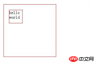
It is known from the above that position:absolute is positioned relative to the browser, and position:absolute relative can be realized through position:relative Positioning relative to other elements but the following points must be met:
1. The referenced element must be the parent element of the positioned element
2. The referenced element is set to position:relative
3. Set the positioning element to position:absolute
#div1{
 border:1px solid red;
 width:200px;
 height:200px;
 position:relative;
}
#div2{
 border:1px solid red;
 width:50px;
 height:50px;
 left:20px;
 top:20px;
 position:absolute;
}
<div id="div1">
    <div id="div2">hello</div>
</div>
This way, div2 is positioned relative to div1.
The above is the detailed content of Detailed explanation of CSS advanced layout model examples. For more information, please follow other related articles on the PHP Chinese website!


