Hello! Friends, have you digested the CSS3 tutorial-animation knowledge in our last article? The new multi-column layout in CSS3 is a powerful expansion of the block layout mode in traditional HTML web pages. This new syntax allows WEB front-end developers to easily display text in multiple columns.
CSS3 Multiple Columns:
With CSS3 you can create multiple columns to lay out your text – just like a newspaper!
In this chapter, you will learn the following multi-column attributes:
1. column-count;
2. column-gap;
3. column-rule.
Browser support:

Internet Explorer 10 and Opera support multi-column properties.
Firefox requires the prefix -moz-.
Chrome and Safari require the prefix -webkit-.
Note: Internet Explorer 9 and earlier versions do not support multi-column properties.
CSS3 Create multiple columns:
The column-count attribute specifies the number of columns by which the element should be separated:
Example:
Put the text in the div element Separated into three columns:
div
{
-moz-column-count:3; /* Firefox */
-webkit-column-count:3; /* Safari 和 Chrome */
column-count:3;
}CSS3 specifies the gap between columns:
column-gap attribute specifies the gap between columns:
Example:
Specify the 40 pixel spacing between columns:
div
{
-moz-column-gap:40px; /* Firefox */
-webkit-column-gap:40px; /* Safari 和 Chrome */
column-gap:40px;
}CSS3 column rules:
column-rule property sets the width, style and color rules between columns.
Example:
Specify width, style and color rules between columns:
div
{
-moz-column-rule:3px outset #ff0000; /* Firefox */
-webkit-column-rule:3px outset #ff0000; /* Safari and Chrome */
column-rule:3px outset #ff0000;
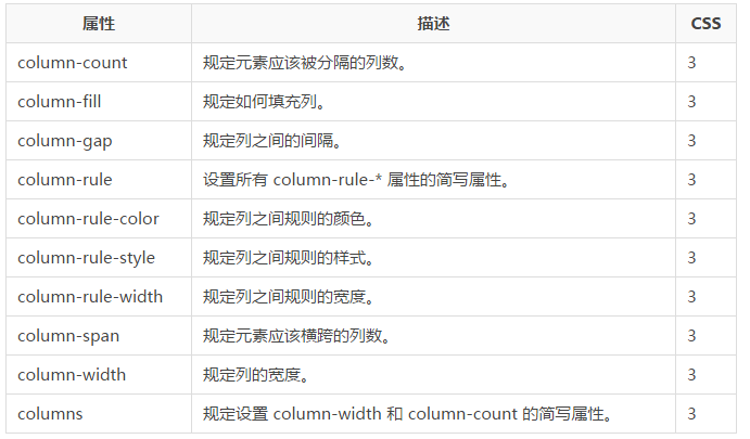
}New multi-column properties:
Listed in the table below All conversion attributes:

The above is the content of CSS3 tutorial-multi-column. For more related content, please pay attention to the PHP Chinese website (m.sbmmt.com)!


