"As a person lives, some people become face and some become lizi. It's all dictated by the times." - "The Grand Master"
If we reconstruct lizi and face, then HTML should be responsible for lizi, and css is It’s time to take charge of face. Let’s talk about CSS. This time we analyze it from the perspective of variability and immutability.
An interview question
First of all, this is an interview question. Secondly, I have never done this interview question anyway. In the end, I forgot which factory the interview question was from.
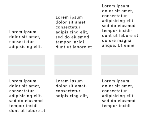
I forgot the specific requirements. The general meaning is that the content should be centered vertically in the window. Use the picture as a reference. The text extends up and down. If there are more words on the top, it will stretch upwards. If there are more words on the bottom, it will stretch downwards. Picture The size is fixed, but the amount of text is not fixed (the red line is added by me as a vertical middle line to assist explanation). Here the text belongs to the variable factor, while the picture belongs to the fixed factor.

Thinking Analysis
First of all, we see that the pictures here are all on the same horizontal line. The amount of text cannot affect the pictures at all, so we come up with two possible solutions. The first is the normal document flow of text, and the picture Absolute positioning; the second type of text is absolutely positioned, and the picture flows normally in the document.
Secondly, because the extension direction of the text above is upward, it violates the normal document flow direction (normally it should extend downward as the text increases), so it can be concluded that the text part above must be absolutely positioned , set the bottom value
Finally, based on the above two reasons, we first use the second solution to test, with absolute positioning of text and normal document flow of pictures.
Here, we use the idea of disassembly in the previous article to get the html structure as follows:
ul.demo
    li
        .text-top
        img.img-center
.text-bottomThe main css code is as follows:
.demo{ position:absolute; top: 50%;
} .demo li{ float: left; width: 120px; margin: 0 20px; position: relative;
} .text-top{ position: absolute; bottom: 90px; left: 0;
} .img-center{ margin-top: -34px; width: 120px; height: 68px;
} .text-bottom{ position: absolute; top: 50px;
}Common examples
Content fluid layout
Here we choose the sidebar to be fixed and the content to be the fluid layout of the remaining width. . The sidebar is a fixed factor and the content is a variable factor.
section.section-main
    .inner-center.clearfix
        .main>.content
aside.aside-right.main{ float: left; width: 100%;
} .main .content{ margin-right: 320px;
} .aside-right{ float: left; width: 300px; margin-left: -320px;
}Mixed graphics and text
It’s still the same mixed arrangement of graphics and text. Generally speaking, the width of the picture is fixed, but the width of the text part is not set. The fixed factor is the width of the image, and the variable factor is the width of the text.
.imgtext-mix
    a.mix-img-link>img.mix-img
    .mix-text
        h3.mix-tt>a.mix-tt-link
.mix-intro.mix-img-link{ float: left; width: 200px; margin-right: 20px;
} .mix-text{ overflow: hidden;
}The width of the container is variable, but the aspect ratio is certain
For details, please refer to: How to scale the container proportionally in CSS, I won’t go into details here. The constant factor is the aspect ratio, and the variable factor is the width.
Variable and immutable on mobile terminals
Many people who are just getting started with mobile terminal reconstruction usually ask a question, do mobile terminals all use percentages? In fact, aside from those new units such as rem, vw, vh, etc., in addition to percentage, px can also be used on the mobile terminal, which is not what you think at all. What unit to use, the most important thing is to grasp the variable and immutable. If you grasp it well, then mobile terminal reconstruction is actually the same as PC. Of course, if you are used to setting a fixed width and height on your PC, you will probably be frustrated.
Full-screen picture scrolling
Full-screen, if vw can’t be used yet, it has to be 100% (full-screen here means that the width covers the entire screen, excluding height).
ul.imgslide
li*4>img// float布局
.imgslide{
width: 400%;
}
.imgslide li{
width: 25%;
float: left;
}
// absoulte布局
.imgslide{
width: 100%;
height: 100px;
position: relative;
}
.imgslide li{
width: 100%;
height: 100%;
position: absolute;
top: 0;
left: 0;
}
.imgslide li:nth-child(n+1){
transform: translate(100%, 0);
}Mixed picture and text list
Still the same mixed picture and text arrangement as before, haha, for PC, maybe you can ignore the variable text on the right and directly set the width, but for mobile terminals, I’m sorry, you must consider this variable factor .
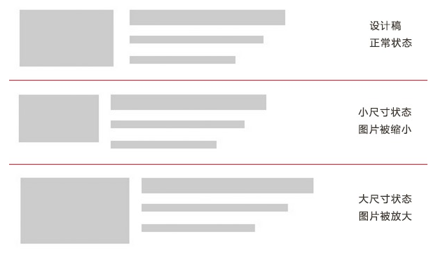
这个估计90%的移动端都有这个效果,当然不可能设计给你的是375px的稿子,然后你就做了个375px宽度的效果。但是如果按照设计稿的比例,然后设置图片和宽度的百分比呢,这种情况图片宽度的改变,当然会影响图片高度的改变(如果是固定的高度那图片估计就没法看了,各种被拉伸或是变形),而图片高度的改变就会影响整体行的改变,那估计拿着不同的手机,看到的右边的文字内容或高或低也是醉了。
百分比效果大概如下图:

所以这里一般设计的是图片固定大小不变,右边文字可变,占满其余空间。实现跟上面的图文混排一样,当然技术上可以使用很多方法如flex,absolute,float等
单行列表
同样单行列表,标题因为长度不一属于可变因子,不宜直接控制其宽度。而右侧的一些按钮或辅助信息相对来说使用绝对定位在右边比较合理。
ul.line-list
    li
p.title+i.icon-xxx.line-list li{
position: relative;
padding-right: 40px;
line-height: 40px;
}
.line-list li .icon-xxx{
position: absolute;
right: 10px;
top: 50%;
tranform: translate(0, -50%);
}
// 如果文字比较长,需要做超出省略截断
.line-list li .title{
padding-left: 10px;
text-overflow: ellipsis;
white-space: nowrap;
overflow: hidden;
}等分
这里的等分指水平的等分,可以使用的技术有flex,float,table-cell等,其中float应该是最low的,因为你必须要设置item的宽度,三等分设置33.33%,四等分设置25%等,这种重复利用性太low,已经不适合更高级的移动端了,所以flex和table-cell是不错的选择,根本不需要在意item的个数(当然得确定一行能显示下,显示不下那也是悲催)。所以这种情况下连单位都是多余的。
ul.equal-list
li*n// flex
.equal-list{
display: flex;
}
.equal-list li{
flex: 1;
}
// table-cell
.equal-list{
display: table;
table-layout: fixed;
width: 100%;
}
.equal-list li{
display: table-cell;
}translate
translate中使用的百分比单位是针对自己宽高的百分比,所以对于未知宽高的计算来说,是非常大的优势,尤其用在水平和垂直居中上。
.center-translate{ position: absolute; left: 50%; top: 50%; transform: translate(-50%, -50%);
}当然这些变与可变的还有很多,总之,在移动端的可变因子比pc上更多,更多的对宽度或高度的不确定,就需要各种方法去避免直接设置死宽度或高度,当然庆幸的是,css3的支持让这些不确定因素的控制变得趋向简单。
变与不变之道
最后不管是移动端还是pc端,对于动不动就设置一个具体width或height的方式注定可扩展性欠缺。所以尤其是在做通用组件的时候,一定要进一步深挖掘,了解更多的使用场景,每个场景的一些特殊特征,甚至于对未来的修改都有可预见性。
可能这里说得更多的是宽度方面的控制,其实对于方法的选择也一样,同一种效果,可能有很多方法去实现,而每种方法都有各自的利弊,所以也要根据实际情况去灵活变通使用,这同样也属于可变的。如果你所有的都是一刀切,那就是固定的一个思维了,无所谓变通了。
如果从一个更高的角度来说,没有什么是恒定的不变,一切皆可变。也许这个站点的不可变,到了那个站点就得变,所以拒绝教条主义,一切从实际情况出发,根据需求分析,得出一个合理的实践。


