In the previous article "How to use CSS to create a wavy background? 》Introduced to you how to use CSS to create a wave background. Friends in need can read and learn about it~
Then this article will introduce to you the most common effect implementation in the front-end development process. , which is the implementation of loading animation.
To put it simply, for example, the common web page loading waiting effect loading... is usually a dynamic loading effect.
Now I will introduce to you a very simple and basic method to achieve the effect of loading animation:
Directly enter the code:
<!DOCTYPE html>
<html lang="en">

<head>
    <meta charset="UTF-8" />
    <title></title>
    <style>
        body {
            margin: 0;
            padding: 0;
            background: black;
            display: flex;
            flex-direction: row;
            align-items: center;
            justify-content: center;
            height: 100vh;
        }

        .dot1, .dot2, .dot3 {
            background: #fff;
            width: 15px;
            height: 15px;
            border:double;
            border-color:black;
            border-radius: 50%;
            margin: 10px;
        }

        .dot1 {
            animation: jump 1.6s -0.32s linear infinite;
            background: #4B0082;
        }
        .dot2 {
            animation: jump 1.6s -0.16s linear infinite;
            background: #B22222;
        }
        .dot3 {
            animation: jump 1.6s linear infinite;
            background: #006400;
        }

        @keyframes jump {
            0%, 80%, 100% {
                -webkit-transform: scale(0);
                transform: scale(0);
            } 40% {
                  -webkit-transform: scale(2.0);
                  transform: scale(2.0);
              }
        }
    </style>
</head>
<body>
<div class="dot1"> </div>
<div class="dot2"></div>
<div class="dot3"></div>
</body>

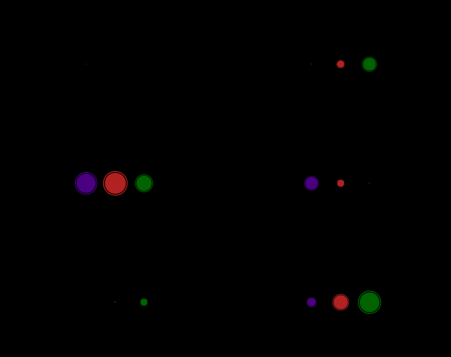
</html>The effect is as shown below :

The following are two key properties:
CSS3 animation (animation) Property
Syntax: animation: name duration timing-function delay iteration-count direction fill-mode play-state;
值
animation-name:指定要绑定到选择器的关键帧的名称
animation-duration:动画指定需要多少秒或毫秒完成
animation-timing-function:设置动画将如何完成一个周期
animation-delay:设置动画在启动前的延迟间隔。
animation-iteration-count:定义动画的播放次数。
animation-direction:指定是否应该轮流反向播放动画。
animation-fill-mode:规定当动画不播放时(当动画完成时,或当动画有一个延迟未开始播放时),要应用到元素的样式。
animation-play-state:指定动画是否正在运行或已暂停。
initial:设置属性为其默认值。
inherit:从父元素继承属性。
CSS3 @keyframes Rules
Animations can be created using @keyframes rules. Animation is created by gradually changing from one CSS style setting to another.
During the animation process, the CSS style settings can be changed multiple times. Specify when a change occurs using %, or the keywords "from" and "to", which are the same as 0% to 100%.
0% is when the animation starts, 100% is when the animation is completed. For best browser support, selectors should always be defined as 0% and 100%.
Note: Use the animation attribute to control the appearance of the animation, and also use the selector to bind the animation.
Grammar: @keyframes animationname {keyframes-selector {css-styles;}}
值
animationname:必需的,定义animation的名称。
keyframes-selector:必需的,动画持续时间的百分比。
合法值:
0-100%
from (和0%相同)
to (和100%相同)
注意:可以用一个动画keyframes-selectors。
css-styles:必需的,一个或多个合法的CSS样式属性。
The PHP Chinese website platform has a lot of video teaching resources, everyone is welcome to learn "css video tutorial"!
The above is the detailed content of How to quickly create a 3-point loading animation with css. For more information, please follow other related articles on the PHP Chinese website!