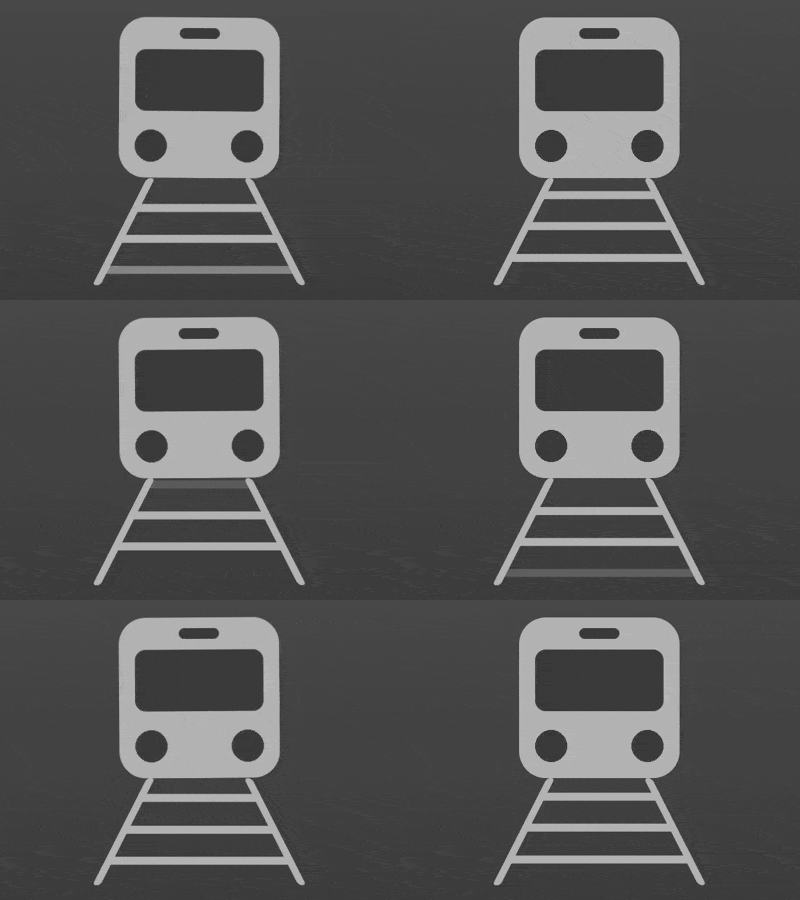
This article introduces you to the article about how to use pure CSS to realize a moving train. It has a good reference value. I hope it can help friends in need.

Define dom, the container contains 2 elements,trainrepresents the train,trackrepresents the railroad track, and the 3contained in it represent the 3 sleepers.
Centered display:
body{ margin: 0; height: 100vh; display: flex; align-items: center; justify-content: center; background: linear-gradient(#666, #333); }
Define container size:
.loader { width: 8em; height: 10em; font-size: 20px; }
Draw the train first.
Draw the outline of the train:
.train { width: 6em; height: 6em; color: #444; background: #bbb4ab; border-radius: 1em; position: relative; left: 1em; }
Use the ::before pseudo element to draw the window:
.train::before { content: ''; position: absolute; width: 80%; height: 2.3em; background-color: currentColor; border-radius: 0.4em; top: 1.2em; left: 10%; }
Use the ::after pseudo element to draw the signal light on the window:
.train::after { content: ''; position: absolute; width: 25%; height: 0.4em; background-color: currentColor; border-radius: 0.3em; top: 0.4em; left: calc((100% - 25%) / 2); }
Use radial gradient to draw the lights:
.train { background: radial-gradient(circle at 20% 80%, currentColor 0.6em, transparent 0.6em), radial-gradient(circle at 80% 80%, currentColor 0.6em, transparent 0.6em), #bbb; }
Next draw the rails and sleepers.
Define the width of the rails, slightly wider than the train:
.track { width: 8em; }
Use pseudo elements to draw the rails:
.track { position: relative; } .track::before, .track::after { content: ''; position: absolute; width: 0.3em; height: 4em; background-color: #bbb; border-radius: 0.4em; }
Place the rails on both sides to create a visual sense of near and far. Effect:
.track::before, .track::after { transform-origin: bottom; } .track::before { left: 0; transform: skewX(-27deg); } .track::after { right: 0; transform: skewX(27deg); }
Draw the sleepers, which is the effect closest to the observer. Currently, the three sleepers are overlapping:
.track span { width: inherit; height: 0.3em; background-color: #bbb; position: absolute; top: 4em; }
Set the animation effect of the railway track:
.track span { animation: track-animate 1s linear infinite; } @keyframes track-animate { 0% { transform: translateY(-0.5em) scaleX(0.9); filter: opacity(0); } 10%, 90% { filter: opacity(1); } 100% { transform: translateY(-4em) scaleX(0.5); filter: opacity(0); } }
Set an animation delay for the other 2 sleepers to make the track look like it will never end:
.track span:nth-child(2) { animation-delay: -0.33s; } .track span:nth-child(3) { animation-delay: -0.66s; }
Finally, add an animation effect to the train to make it look like it is shaking slightly while running:
.train { animation: train-animate 1.5s infinite ease-in-out; } @keyframes train-animate { 0%, 100% { transform: rotate(0deg); } 25%, 75% { transform: rotate(0.5deg); } 50% { transform: rotate(-0.5deg); } }
Done!
Related recommendations:
How to use css to draw a bird (code)
How to use pure CSS to create a cartoon parrot Effect
The above is the detailed content of How to implement a dynamically moving train using pure CSS. For more information, please follow other related articles on the PHP Chinese website!


