


This article mainly introduces how to use CSS3 to create a color progress bar style. It has a certain reference value. Now I share it with you. Friends in need can refer to
Using CSS3's border-radius, Box-shadow, transition, -moz-linear-gradient, -webkit-gradient and other styles can complete a fashionable progress bar. Here we look at a few CSS3 code examples for making colored progress bar styles:
1. Create a static purple stripe progress bar
html code:
<body>
<p class="progress-bar purple"> <span style="width:40%;"></span> </p>
</body>
css code:
body {
 background-color:#333;
}
.progress-bar {
 background-color:#222;
 border-radius:3px;
 width:300px;
 height:24px;
 padding:5px;
 margin:50px;
 border-bottom:1px solid #444;
 box-shadow:inset 0 0 2px 0 #000;
}
.progress-bar span {
 display:inline-block;
 width:140px;
 height:24px;
        border-radius:2px;
 box-shadow:0 1px 0 rgba(255, 255, 255, 0.5) inset;
 -moz-box-shadow:0 1px 0 rgba(255, 255, 255, 0.5) inset;
 -webkit-box-shadow:rgba(255,255,255,0.5) 0 1px 0 inset;
}
.purple span{
 background-color:#F09;
 background-image:-moz-linear-gradient(45deg, rgba(255, 255, 255, 0.3) 25%, transparent 25%, transparent 50%, rgba(255, 255, 255, 0.3) 50%, rgba(255, 255, 255, 0.3) 75%, transparent 75%);
 background-image:-webkit-gradient(linear,0 100%,100% 0,color-stop(25%,rgba(255,255,255,0.3)),color-stop(25%,transparent),color-stop(50%,transparent),color-stop(50%,rgba(255,255,255,0.3)),color-stop(75%,rgba(255,255,255,0.3)),color-stop(75%,transparent));
 background-size:16px 16px;
} The final effect is as shown below: 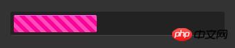
2. Create a static blue progress bar
html code:
<p class="progress-bar orange"> <span style="width:60%;"></span> </p>
css code:
.orange span{
 background-image:-webkit-gradient(linear,0% 0%,0% 100%,from(#fecd22),to(#fd9415));
 background-image:-moz-linear-gradient(-90deg,#fecd22,#fd9415);
}The final effect is as shown below: 
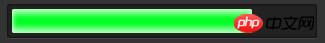
##3. Production Static green progress bar
html code:
<p> <span style="width:80%;"></span> </p>
.green span{
 background-color:#00ff24;
 box-shadow:rgba(255,255,255,0.7)0 5px 5px inser,rgba(255,255,255,0.7)0 -5px 5px inset;
 -webkit-box-shadow:rgba(255, 255, 255, 0.7) 0 5px 5px inset, rgba(255, 255, 255, 0.7) 0 -5px 5px inset;
 -moz-box-shadow:rgba(255, 255, 255, 0.7) 0 5px 5px inset, rgba(255, 255, 255, 0.7) 0 -5px 5px inset;
}
4. Add dynamic effects to the purple stripes
css code:
.purple span:hover{
 -webkit-animation:animate-stripes 3s linear infinite;
 -moz-animation:3s linear 0s normal none infinite animate-stripes;
}
@-webkit-keyframes animate-stripes {
0% {background-position: 0 0;} 100% {background-position: 60px 0;}
}
@-moz-keyframes animate-stripes {
0% {background-position: 0 0;} 100% {background-position: 60px 0;}
}Use CSS3 to simulate the IOS sliding switch effect
Implementation of CSS3 and HTML5 web page loading progress bar
The above is the detailed content of How to create a colored progress bar style using CSS3. For more information, please follow other related articles on the PHP Chinese website!


![[Web front-end] Node.js quick start](https://img.php.cn/upload/course/000/000/067/662b5d34ba7c0227.png)


