


This article mainly introduces the usage summary of common transformation graphics changes in CSS3, and summarizes the usage methods of rotation, scaling, translation, tilt and matrix. Friends who need it can refer to it
1 .rotate rotation
Rotate the picture, the unit is deg, which means "degree"
-moz-transform: rotate(20deg); -webkit-transform: rotate(20deg); -o-transform: rotate(20deg); -ms-transform: rotate(20deg);
2.scale zoom in and out
Zoom in and out in proportion, such as "1.6 " is to enlarge 1.6 times, if "-1.6" is to reduce 1.6 times
-webkit-transform: scale(1.6); -moz-transform: scale(1.6); -o-transform: scale(1.6); -ms-transform: scale(1.6);
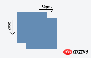
3.translate translation
translate is the translation of the specified object, with two parameters, the first is the translation in the x-axis direction, and the second one is the translation in the y-axis direction. If the second argument is not provided, the default value is 0 .
For example, if you need to set an element to move 30px in the x-axis direction and 20px in the y-axis direction when the mouse is hovering, you can write it like this:
#translate-demo:hover { -webkit-transform: translate(30px, 20px); -moz-transform: translate(30px, 20px); -o-transform: translate(30px, 20px); -ms-transform: translate(30px, 20px); transform: translate(30px, 20px); }
It must be noted here that the latest version of mainstream modern browsers (Kayo tested Chrome 22.0.1229.94, Firefox 17.0.1, Safari 5.1.7, Opera 12.12) except the webkit kernel Except for Chrome and Safari, there is no need to use private attributes to support transform. However, since the transform attribute in early modern browsers needs to be supported through their own private attributes, in order to be as compatible as possible with early versions of browsers, it is used in actual projects. It is best to use their own private properties when transforming. At the same time, for backward compatibility, calls without private properties need to be added.
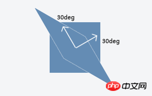
4.skew tilt
skew specifies the oblique distortion of the element, that is, the element is tilted around the x-axis and y-axis. It has two parameters, the first one corresponds to the x-axis direction. Tilt angle, the second one corresponds to the tilt angle in the y-axis direction. If the second argument is not provided, the default value is 0 . Skew is somewhat similar to scale, but scale only rotates the element and does not change the shape of the element, while skew will change the shape of the element.
For example, if you need to set an element to perform an oblique distortion of 30 degrees in the x-axis direction and 30 degrees in the y-axis direction when the mouse is hovered, you can write it like this:
#skew-demo:hover { -webkit-transform: skew(30deg, 30deg); -moz-transform: skew(30deg, 30deg); -o-transform: skew(30deg, 30deg); -ms-transform: skew(30deg, 30deg); transform: skew(30deg, 30deg); }
It is worth noting that since translate, skew and the scale mentioned above all use values related to the x and y axes as parameters, for the sake of convenience, W3C also provides The translateX and translateY, skewX and skewY, and scaleX and scaleY methods are added, which are used to independently set the effects in the x-axis and y-axis directions respectively.
5.matrix matrix
matrix is a matrix, specifically a 3*3 matrix is used here.
Use a matrix to represent attribute values?
Yes, in addition to transform, there are some other properties in CSS3 that use matrix as their attribute value. In fact, matrix is the most basic and most powerful value in transform. The above translate and skew and the ones introduced before Rotate and scale are implemented through matrix at the bottom level, so in fact all transform values can be represented by a 3*3 matrix.
We know that transform is a 2D transformation on the x, y coordinate system, so in fact transformation is the process in which each point on the element changes through a transformation equation and then generates a new coordinate value. Therefore, we set the old x and y coordinate values to XprevCoordSys and YprevCoordSys respectively, and the new x and y coordinate values to XnewCoordSys and YnewCoordSys respectively. Since the transformation is performed in 2D, the z coordinate value is set to 1. At this time, let matrix be another matrix as follows,
Then there is the following relationship between the old coordinate value, the new coordinate value and the matrix: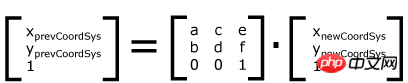
That is, the old and new values can be connected to form an equation through a matrix, so developers only need to set the value of the matrix to write a custom transformation. Next, it should be noted that although matrix is a 3*3 matrix, in actual use only 6 parameters need to be filled in (the other 3 have nothing to do with the x and y axes), and the following order needs to be used when calling [a b c d e f]
For example, write the following statement:
#matrix-demo:hover { -webkit-transform: matrix(1, 1, 0, 1, 0, 0); -moz-transform: matrix(1, 1, 0, 1, 0, 0); -o-transform: matrix(1, 1, 0, 1, 0, 0); -ms-transform: matrix(1, 1, 0, 1, 0, 0); transform: matrix(1, 1, 0, 1, 0, 0); }
In this way, the element will stretch in the y-axis direction when the mouse is hovered (that is, the effect equivalent to skewY(45deg)).
In addition, if two or more transform methods are used at the same time, they can be written together.
The above is the entire content of this article. I hope it will be helpful to everyone's study. For more related content, please pay attention to the PHP Chinese website!
Related recommendations:
How to use the calc() property in CSS3 to express size
About CSS3 animation to achieve frame-by-frame animation Effect
The above is the detailed content of About the usage of common transformation graphic changes in CSS3. For more information, please follow other related articles on the PHP Chinese website!


![[Web front-end] Node.js quick start](https://img.php.cn/upload/course/000/000/067/662b5d34ba7c0227.png)


