


This article mainly introduces the example code of CSS to implement multi-row and multi-column layout. Friends who need it can refer to it
1. Two columns and multiple rows:
HTML:
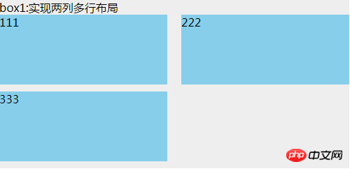
<p class="box1">
    box1:实现两列多行布局
    <ul>
        <li>111</li>
        <li>222</li>
        <li>333</li>
    </ul>
</p>CSS:
.box1 {
  width: 500px;
  background: #EEEEEE;
}
.box1 ul {
  clear: both;
  overflow: hidden;
}
.box1 ul li {
  width: 48%;
  height: 100px;
  margin-bottom: 10px;
  background: skyblue;
  float: left;
}
.box1 ul li:nth-child(even) {
  margin-left: 4%;
}This uses nth-child(), which is compatible with browsers ie9 and above. There are two gaps in the middle. The sum of the side-by-side p widths, the remaining width after subtracting 100%;
Since nth-child() is mentioned, then we need to talk about nth-of-type (), which is also only compatible with browsers ie9 and above. The difference between it and nth-child is:
<p class="box">
    <h1></h1>
    <h1></h1>
    <p></p>
    <p></p>
    <p></p>
</p>If you want the background of the second p tag to be red, then, p: nth-child(4) can achieve the effect; and p:nth-of-type(2) can achieve the effect. Therefore, nth-of-type only recognizes the second element of p no matter how much content is in front of the p tag. But nth-child is to find the first element of its parent. In this case, the advantages of nth-of-type are reflected.
2. Multiple rows and multiple columns
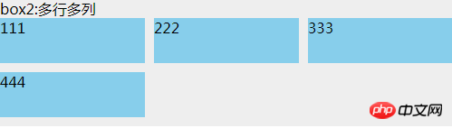
<p class="box2">
    box2:多行多列
    <ul>
        <li>
            <p class="com">
                111
            </p>
        </li>
        <li>
            <p class="com">
                222
            </p>
        </li>
        <li>
            <p class="com">
                333
            </p>
        </li>
        <li>
            <p class="com">
                444
            </p>
        </li>
    </ul>
</p>.box2 {
background: #EEEEEE;
margin-top: 20px;
width: 500px;
}
.box2 ul {
overflow: hidden;
margin-left: -10px;
background: #EEEEEE;
}
.box2 ul li {
width: 33.3333%;
height: 50px;
float: left;
padding-left: 10px;
box-sizing: border-box;
margin-bottom: 10px;
}
.box2 ul li .com {
height: inherit;
background: skyblue;
}box-sizing:border-box, and the parent uses a negative margin-left value. This value is the same as the child's padding-left of. Adding p in li is just to make the effect obvious. Otherwise, if you add a background to li, due to the existence of box-sizing: border-box, li will seem to have no effect and are all connected together.
##HTML:
<p class="box3">
    <p class="header">圣杯布局(使用浮动)顶部</p>
    <p class="container">
        <p class="center">
            中间自适应宽度,注意这个center是在left的p前面
        </p>
        <p class="left">
            左部固定宽度
        </p>
        <p class="right">
            右部固定宽度
        </p>
    </p>
    <p class="footer">圣杯布局底部</p>
</p>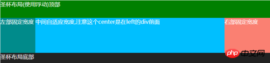 CSS:
CSS:
.box3 {
  background: #EEEEEE;
  color: white;
  margin-top: 20px;
}
.box3 .header {
  width: 100%;
  background: #008000;
  height: 50px;
}
.box3 .container {
  clear: both;
  overflow: hidden;
  padding: 0 130px 0 100px;
}
.box3 .container .left {
  width: 100px;
  float: left;
  background: #008B8B;
  height: 100px;
  margin-left: -100%;
  position: relative;
  left: -100px;
}
.box3 .container .center {
  background: #00BFFF;
  height: 100px;
  float: left;
  width: 100%;
}
.box3 .container .right {
  width: 130px;
  float: left;
  background: #FA8072;
  height: 100px;
  margin-left: -130px;
  position: relative;
  right: -130px;
}
.box3 .footer {
  width: 100%;
  background: #222222;
  height: 30px;
}## HTML:
<p class="box4">
    <p class="header">圣杯布局2(使用定位)顶部</p>
    <p class="container">
        <p class="left">
            左部固定宽度
        </p>
        <p class="center">
            中间自适应宽度,无需考虑顺序
        </p>
        <p class="right">
            右部固定宽度
        </p>
    </p>
    <p class="footer">圣杯布局2底部</p>
</p>CSS: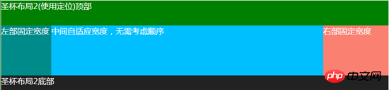
.box4 {
  background: #EEEEEE;
  color: white;
  margin-top: 20px;
}
.box4 .header {
  width: 100%;
  background: #008000;
  height: 50px;
}
.box4 .container {
  clear: both;
  overflow: hidden;
  padding: 0 130px 0 100px;
  position: relative;
}
.box4 .container .left {
  width: 100px;
  background: #008B8B;
  height: 100px;
  position: absolute;
  top: 0px;
  left: 0px;
}
.box4 .container .center {
  background: #00BFFF;
  height: 100px;
  width: 100%;
}
.box4 .container .right {
  width: 130px;
  background: #FA8072;
  height: 100px;
  position: absolute;
  top: 0px;
  right: 0px;
}
.box4 .footer {
  width: 100%;
  background: #222222;
  height: 30px;
}
Copy after login
The idea of this method is: The same effect can be achieved by positioning the left and right sides absolutely, and then setting padding on the p in the middle. Don’t worry about the layout order of the three p’s in the middle, I always use this method.
Also compatible with ie7, ie6 has not been tested
5. Double flying wing layout
##HTML:<p class="box5">
<p class="header">双飞翼布局顶部</p>
<p class="container">
<p class="center">
<p class="center-in">
中间自适应宽度,注意这个center是在left的p前面
</p>
</p>
<p class="left">
左部固定宽度
</p>
<p class="right">
右部固定宽度
</p>
</p>
<p class="footer">双飞翼布局底部</p>
</p>Copy after login
CSS: The double-flying wing layout and the holy grail layout look similar, but the biggest difference is: in the double-flying wing layout, there is a p inside the middle p in the center. The purpose of layout is mainly achieved through the margin value of this p. Then there is no need to set relative positioning for the two p's left and right. Everything else is basically the same Compatible with ie7, ie6 has not been tested. There are also many multi-row and multi-column layout methods, such as CSS3's flex, inline-block, etc. . As long as you have ideas, no matter how difficult the layout is, you can achieve it. The above is the entire content of this article. I hope it will be helpful to everyone's study. For more related content, please pay attention to the PHP Chinese website! Related recommendations: About how to use matrices in css3 How to use CSS to rotate the icon by moving the mouse up Effect The above is the detailed content of How to implement multi-row and multi-column layout using CSS. For more information, please follow other related articles on the PHP Chinese website!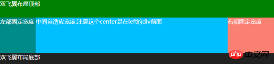
.box5 {
  background: #EEEEEE;
  color: white;
  margin-top: 20px;
}
.box5 .header {
  width: 100%;
  background: #008000;
  height: 50px;
}
.box5 .container {
  clear: both;
  overflow: hidden;
}
.box5 .container .left {
  width: 100px;
  float: left;
  background: #008B8B;
  height: 100px;
  margin-left: -100%;
}
.box5 .container .center {
  background: #00BFFF;
  height: 100px;
  float: left;
  width: 100%;
}
.box5 .container .center .center-in {
  margin: 0 130px 0 100px;
}
.box5 .container .right {
  width: 130px;
  float: left;
  background: #FA8072;
  height: 100px;
  margin-left: -130px;
}
.box5 .footer {
  width: 100%;
  background: #222222;
  height: 30px;
}
Copy after login


![[Web front-end] Node.js quick start](https://img.php.cn/upload/course/000/000/067/662b5d34ba7c0227.png)


