The table-cell attribute is very effective in dealing with the arrangement of equal-height elements within a row. Let’s take a look at the tutorial on how to use the table-cell attribute in CSS. Friends who need it can refer to it.
Let’s start with Let's study the table. Why was the table layout used in those years so brilliant? What are her characteristics? Abandoning table compatibility, SEO, loading and other content that has nothing to do with this article, let's just look at the attributes, then there are two characteristics:
1. Peers are of equal height.
2. Automatic width adjustment.
So does table-cell have this characteristic? The answer is yes, why? There is an interesting rule in CSS "Create anonymous table elements". Take table-cell as an example, that is, when an element is set to display:table-cell, if its parent node is not display:table-row, and the grandpa node is not display:table, then the following is the time to witness the miracle. , this son gave birth to his father and grandfather (the browser will automatically create two anonymous box objects). Although you can't find your father and grandfather, this did happen. This is really incredible. How incredible is it? , the lack of applause is the most incredible. ^_^
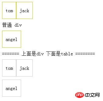
Then let’s look at a few situations to help us understand this incredible thing. I first wrote the code as follows:
<style type="text/css">
    p{padding:10px 0;}
    .classtd,
    td{height:34px; padding:10px; margin:10px; border:1px solid #ccc; vertical-align:middle;}
    .classtd{display:table-cell; border-color:#cc0;}
</style>
<p class="classtd">tom</p>
<p class="classtd">jack</p>
<p>普通 p</p>
<p class="classtd">angel</p>
<p>======= 上面是p 下面是table ========</p>
<table cellpadding="0" cellspacing="0">
    <tr>
        <td class="dtc">tom</td>
        <td class="dtc">jack</td>
    </tr>
</table>
<table style="margin-top:10px;" cellpadding="0" cellspacing="0">
    <tr>
        <td>angel</td>
    </tr>
</table>Then, I predicted that the browser would display as follows:

Okay, I admit that I saw the effect first, and then We can draw a conclusion: Tom and Jack had an affair and gave birth to father and grandfather (the browser will create a table to wrap the adjacent display:table-cell element), and the performance is the same as the first table. Angel gave birth to his father and grandfather, and their performance was the same as in the second table.
Since this is the case, if you want to understand table-cell, you need to understand the td of the table in disguise. That brings us back to the two features mentioned earlier: equal height and automatic width adjustment.
Since this is the case, then we can use this product to make a constant height layout:
<style type="text/css">
    .classtd{padding:10px; margin:10px; border:1px solid #ccc; vertical-align: top;}
    .classtd{display:table-cell; border-color:#cc0;}
</style>
<p class="classtd">
    <p>大人。<br />其实我觉得大家别问元芳,元芳不是神人,<br />也不会武功,也许还是个智障,<br />我就不信我在这里黑元芳<br />他会突然飞檐走壁来到我身后<br />把我的头按在键盘上yu7jhklhgjkfgt;/.";. yujh bnujm798u7jrtb5 tq1qwsewrt5
    </p>
</p>
<p class="classtd"><p>我和左边等高</p></p> Using the feature of automatic column width adjustment, we can make a fixed left and right adaptive layout:
<style type="text/css">
    .left{float:left; width:260px; padding:10px; margin-right:10px; border:1px solid #ccc;}
    .classtd{ display: table-cell; width:3000px; padding:10px; border:1px solid #ccc;}
</style>
<p class="left">我是左边栏目</p>
<p class="classtd">
    我是自适应的右边
</p>Combine this with vertical-align: middle to perform vertically centered layout of elements with unfixed sizes (and vertically centered multi-line text):
<style type="text/css">
    .classtd{ display: table-cell; padding:10px;margin:10px;border:1px solid #ccc;}
    .classtd p{ display: inline-block; vertical-align: middle;}
</style>
<p class="classtd">
    <p style="padding:40px 80px 10px 10px; background: #639146; color:#fff;">p+css</p>
    <p style="padding:60px 80px 10px 10px; background: #2B82EE; color:#fff;">javascript</p>
    <p style="padding:70px 80px 10px 10px; background: #F57900; color:#fff;">HTML5</p>
    <p style="padding:80px 80px 10px 10px; background: #BC1D49; color:#fff;">CSS3</p>
</p>
Using the feature of automatic column width adjustment, you can make a fixed left and right adaptive layout:
<style type="text/css">
    .left{float:left; width:260px; padding:10px; margin-right:10px; border:1px solid #ccc;}
    .classtd{ display: table-cell; width:3000px; padding:10px; border:1px solid #ccc;}
</style>
<p class="left">我是左边栏目</p>
<p class="classtd">
    我是自适应的右边
</p>
Some children may be confused by the width: 3000px in this layout. . Then the following is the principle of this layout:
display: The anonymous table generated by the table-cell element defaults to table-layout:auto. The width will automatically adjust based on the cell contents. So the purpose of setting width:3000px is to make it as wide as possible. In this way, an adaptive effect can be achieved.
The above is the entire content of this article. I hope it will be helpful to everyone's study. For more related content, please pay attention to the PHP Chinese website!
Related recommendations:
About the usage analysis of the Animation animation attribute in CSS3
Related code of CSS3 region module region
The above is the detailed content of About how to use the table-cell attribute in CSS. For more information, please follow other related articles on the PHP Chinese website!


