This time I will show you how to use the box-shadow shadow effect, and what are theprecautionswhen using the box-shadow shadow effect. The following is a practical case, let's take a look.
Everyone knows that box-shadow is a new attribute of h5, which is used to achieve the effect of shadow on the edge of the box. However, we often see various shadow styles in many scenes. It is not simply a shadow around the box. Effects, how are they achieved? Today I will share with you two ways to achieve shadows.
1. Curved edge shadow
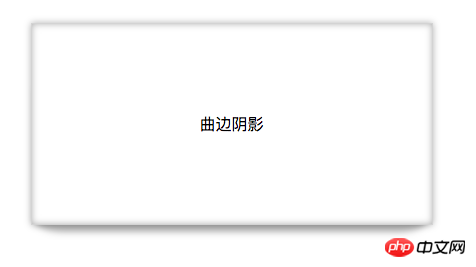
The effect picture is as follows: It is not only surrounded by shadows, but also has a layer of curved edge shadow at the bottom. The principle is actually very simple. First, the box itself has a shadow, and then another box with a shadow is used to overlap it to form the curved shadow in the rendering.

First let’s talk about the syntax of box-shadow. It supports the writing of multiple shadows, separated by commas, as follows

Create a box and use box-shadow to give the box an outer shadow and an inner shadow with a zero bloom radius of 10px in the x-axis and y-axis directions.
style{ .box1{ width: 400px; height: 200px; background: white; border: 1px solid lightgrey; margin: 100px auto; text-align: center; line-height: 200px; box-shadow: 0 0 10px rgba(0,0,0,0.3), 0 0 10px rgba(0,0,0,0.3) inset; } } body{ 曲边阴影
}
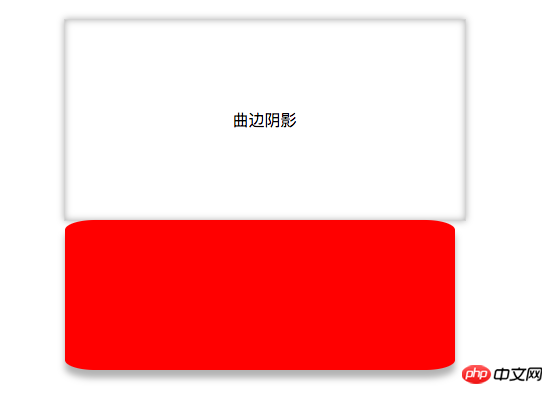
Use after pseudoClass selectorAdd a virtual label after the box1 subset. Since it is a virtual label, the browser cannot recognize it. You need to define the display attribute for this label. Also add a shadow. Since it is a curved surface, you need to set the border-radius to give it a curvature. Then use positioning to overlap the virtual label with the original box, and use z-index to change the level so that it is below p. The code is as follows
.box1::after{ display: block; //必须写 content: ""; //必须写 z-index: -1; width: 390px; height: 150px; background: red; position: absolute; bottom: 0; left: 4px; border-radius: 30px/10px; box-shadow: 0 8px 10px rgba(0,0,0,0.3); }
When there is no positioning, the two boxes are arranged as follows:

After positioning, the curved edge shadow is realized: the result picture is as follows:

2. Curved edge shadow
The principle is the same as the curved edge shadow, using the pseudo-class selector ::afteryu and ::before add two virtual labels and use the overlap of shadows to achieve edge-warping shadows.
The code is as follows:
.box2::after,.box2::before{ display: block; content: ""; z-index: -1; width: 170px; height: 240px; background: red; position: absolute; bottom: 20px; left: 38px; box-shadow: 30px 10px 40px rgba(0,0,0,0.5); transform: skewX(-15deg); } .box2::before{ box-shadow: -20px 10px 40px rgba(0,0,0,0.5); transform: skewX(15deg); }
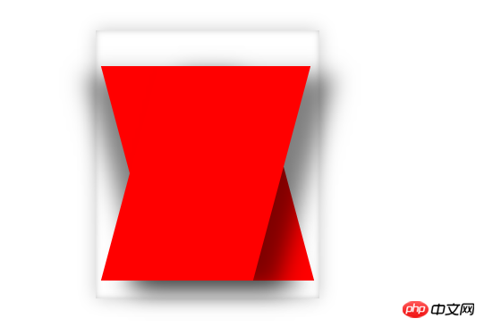
In order to make it easier for us to see, a red background is given. The result without changing the level is as follows:

Adjust the two boxes Level, the effect is as follows:

# I believe you have mastered the method after reading the case in this article. For more exciting information, please pay attention to other related articles on the PHP Chinese website!
Recommended reading:
Detailed explanation of the use of pointer-events in css3
Use of pseudo-elements::before and::after Detailed explanation
The above is the detailed content of How to use the shadow effect of box-shadow. For more information, please follow other related articles on the PHP Chinese website!


