

This time I will bring you a detailed explanation of the use of pseudo elements::before and ::after. What are theprecautions for using pseudo elements::before and ::after. The following is a practical case. Let’s take a look. take a look.
Preface
It is well known that the two pseudo-elements::before and ::after are actually the content in CSS3, but in fact in CSS2 There are already these two, but in CSS2 they are represented by a colon in front (:before and :after). Today I will mainly talk about how to use these two pseudo elements.1. You can add styles to ordinary elements just like ordinary elements.
For example, if I want to add an icon in front of the text, if I use ordinary When writing elements, I can write like this:/*CSS*/ .del{ font-size: 20px;} .del i{ display: inline-block; width: 20px; height: 25px; margin-right: 2px; vertical-align: middle; background: url("imgs/delete.png") no-repeat center; background-size: 100%;} .del span{ vertical-align: middle;}
/*HTML*/删除
/*CSS*/ .del{ font-size: 20px;} .del::before{ content: ""; display: inline-block; width: 20px; height: 25px; margin-right: 2px; vertical-align: middle; background: url("imgs/delete.png") no-repeat center; background-size: 100%;} .del span{ vertical-align: middle;}
/*HTML*/删除

clear floatproblem:
.clearfix::after{ display:block; clear:both; content:""; overflow:hidden; height: 0; }Of course, if your website still needs to be compatible with IE8, then use :after, ::after is not compatible.
2. Insert text into elements
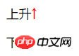
Sometimes I may need to add the same text to many elements at the same time, then you can consider using These two pseudo elements. For example:/*CSS*/ .up:after{ content: '↑'; color: #f00;} .down:after{ content: '↓'; color: #0f0;}
/*HTML*/上升
下降
##3. Insert the image into the elementTo achieve a picture plus text effect similar to the first example in this article, you can also use pseudo elements to directly insert pictures without using a background image, like this:
/*CSS*/ .del{ font-size: 20px;} .del::before{ content: url("imgs/delete.png"); display: inline-block; margin-right: 2px; vertical-align: middle; } .del span{ vertical-align: middle;}
But you need to be very careful, Images inserted in this way cannot change the size of the image by controlling the size of the pseudo-element. They can only introduce images of a fixed size (this is a bit confusing...), so I personally think it is best to compare the background image honestly and practically. good.
4. Insert consecutive project numbersMaybe you will say, isn’t it easy to add consecutive project numbers? Just use an ordered list directly!
Yes, it is indeed possible, just like this:
我的爱好:
- 吃饭
- 睡觉
- 打豆豆
This is the effect under Chrome:
 Looks pretty good , no problem, what if I want to bold the previous serial number? I'm confused...
Now you say, can't I just manually add labels and numbers before each text, and then add styles to the labels?
/*CSS*/ ul li{ list-style: none;} ul li span{ font-weight: bold;}
/*HTML*/我的爱好:
Yes, there are three items now. What if there are thirty items or three hundred items? Add them one by one? (Very silly and naive...)
If you use pure CSS at this time, you have to use pseudo elements:
/*CSS*/ ul li{ list-style: none; counter-increment: number;} //number相当于是个变量,随便取名就好,在伪元素中调用 ul li::before{ content: counter(number)"."; font-weight: bold;} //注意这里不同于JS,counter(number)与"."之间不需要加任何东西,直接连接就好
/*HTML*/我的爱好:
The effect is as follows:
 So if I don’t want Arabic numerals, can I just use Chinese numerals?
Can! Pseudo elements are nice and powerful!
ul li{ list-style: none; counter-increment: number;} ul li::before{ content: counter(number,cjk-ideographic)"、"; font-weight: bold;}
The effect is as follows:
##In addition to this cjk-ideographic, you can also use more CSS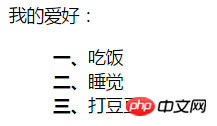 list-style-type
I believe you have mastered the method after reading the case in this article. For more exciting information, please pay attention to other related articles on the PHP Chinese website!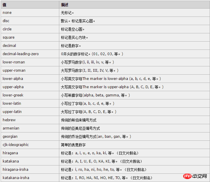
CSS3 makes a large striped background
CSS3 dynamic prompt effect when the mouse moves into the picture
How to use sticker-footer layout in css
The above is the detailed content of Detailed explanation of the use of pseudo-elements::before and ::after. For more information, please follow other related articles on the PHP Chinese website!


![[Web front-end] Node.js quick start](https://img.php.cn/upload/course/000/000/067/662b5d34ba7c0227.png)


