

This time I will bring you CSS to implement wave movement. What are the precautions to implement wave movement with CSS? The following is a practical case, let’s take a look.
We often see the wave effect on some pages. Although it only has a decorative effect, it makes the page look more vivid. At the same time, it can also play a role in some casesProgress bar, but the wave form is more beautiful and interesting than the ordinary progress bar.
If you want to achieve the effect of waves, the first method that the author thinks of is to draw the waves through canvas, and then use frame animation to make the waves move. The wave effect achieved in this way should be the best and can achieve many details, such as controlling the height of the wave crest, changing the number of waves, calculating the height of the next wave based on the height of the previous wave, etc.
But often the requirements are not that complicated. What the product manager and designer want is just a beautiful-looking wave effect. If you use canvas to do it, it is really overkill, time-consuming and labor-intensive. So in this case, you can try to use css to complete this small requirement.
Analysis of wave effect
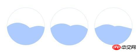
The above is one of the wave effects completed by the author (if you don’t know how to make gif, just use multiple Let’s put the picture together instead), it has two wave crests. When these two wave crests move, there will be an effect of pushing to the right. Let’s look at it one by one. If we want to achieve a wave peak, what should we do?
The wave crest has a curvature, and the border-raduis attribute that can achieve the curvature effect in CSS is the property; and for the effect of pushing to the right, if viewed individually, it can actually be understood as rotation Animation, we can achieve it through animation.
// html
<p class="wave"></p>
// style
.wave {
    width: 300px;
    height: 300px;
    border-raduis: 50%;
    background: blue;
}The display effect of .wave in the above code on the page is a circle. Although animation has not been added yet, we can already predict that even if it rotates, we will not be moving visually. How to solve this? It's actually very simple, just make the radian of each corner different. At the same time, making the width and height different can make the drawing effect better.
.wave {
    width: 250px;
    height: 300px;
    border-top-right-radius: 150px;
    border-top-left-radius: 150px;
    border-bottom-right-radius: 150px;
    border-bottom-left-radius: 140px;
    background: #adcbfe;
}Then make this irregular shape move through animation.
.wave {
    width: 250px;
    height: 300px;
    border-top-right-radius: 150px;
    border-top-left-radius: 150px;
    border-bottom-right-radius: 150px;
    border-bottom-left-radius: 140px;
    background: #adcbfe;
    animation: wave 4s linear infinite;
}
@keyframes wave {
    0% {transform: rotate(0deg);}
    100% {transform: rotate(360deg);}
}Regarding the use of CSS animation, you can refer to a previous article:
Pure CSS to realize the carousel effect
At this point, the implementation of a wave is completed . The implementation steps of the second wave are the same as the first one, but you can modify the properties of width height border-raduis animation to make the movement rhythm of the two waves different, fast, slow, high and low, so that the waves are The effect will be more realistic.
Friends who want to see the source code can click on the link below:
demo on github
I believe you have mastered the method after reading the case in this article. Please pay attention for more exciting things. Other related articles on php Chinese website!
Recommended reading:
How to use Redraw and Rearrange
Canvas to create the animation of rotating Tai Chi
The above is the detailed content of CSS implements wave movement. For more information, please follow other related articles on the PHP Chinese website!


![[Web front-end] Node.js quick start](https://img.php.cn/upload/course/000/000/067/662b5d34ba7c0227.png)


