This article will give you a detailed introduction on how to use svg to develop a circular progress bar vue2 component. I hope it will be helpful to everyone!

We can easily implement the ordinary rectangular progress bar through div css, but the circular one is a bit troublesome. Of course, he can also use div css through the background attribute or clip attribute. It can be implemented with css3 variables as a blind method, but it is too complicated and troublesome to be compatible and controlled. Therefore, to achieve the best effect, we should use svg to achieve it. [Related recommendations: "vue.js Tutorial"]
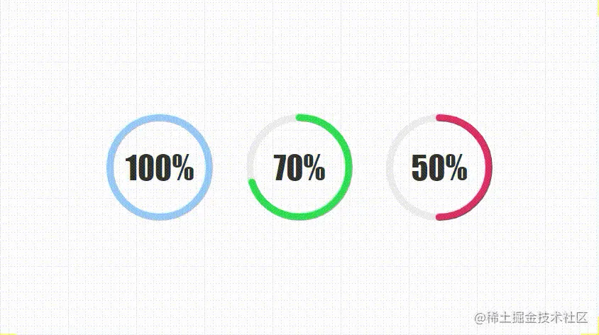
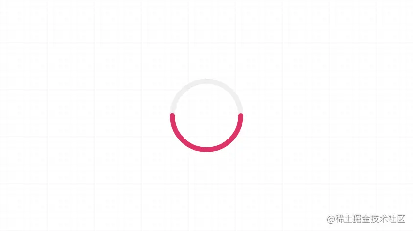
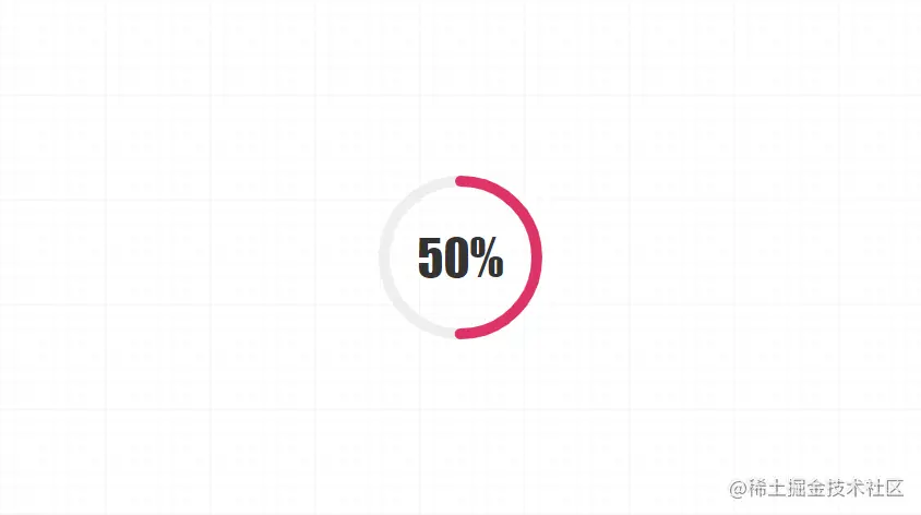
Let’s start with the final effect of Kangkang:

Develop yourself The advantage of components is that the size, color, thickness, animation, etc. can be expanded arbitrarily. Are you ready? It’s about to start~
I believe everyone will guess roughly how to develop it based on the above comments. Our component can set the size, border thickness, progress bar color, and how long it will take to render from 0. The animation duration of the progress value. As for the calculated attributes, when the SVG is drawn later, it is not difficult to see the purpose based on the one-to-one correspondence in the comments.
{{countDown}}%
In fact, this is very simple, just use svg to write two rings, the first one is the gray bottom circle, and the second one is ours Progress bar, set the size and center radius border color, and we need to change the fill color to the same name. We have finished writing the remaining two items stroke-dasharray and stroke-dashoffset. I believe everyone will guess it. The core of the svg progress bar change is These two attributes, which were calculated just now, are the circumference of the ring and the length of the current progress. We use the current progress value to calculate the percentage of the current length and realize the change of the circular progress bar. It is that simple.
Then we still have to write some CSS, and we must write it, because the svg ring does not start from 0 degrees as we think, but is offset by 90 degrees.

So we have to use css to rotate it 90 degrees!
.circle { transform: rotate(-90deg); }
Then we write some styles of text and main frame.
.circle-main-box { position: relative; display: block; margin: 0 auto; } .count-num { width: 100px; height: 100px; position: absolute; left: 50%; top: 50%; margin-left: -50px; margin-top: -50px; align-items: center; justify-content: center; display: flex; font-family: fantasy; font-size: 30px; color: #333; user-select: none; }

#In this way we get a static circular progress bar.