In the previous article "Practical Excel Tips Sharing: Automatic Grouping and Numbering of 16,000 Rows of Data", we learned about the method to quickly achieve automatic grouping and numbering of 16,000 rows of data in 3 seconds. Today we are going to talk about Excel charts, which can graph data and make the data interesting, easy to read and understand. Let’s see how to make excel bar charts more vivid and different. Come and learn!

The data source shown in the figure below is the enrollment completion status of office courses. (Note: The target data must be in the front and the completion data in the back.)
The traditional bar chart is displayed like this:

And we want it to be displayed like this:

The above picture uses the virtual and real comparison of character patterns to reflect the enrollment performance of each course, which is better than the ordinary bar Graphics are more vivid and interesting. How to achieve this?
The first step is to generate a bar chart.
Select the A3:C5 cell range, click the [Insert] tab, and select the first clustered bar chart of the two-dimensional bar chart in the bar chart to insert. (Note that I am currently using the Excel 2016 version. If you are using the 2010 version, etc., the operation is similar.)

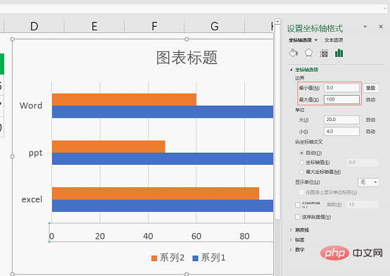
Select the horizontal axis, right-click the mouse and select [Set Coordinates] Axis Format] command.

Set the minimum value to 0 and the maximum value to 100.

Then select the horizontal axis and press the Delete key to delete it, and select the grid line and press the Delete key to delete it.
Select the vertical (category) axis, click the [Chart Tools-Format] tab, and set the shape outline to [No Outline]
The second step is to replace the bar chart with a character pattern.
Select the [Insert] tab, click the icon to bring up the "Insert Icon" dialog box, select a suitable head icon among the character icons and click the "Insert" button below . (The Excel 2010 version does not have the function of inserting icons. You can directly use the ellipse, rounded rectangle, etc. in the shape tool to draw a character image shape or search for character icons on the Internet and click to insert the picture)
Select the head icon, click the [Graphic Tools-Format] tab, and set the graphic fill to orange (can be set according to your own needs).
Select the head icon and press Ctrl C to copy, then select Series 2 and press Ctrl V to paste the icon.
Select the head icon again and set the graphic fill to light gray.
Then press Ctrl C to copy the head icon, select Series 1 and press Ctrl V to paste the icon. The effect after the paste is completed is as follows.
Select Series 2, right-click the mouse and select the [Format Data Series] command.
In the [Format Data Series] dialog box, select the first tab [Fill and Line], and check [Cascade] under Fill.
Then select Series 1 and also check [Cascade].
#The third step is to fine-tune the modification.
Select the third tab [Series Options], set the series overlap to 100%, and overlap the two series together. This is why the target data comes first and the completion data comes last, otherwise the series 2 completion data will be obscured by the series 1 target data.
Double-click the title directly to change the "Chart Title" to "Completion of Office Course Enrollment".
Then select the orange head icon, click on the symbol next to the chart, and check [Data Label]. You can see that the completed data value is displayed on the right side of the orange head icon.
Then select the legend series 2 and series 1 below the chart and press the Delete key to delete.
Finally, the perfect bar chart is completed.
Isn’t it easy to get unique charts? Generally speaking, choosing a suitable pattern to replace the shapes in the default chart is a convenient way to make your chart stand out. Turn on your computer and try it!
Related learning recommendations: excel tutorial
The above is the detailed content of Practical Excel skills sharing: How to make bar charts more vivid!. For more information, please follow other related articles on the PHP Chinese website!
 Compare the similarities and differences between two columns of data in excel
 excel duplicate item filter color
 How to copy an Excel table to make it the same size as the original
 Excel table slash divided into two
 Excel diagonal header is divided into two
 Absolute reference input method
 java export excel
 Excel input value is illegal