


 需求:一个p设置了background: url,现在需要使图片背景模糊,p内的文字清晰显示。
原始代码:
<!DOCTYPE html><html lang="en"><head>
    <meta charset="utf-8">
    <style type="text/css">
        .content {            color: #ffffff;            font-size: 40px;        }
        .bg {            background: url('1.jpg');            background-repeat: no-repeat;            background-position: center;            background-size: cover;            height:600px;            text-align: center;            line-height: 600px;        }
    </style></head><body><p class="bg">
    <p class="content">我是内容</p></p></body></html>
原始效果: 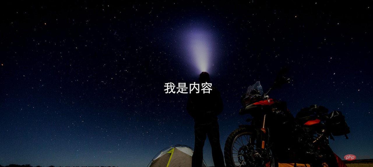
解决方法:内容和图片分别置于一个p,通过css设置背景p模糊度,设置内容p绝对位置。
html代码:
<!DOCTYPE html><html lang="en"><head>
    <meta charset="utf-8">
    <style type="text/css">
        .content {            color: #ffffff;            font-size: 40px;        }
        .bg {            background: url('1.jpg');            height:600px;            text-align: center;            line-height: 600px;        }
        .bg-blur {            float: left;            width: 100%;            background-repeat: no-repeat;            background-position: center;            background-size: cover;            -webkit-filter: blur(15px);            -moz-filter: blur(15px);            -o-filter: blur(15px);            -ms-filter: blur(15px);            filter: blur(15px);        }
        .content-front {          position:absolute;          left: 10px;          right: 10px;          height:600px;          line-height: 600px;          text-align: center;        }

    </style></head><body>
    <p>
        <p class="bg bg-blur"></p>
        <p class="content content-front">我是内容</p>
    </p></p></body></html>
效果: 
需求:一个p设置了background: url,现在需要使图片背景模糊,p内的文字清晰显示。
原始代码:
<!DOCTYPE html><html lang="en"><head>
    <meta charset="utf-8">
    <style type="text/css">
        .content {            color: #ffffff;            font-size: 40px;        }
        .bg {            background: url('1.jpg');            background-repeat: no-repeat;            background-position: center;            background-size: cover;            height:600px;            text-align: center;            line-height: 600px;        }
    </style></head><body><p class="bg">
    <p class="content">我是内容</p></p></body></html>
原始效果:
解决方法:内容和图片分别置于一个p,通过css设置背景p模糊度,设置内容p绝对位置。
html代码:
<!DOCTYPE html><html lang="en"><head>
    <meta charset="utf-8">
    <style type="text/css">
        .content {            color: #ffffff;            font-size: 40px;        }
        .bg {            background: url('1.jpg');            height:600px;            text-align: center;            line-height: 600px;        }
        .bg-blur {            float: left;            width: 100%;            background-repeat: no-repeat;            background-position: center;            background-size: cover;            -webkit-filter: blur(15px);            -moz-filter: blur(15px);            -o-filter: blur(15px);            -ms-filter: blur(15px);            filter: blur(15px);        }
        .content-front {          position:absolute;          left: 10px;          right: 10px;          height:600px;          line-height: 600px;          text-align: center;        }

    </style></head><body>
    <p>
        <p class="bg bg-blur"></p>
        <p class="content content-front">我是内容</p>
    </p></p></body></html>
效果:
感谢大家的阅读,希望大家受益良多。
本文转自:https://blog.csdn.net/oHeHeHou/article/details/51975539
推荐教程:《css教程》
以上就是css设置背景图片模糊,内容不模糊的详细内容,更多请关注php中文网其它相关文章!
声明:本文原创发布php中文网,转载请注明出处,感谢您的尊重!如有疑问,请联系admin@php.cn处理
- 上一篇:三分钟了解css中z-index属性
- 下一篇:添加CSS的三种方式


网友评论
文明上网理性发言,请遵守 新闻评论服务协议
我要评论