
Drawing multiple curves in an Excel chart can effectively present the relationship between multiple data sets. This article will introduce in detail how to draw multiple curves, including steps such as adding data, inserting charts, setting data series, and formatting charts. By following our detailed guide, you'll be able to easily create informative charts that help you gain insights and perform data analysis.
Open the Excel document that needs to be edited and click the insert option above.

After clicking, in Insert we click the icon of the scatter plot, and then select the scatter plot with smooth lines and data markers.

After selecting, you can also select the background of the icon at the top and click the option to select data.

After clicking, on the select data page, we click on the added option.

After clicking Add, in the edit data series interface, we select the series name and x-axis series value, and click OK after selection.

After confirmation, you can see that a vertical curve will be drawn in the chart.

Similarly, continue to add other data in the selection data and click OK.

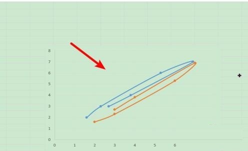
After the determination is completed, multiple data curves can be drawn in the chart for display.
The above is the detailed content of Detailed steps for drawing multiple curves in Excel charts. For more information, please follow other related articles on the PHP Chinese website!


