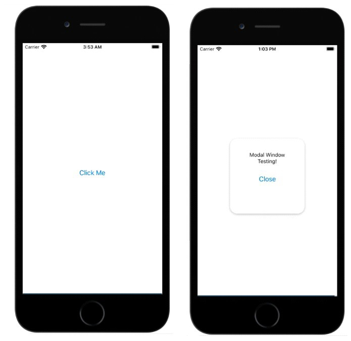
Modal components help to display content views above UI content.
The basic modal components are as follows-
<Modal animationType="slide" transparent={true} visible={modalVisible} onRequestClose={() => { Alert.alert("Modal has been closed."); }}> Your Content Here</Modal>To use the modal component, you need to import it first, as shown below-
import { Modal } from "react-native";The basic properties of the modal window are as follows-
| Sr.No | Props and instructions |
|---|---|
| 1 | < strong>animationType This property handles the displayed animation Modal window. It is an enumeration with three values − Slide, Fade and None. |
| 2 | onDismiss This property accepts a function that will be called When the modal window is closed. |
| 3 | onOrientationChange Callback function called when the device starts When a modal window changes orientation show. |
| 4 | onShow The function passed as the prop value is called When showing a modal window. |
| 5 | presentationStyle This property handles the display of the modal box window. Available values are full screen, pageSheet, formSheet and overFullScreen. |
| 6 | Transparent This prop will determine whether to provide a transparent view or fill The entire view of the modal window. |
| 7 | visibile< p>This property will determine whether your modal window is Visible or invisible. |
To use a modal component, you need to import it first as shown below -
import { Modal } from "react-native";To display a modal window, you can decide the animation to be displayed on it. Options are Slide, Fade, and None. In the following example, we want to display a simple modal window with text and buttons as shown below -
<Modal
      animationType="slide"
      transparent={true}
      visible={isVisible}
   >
   <View style={styles.centeredView}>
      <View style={styles.myModal}>
         <Text style={styles.modalText}>Modal Window Testing!</Text>
            <Button style={styles.modalButton} title="Close" onPress={() => {setModalVisiblility(false); }}/>
      </View>
   </View>
</Modal>isVisible variable is assigned to the visible property. Defaults to false, i.e. modal windows will not be shown by default. The isVisible property is initialized as follows -
const [isVisible, setModalVisiblility] = useState(false);
setModalVisiblility will update the isVisible variable from false to true and vice versa.
To show a modal window,
<View style={styles.centeredView}>
   <Modal
      animationType="slide"
      transparent={true}
      visible={isVisible}
   >
   <View style={styles.centeredView}>
      <View style={styles.myModal}>
         <Text style={styles.modalText}>Modal Window Testing!</Text>
            <Button style={styles.modalButton} title="Close" onPress={() =>{setModalVisiblility(false); }}/>
            </View>
         </View>
      </Modal>
      <Button title="Click Me" onPress={() => {
         setModalVisiblility(true);
      }}
   />
</View>This is the working code to show/hide the modal window.
import React, { useState } from "react";
import { Button, Alert, Modal, StyleSheet, Text, View } from "react-native";
const App = () => {
   const [isVisible, setModalVisiblility] = useState(false);
   return (
      <View style={styles.centeredView}>
         <Modal
            animationType="slide"
            transparent={true}
            visible={isVisible}
         >
         <View style={styles.centeredView}>
            <View style={styles.myModal}>
               <Text style={styles.modalText}>Modal Window Testing!</Text>
                  <Button style={styles.modalButton} title="Close" onPress={() =>{setModalVisiblility(false); }}/>
                  </View>
               </View>
            </Modal>
            <Button title="Click Me" onPress={() => {
               setModalVisiblility(true);
            }}
         />
      </View>
   );
};
const styles = StyleSheet.create({
   centeredView: {
      flex: 1,
      justifyContent: "center",
      alignItems: "center",
      marginTop: 22
   },
   myModal: {
      width:200,
      height:200,
      margin: 20,
      backgroundColor: "white",
      borderRadius: 20,
      padding: 35,
      alignItems: "center",
      shadowColor: "#000",
      shadowOffset: {
         width: 0,
         height: 2
      },
      shadowOpacity: 0.30,
      shadowRadius: 4,
      elevation: 5
   },
   modalText: {
      marginBottom: 20,
      textAlign: "center"
   },
   modalButton: {
      marginBottom: 50,
   }
});
export default App;
The above is the detailed content of Explaining how modal windows work in React Native. For more information, please follow other related articles on the PHP Chinese website!


