
#This article will show how to beautify numbers in a Pandas DataFrame and use some More advanced Pandas-style visualization options to improve your ability to analyze data using Pandas.
Common examples include:
This article will use a virtual data to explain it to everyone. The data is 2018 sales data for a fictional organization.
The data set link is as follows:
https://www.aliyundrive.com/s/Tu9zBN2x81c
import numpy as np
import pandas as pd

df = pd.read_excel('2018_Sales_Total.xlsx')
The effect is as follows: After reading these data, we can make a quick summary to see how much the customer purchased from us and What is their average purchase amount. For the sake of simplicity, I have intercepted the first 5 data here.
df.groupby('name')['ext price'].agg(['mean', 'sum'])
The result is as follows: 
when you When looking at this data, it's a little difficult to understand the scale of the numbers because you have 6 decimal points and some larger numbers. Additionally, it is unclear whether this is USD or another currency. We can solve this problem using DataFrame style.format.
(df.groupby('name')['ext price']
 .agg(['mean', 'sum'])
.style.format('${0:,.2f}'))The results are as follows: 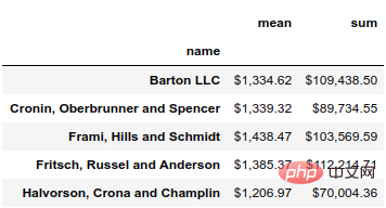 Using the format function, you can use all the functions of Python's string formatting tools on the data. In this case, we use ${0:,.2f} to put the leading dollar sign, add a comma and round the result to two decimal places.
For example, if we want to round to 0 decimal places, we can change the format to ${0:,.0f}.
(df.groupby('name')['ext price']
 .agg(['mean', 'sum'])
.style.format('${0:,.0f}'))The result is as follows: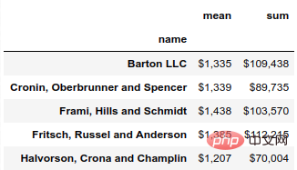
if we want To view total sales by month, we can use grouper to summarize by month and calculate each month's percentage of total annual sales.
monthly_sales = df.groupby([pd.Grouper(key='date', freq='M')])['ext price'].agg(['sum']).reset_index()
monthly_sales['pct_of_total'] = monthly_sales['sum'] / df['ext price'].sum()
The results are as follows: 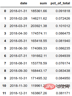 In order to display this percentage more clearly, we'd better convert it into a percentage.
format_dict = {'sum':'${0:,.0f}', 'date': '{:%m-%Y}', 'pct_of_total': '{:.2%}'}
monthly_sales.style.format(format_dict).hide_index()结果如下: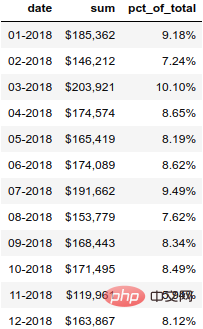
除了样式化数字,我们还可以设置 DataFrame 中的单元格样式。让我们用绿色突出显示最高的数字,用彩色突出显示最高、最低的数字。
(monthly_sales
 .style
 .format(format_dict)
 .hide_index()
 .highlight_max(color='lightgreen')
 .highlight_min(color='#cd4f39'))
结果如下: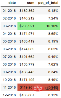
另一个有用的函数是 background_gradient,它可以突出显示列中的值范围。
(monthly_sales.style
 .format(format_dict)
 .background_gradient(subset=['sum'], cmap='BuGn'))
结果如下: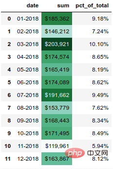
pandas样式功能还支持在列内绘制条形图。
(monthly_sales
 .style
 .format(format_dict)
 .hide_index()
 .bar(color='#FFA07A', vmin=100_000, subset=['sum'], align='zero')
 .bar(color='lightgreen', vmin=0, subset=['pct_of_total'], align='zero')
 .set_caption('2018 Sales Performance'))
结果如下: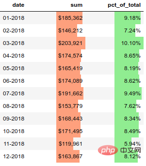
我认为这是一个很酷的功能。
import sparklines

def sparkline_str(x):
    bins=np.histogram(x)[0]
    sl = ''.join(sparklines(bins))
    return sl

sparkline_str.__name__ = "sparkline"
df.groupby('name')['quantity', 'ext price'].agg(['mean', sparkline_str])结果如下: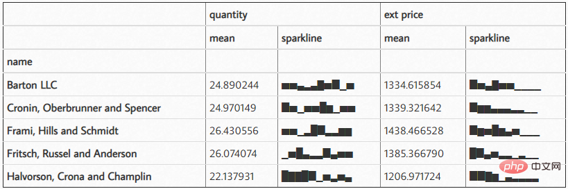
The above is the detailed content of 3000 words long article, Pandas beautifies your Excel table!. For more information, please follow other related articles on the PHP Chinese website!
 python development tools
 python packaged into executable file
 what python can do
 Compare the similarities and differences between two columns of data in excel
 excel duplicate item filter color
 How to use format in python
 How to copy an Excel table to make it the same size as the original
 Excel table slash divided into two


