


Data visualization is a very important part of data science or machine learning projects. Typically, you need to perform exploratory data analysis (EDA) early in a project to gain some understanding of the data, and creating visualizations can really make the task of analysis clearer and easier to understand, especially for large-scale, high-dimensional data. set. Nearing the end of a project, it's also important to present the end result in a clear, concise and compelling way that your audience (who are often non-technical clients) can understand.
A method of using color to represent the value of each element in a data matrix is called a Heat Map. Through matrix indexing, two items or features that need to be compared are associated and different colors are used to represent their different values. Heat maps are suitable for displaying relationships between multiple feature variables because the color can directly reflect the size of the matrix element at that position. You can compare each relationship to other relationships in the data set through other points in the heat map. Because of the intuitive nature of color, it provides us with a simple and easy-to-understand way of interpreting data.
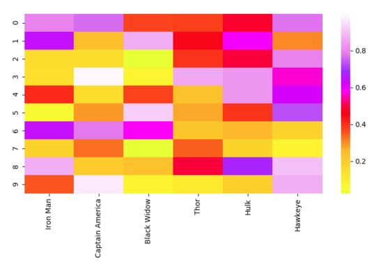
Now let’s take a look at the implementation code. Compared with "matplotlib", "seaborn" can be used to draw more advanced graphics, which usually requires more components, such as multiple colors, graphics or variables. "matplotlib" can be used to display graphics, "NumPy" can be used to generate data, and "pandas" can be used to process data! Drawing is just a simple function of "seaborn".
# Importing libs
import seaborn as sns
import pandas as pd
import numpy as np
import matplotlib.pyplot as plt

# Create a random dataset
data = pd.DataFrame(np.random.random((10,6)), columns=["Iron Man","Captain America","Black Widow","Thor","Hulk", "Hawkeye"])

print(data)

# Plot the heatmap
heatmap_plot = sns.heatmap(data, center=0, cmap='gist_ncar')

plt.show()
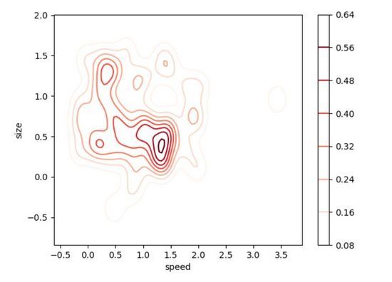
The two-dimensional density plot (2D Density Plot) is an intuitive extension of the one-dimensional version of the density plot. Compared with the one-dimensional version, its advantage is that it can see the relationship between the two probability distribution of a variable. The scale plot on the right uses color to represent the probability of each point in the 2D density plot below. The place where our data has the highest probability of occurrence (that is, where the data points are most concentrated) seems to be around size=0.5 and speed=1.4. As you know by now, 2D density plots are very useful for quickly finding the areas where our data is most concentrated with two variables, as opposed to just one variable like a 1D density plot. Observing the data with a two-dimensional density plot is useful when you have two variables that are important to the output and want to understand how they work together to contribute to the distribution of the output.
#Facts have once again proven that using "seaborn" to write code is very convenient! This time, we'll create a skewed distribution to make the data visualization more interesting. You can adjust most of the optional parameters to make the visualization look clearer.
# Importing libs
import seaborn as sns
import matplotlib.pyplot as plt
from scipy.stats import skewnorm

# Create the data
speed = skewnorm.rvs(4, size=50)
size = skewnorm.rvs(4, size=50)

# Create and shor the 2D Density plot
ax = sns.kdeplot(speed, size, cmap="Reds", shade=False, bw=.15, cbar=True)
ax.set(xlabel='speed', ylabel='size')
plt.show()
Spider plots are one of the best ways to display one-to-many relationships.. In other words, you can plot and view the values of multiple variables in relation to a specific variable or category. In a spider web diagram, the significance of one variable over another is clear and obvious because the area covered and the length from the center become larger in a particular direction. You can plot the different categories of objects described by these variables side by side to see the differences between them. In the chart below, it’s easy to compare the different attributes of the Avengers and see where they each excel! (Please note that these data are randomly set and I am not biased against the members of the Avengers.)
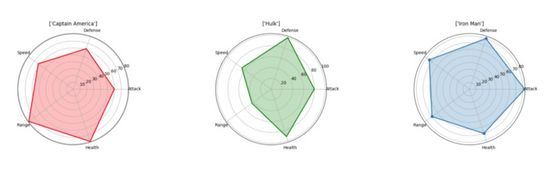
We can use "matplotlib" to generate visualization results, and No need to use "seaborn". We need to have each attribute equally spaced around the circumference. There will be labels on each corner and we will plot the values as a point whose distance from the center is proportional to its value/size. To show this more clearly, we will fill the area formed by the lines connecting the property points with a semi-transparent color.
# Import libs
import pandas as pd
import seaborn as sns
import numpy as np
import matplotlib.pyplot as plt

# Get the data
df=pd.read_csv("avengers_data.csv")
print(df)

"""
   #             Name  Attack  Defense  Speed  Range  Health
0  1         Iron Man      83       80     75     70      70
1  2  Captain America      60       62     63     80      80
2  3             Thor      80       82     83    100     100
3  3             Hulk      80      100     67     44      92
4  4      Black Widow      52       43     60     50      65
5  5          Hawkeye      58       64     58     80      65

"""

# Get the data for Iron Man
labels=np.array(["Attack","Defense","Speed","Range","Health"])
stats=df.loc[0,labels].values

# Make some calculations for the plot
angles=np.linspace(0, 2*np.pi, len(labels), endpoint=False)
stats=np.concatenate((stats,[stats[0]]))
angles=np.concatenate((angles,[angles[0]]))

# Plot stuff
fig = plt.figure()
ax = fig.add_subplot(111, polar=True)
ax.plot(angles, stats, 'o-', linewidth=2)
ax.fill(angles, stats, alpha=0.25)
ax.set_thetagrids(angles * 180/np.pi, labels)
ax.set_title([df.loc[0,"Name"]])
ax.grid(True)

plt.show()We have learned to use treemaps since elementary school. Because tree diagrams are naturally intuitive, they are easy to understand. Nodes that are directly connected are closely related, while nodes with multiple connections are less similar. In the visualization below, I plotted a tree diagram of a small subset of the Pokemon game's dataset based on Kaggle's statistics (health, attack, defense, special attack, special defense, speed).
因此,统计意义上最匹配的口袋妖怪将被紧密地连接在一起。例如,在图的顶部,阿柏怪 和尖嘴鸟是直接连接的,如果我们查看数据,阿柏怪的总分为 438,尖嘴鸟则为 442,二者非常接近!但是如果我们看看拉达,我们可以看到其总得分为 413,这和阿柏怪、尖嘴鸟就具有较大差别了,所以它们在树状图中是被分开的!当我们沿着树往上移动时,绿色组的口袋妖怪彼此之间比它们和红色组中的任何口袋妖怪都更相似,即使这里并没有直接的绿色的连接。
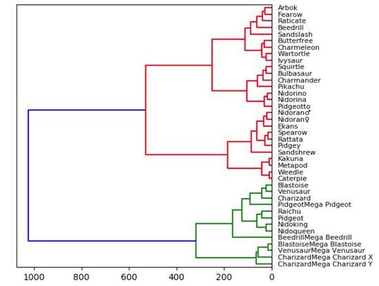
实际上,我们需要使用「Scipy」来绘制树状图。一旦读取了数据集中的数据,我们就会删除字符串列。这么做只是为了使可视化结果更加直观、便于理解,但在实践中,将这些字符串转换为分类变量会得到更好的结果和对比效果。我们还创建了数据帧的索引,以方便在每个节点上正确引用它的列。告诉大家的最后一件事是:在“Scipy”中,计算和绘制树状图只需一行简单代码。
# Import libs
import pandas as pd
from matplotlib import pyplot as plt
from scipy.cluster import hierarchy
import numpy as np

# Read in the dataset
# Drop any fields that are strings
# Only get the first 40 because this dataset is big
df = pd.read_csv('Pokemon.csv')
df = df.set_index('Name')
del df.index.name
df = df.drop(["Type 1", "Type 2", "Legendary"], axis=1)
df = df.head(n=40)

# Calculate the distance between each sample
Z = hierarchy.linkage(df, 'ward')

# Orientation our tree
hierarchy.dendrogram(Z, orientation="left", labels=df.index)

plt.show()
The above is the detailed content of What are the fast and easy-to-use Python data visualization methods?. For more information, please follow other related articles on the PHP Chinese website!


![[Web front-end] Node.js quick start](https://img.php.cn/upload/course/000/000/067/662b5d34ba7c0227.png)


