
When we first make reports, we usually start with Excel and use Excel to make reports, so we first understand the basic composition of Excel.
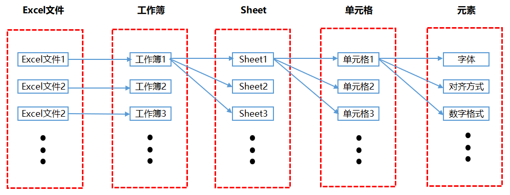
The picture below shows the relationship between the various parts of Excel. We process many Excel files every day at work. An Excel file is actually a workbook. Every time you create a new Excel file, the file name defaults to workbook x, where x represents the number of new files. A workbook can contain multiple Sheets, and each Sheet is an independent table. Each Sheet is composed of several cells. Each cell has several elements or attributes. The most settings we usually make for Excel files are actually settings for the elements of the cell.
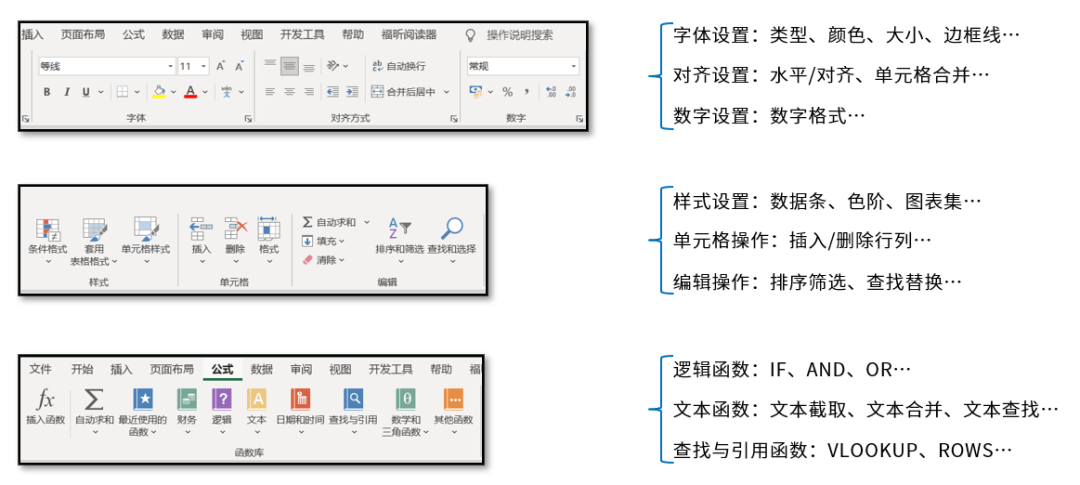
The content mainly set for cell elements includes the content displayed in the menu bar, such as fonts, alignment, conditional formatting, etc. This book is also written according to each module in the Excel menu bar.
The following figure is the process I have compiled to make an automated report, which is mainly divided into 5 steps:
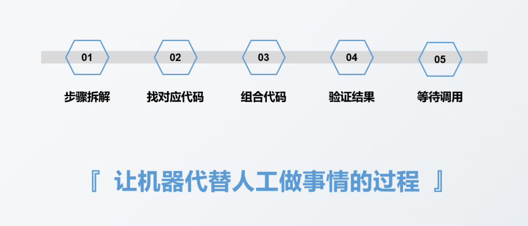
The first step is to dismantle the report to be done step by step. This step of disassembly has no direct relationship with whether or not to use tools or what tools to use, such as making reports. The first step is generally to collect data. This data may be recorded by offline personnel on paper notebooks, or it may be stored in an Excel table, or it may be stored in a database. Depending on the type or storage method of the data source, the corresponding data collection method will be different, but the data collection step itself will not change. The purpose of this step is to collect the data.
The second step is to think about the code implementation corresponding to each specific step involved in the first step. Generally, it is to find the code corresponding to each step, such as what the code for importing data looks like. Another example is what the code for duplicate value deletion looks like.
The third step is to combine the codes corresponding to each step in the second step into a complete code.
The fourth step is to verify the report results obtained from the complete code in the third step to see if the results are correct.
The fifth step is to wait for the call to see when the report needs to be made, and then execute the written code once.
In fact, report automation is essentially the process of letting machines do things instead of humans. We only need to convert every step we need to do manually into a language that the machine can understand, that is, code , and then let the machine execute it automatically. This is actually the realization of automation.
This section will demonstrate how to combine Pandas and openpyxl to automatically generate reports in actual work.
Suppose we now have the following data set:
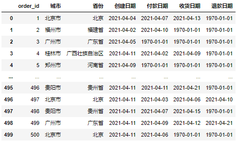
Now we need to make a daily report based on this data set, which will mainly include three Aspects:
The same-month comparison of various indicators on the day;
The number of orders created in each province on the day;
The trend of order volume created in the recent period
Next, we will implement these three parts separately.
We first use Pandas to calculate and process the data to obtain the same-month comparison of each indicator. The specific implementation code is as follows:
#导入文件
import pandas as pd
df = pd.read_excel(r'D:\Data-Science\share\excel-python报表自动化\sale_data.xlsx')

#构造同时获取不同指标的函数
def get_data(date):
    create_cnt = df[df['创建日期'] == date]['order_id'].count()
    pay_cnt = df[df['付款日期'] == date]['order_id'].count()
    receive_cnt = df[df['收货日期'] == date]['order_id'].count()
    return_cnt = df[df['退款日期'] == date]['order_id'].count()
    return create_cnt,pay_cnt,receive_cnt,return_cnt

#假设当日是2021-04-11
#获取不同时间段的各指标值
df_view = pd.DataFrame([get_data('2021-04-11')
                     ,get_data('2021-04-10')
                     ,get_data('2021-04-04')]
                     ,columns = ['创建订单量','付款订单量','收货订单量','退款订单量']
                     ,index = ['当日','昨日','上周同期']).T

df_view['环比'] = df_view['当日'] / df_view['昨日'] - 1
df_view['同比'] = df_view['当日'] / df_view['上周同期'] - 1
df_viewRunning the above code will get the following results:
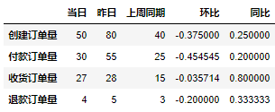
The above only gets the absolute values of each indicator on the same month-on-month basis, but our general daily reports need to make some format adjustments before they are sent out. , such as adjusting fonts and so on. The format adjustment requires the use of the openpyxl library. We need to convert the DataFrame format data in the Pandas library into a data format suitable for the openpyxl library. The specific implementation code is as follows:
from openpyxl import Workbook
from openpyxl.utils.dataframe import dataframe_to_rows

#创建空工作簿
wb = Workbook()
ws = wb.active

#将DataFrame格式数据转化为openpyxl格式
for r in dataframe_to_rows(df_view,index = True,header = True):
    ws.append(r)

wb.save(r'D:\Data-Science\share\excel-python报表自动化\核心指标_原始.xlsx')Running the above code will get the following results, you can Seeing that the original data file looks very confusing:
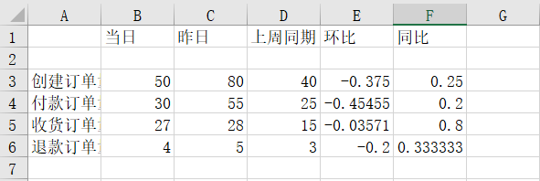
Next, we adjust the format of the original data file above. The specific adjustment code is as follows:
from openpyxl import Workbook
from openpyxl.utils.dataframe import dataframe_to_rows
from openpyxl.styles import colors
from openpyxl.styles import Font
from openpyxl.styles import PatternFill
from openpyxl.styles import Border, Side
from openpyxl.styles import Alignment

wb = Workbook()
ws = wb.active

for r in dataframe_to_rows(df_view,index = True,header = True):
    ws.append(r)

#第二行是空的,删除第二行
ws.delete_rows(2)

#给A1单元格进行赋值
ws['A1'] = '指标'

#插入一行作为标题行
ws.insert_rows(1)
ws['A1'] = '电商业务方向 2021/4/11 日报'

#将标题行的单元格进行合并
ws.merge_cells('A1:F1') #合并单元格

#对第1行至第6行的单元格进行格式设置
for row in ws[1:6]:
    for c in row:
        #字体设置
        c.font = Font(name = '微软雅黑',size = 12)
        #对齐方式设置
        c.alignment = Alignment(horizontal = "center")
        #边框线设置
        c.border = Border(left = Side(border_style = "thin",color = "FF000000"),
                   right = Side(border_style = "thin",color = "FF000000"),
                   top = Side(border_style = "thin",color = "FF000000"),
                   bottom = Side(border_style = "thin",color = "FF000000"))

#对标题行和表头行进行特殊设置
for row in ws[1:2]:
    for c in row:
        c.font = Font(name = '微软雅黑',size = 12,bold = True,color = "FFFFFFFF")
        c.fill = PatternFill(fill_type = 'solid',start_color='FFFF6100')

#将环比和同比设置成百分比格式
for col in ws["E":"F"]:
    for r in col:
        r.number_format = '0.00%'

#调整列宽
ws.column_dimensions['A'].width = 13
ws.column_dimensions['E'].width = 10

#保存调整后的文件
wb.save(r'D:\Data-Science\share\excel-python报表自动化\核心指标.xlsx')Run the above code and you will get the following results:
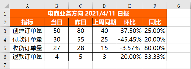
You can see that all items have been set successfully.
df_province = pd.DataFrame(df[df['创建日期'] == '2021-04-11'].groupby('省份')['order_id'].count())
df_province = df_province.reset_index()
df_province = df_province.sort_values(by = 'order_id',ascending = False)
df_province = df_province.rename(columns = {'order_id':'创建订单量'})
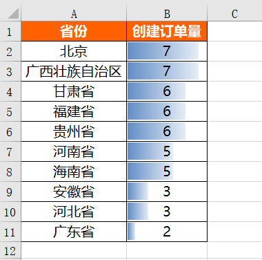
df_provinceWe also first use the Pandas library to process the number of orders created in each province on the day. The specific implementation code is as follows:
运行上面代码会得到如下结果:
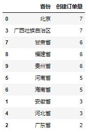
在得到各省份当日创建订单量的绝对数值之后,同样对其进行格式设置,具体设置代码如下:
from openpyxl import Workbook
from openpyxl.utils.dataframe import dataframe_to_rows
from openpyxl.styles import colors
from openpyxl.styles import Font
from openpyxl.styles import PatternFill
from openpyxl.styles import Border, Side
from openpyxl.styles import Alignment
from openpyxl.formatting.rule import DataBarRule

wb = Workbook()
ws = wb.active

for r in dataframe_to_rows(df_province,index = False,header = True):
    ws.append(r)

#对第1行至第11行的单元格进行设置
for row in ws[1:11]:
    for c in row:
        #字体设置
        c.font = Font(name = '微软雅黑',size = 12)
        #对齐方式设置
        c.alignment = Alignment(horizontal = "center")
        #边框线设置
        c.border = Border(left = Side(border_style = "thin",color = "FF000000"),
                   right = Side(border_style = "thin",color = "FF000000"),
                   top = Side(border_style = "thin",color = "FF000000"),
                   bottom = Side(border_style = "thin",color = "FF000000"))

#设置进度条条件格式
rule = DataBarRule(start_type = 'min',end_type = 'max',
                    color="FF638EC6", showValue=True, minLength=None, maxLength=None)
ws.conditional_formatting.add('B1:B11',rule)

#对第1行标题行进行设置
for c in ws[1]:
    c.font = Font(name = '微软雅黑',size = 12,bold = True,color = "FFFFFFFF")
    c.fill = PatternFill(fill_type = 'solid',start_color='FFFF6100')

#调整列宽
ws.column_dimensions['A'].width = 17
ws.column_dimensions['B'].width = 13

#保存调整后的文件
wb.save(r'D:\Data-Science\share\excel-python报表自动化\各省份销量情况.xlsx')运行上面代码会得到如下结果:
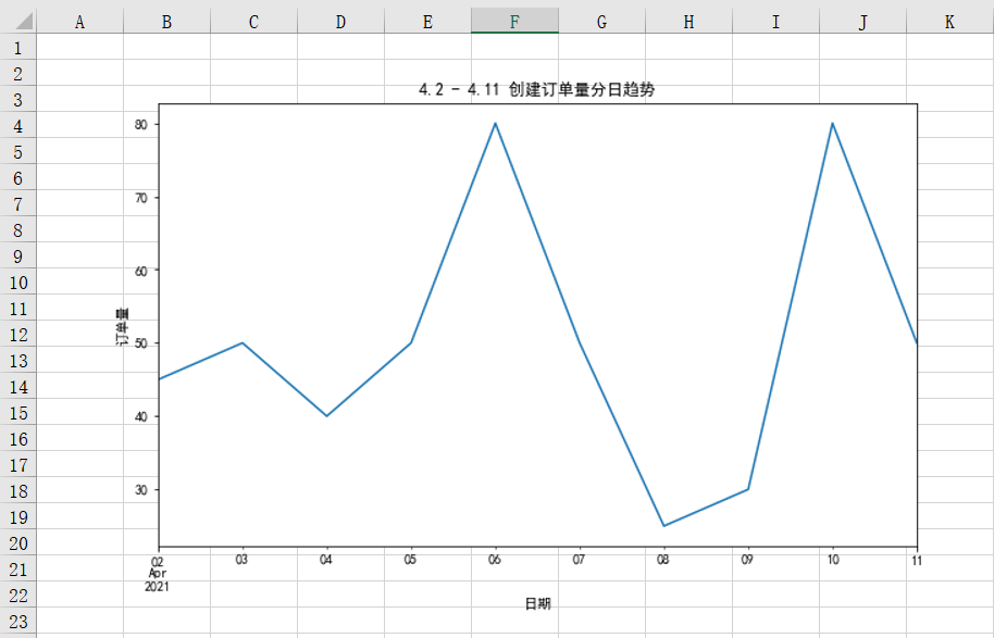
一般用折线图的形式反映某个指标的趋势情况,我们前面也讲过,在实际工作中我们一般用matplotlib或者其他可视化的库进行图表绘制,并将其进行保存,然后再利用openpyxl库将图表插入到Excel中。
先利用matplotlib库进行绘图,具体实现代码如下:
%matplotlib inline
import matplotlib.pyplot as plt
plt.rcParams["font.sans-serif"]='SimHei'#解决中文乱码

#设置图表大小
plt.figure(figsize = (10,6))
df.groupby('创建日期')['order_id'].count().plot()
plt.title('4.2 - 4.11 创建订单量分日趋势')
plt.xlabel('日期')
plt.ylabel('订单量')

#将图表保存到本地
plt.savefig(r'D:\Data-Science\share\excel-python报表自动化\4.2 - 4.11 创建订单量分日趋势.png')
将保存到本地的图表插入到Excel中,具体实现代码如下:
from openpyxl import Workbook
from openpyxl.drawing.image import Image

wb = Workbook()
ws = wb.active

img = Image(r'D:\Data-Science\share\excel-python报表自动化\4.2 - 4.11 创建订单量分日趋势.png')

ws.add_image(img, 'A1')

wb.save(r'D:\Data-Science\share\excel-python报表自动化\4.2 - 4.11 创建订单量分日趋势.xlsx')
运行上面代码会得到如下结果,可以看到图表已经被成功插入到Excel中:
我们将每个部分单独实现后,将其存储在不同的Excel文件中。当然了,有的时候放在不同文件中会比较麻烦,我们就需要把这些结果合并在同一个Excel的相同Sheet或者不同Sheet中。
将不同的结果合并到同一个Sheet中:
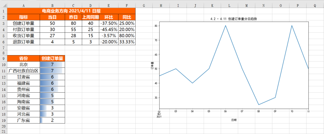
合并不同表结果到同一个Sheet中的挑战在于它们的结构不同,同时需要添加适当的间隔来区分不同的结果。
首先插入核心指标表df_review,插入方式与单独的插入是一样的,具体代码如下:
for r in dataframe_to_rows(df_view,index = True,header = True):
ws.append(r)接下来就该插入各省份情况表df_province,因为append默认是从第一行开始插入的,而我们前面几行已经有df_view表的数据了,所以就不能用appen的方式进行插入,而只能通过遍历每一个单元格的方式进行插入。
那我们怎么知道要遍历哪些单元格呢?核心需要知道遍历开始的行列和遍历结束的行列。
遍历开始的行 = df_view表占据的行 + 留白的行(一般表与表之间留2行) + 1
遍历结束的行 = 遍历开始的行 + df_province表占据的行
遍历开始的列 = 1
遍历结束的列 = df_province表占据的列
而又因为DataFrame中获取列名的方式和获取具体值的方式不太一样,所以我们需要分别插入,先插入列名,具体代码如下:
for j in range(df_province.shape[1]):
ws.cell(row = df_view.shape[0] + 5,column = 1 + j).value = df_province.columns[r]df_province.shape[1]是获取df_province表有多少列,df_view.shape[0]是获取df_view表有多少行。
前面说过,遍历开始的行是表占据的行加上留白的行再加1,一般留白的行是2,可是这里面为啥是df_view.shape[0] + 5呢?这是因为df_view.shape[0]是不包列名行的,同时在插入Excel中的时候会默认增加1行空行,所以就需要在留白行的基础上再增加2行,即2 + 2 + 1 = 5。
由于Excel中的列从1开始计数,而range()函数默认从0开始,因此需要给column加1。
上面的代码只是把df_province表的列名插入进来了,接下来插入具体的值,方式与插入列名的方式一致,只不过需要在列名的下一行开始插入,具体代码如下:
接下来就该插入图片了,插入图片的方式与前面单独的插入是一致的,具体代码如下:
#再把具体的值插入
for i in range(df_province.shape[0]):
    for j in range(df_province.shape[1]):
ws.cell(row = df_view.shape[0] + 6 + i,column = 1 + j).value = df_province.iloc[i,j]将所有的数据插入以后就该对这些数据进行格式设置了,因为不同表的结构不一样,所以我们没法直接批量针对所有的单元格进行格式设置,只能分范围分别进行设置,而不同范围的格式可能是一样的,所以我们先预设一些格式变量,这样后面用到的时候直接调取这些变量即可,减少代码冗余,具体代码如下:
#插入图片
img = Image(r'D:\Data-Science\share\excel-python报表自动化\4.2 - 4.11 创建订单量分日趋势.png')
ws.add_image(img, 'G1')
格式预设完之后就可以对各个范围分别进行格式设置了,具体代码如下:
#格式预设

#表头字体设置
title_Font_style = Font(name = '微软雅黑',size = 12,bold = True,color = "FFFFFFFF")
#普通内容字体设置
plain_Font_style = Font(name = '微软雅黑',size = 12)
Alignment_style = Alignment(horizontal = "center")
Border_style = Border(left = Side(border_style = "thin",color = "FF000000"),
                   right = Side(border_style = "thin",color = "FF000000"),
                   top = Side(border_style = "thin",color = "FF000000"),
                   bottom = Side(border_style = "thin",color = "FF000000"))
PatternFill_style = PatternFill(fill_type = 'solid',start_color='FFFF6100')最后将上面所有代码片段合并在一起,就是将不同的结果文件合并到同一个Sheet中的完整代码,具体结果如下,可以看到不同结果文件合并在了一起,并且各自的格式设置完好。
将不同的结果合并到同一工作簿的不同Sheet中:
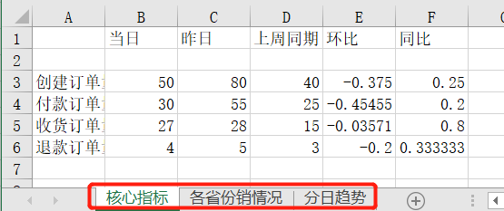
将不同的结果合并到同一工作簿的不同Sheet中比较好实现,只需要新建几个Sheet,然后针对不同的Sheet插入数据即可,具体实现代码如下:
from openpyxl import Workbook
from openpyxl.utils.dataframe import dataframe_to_rows

wb = Workbook()
ws = wb.active

ws1 = wb.create_sheet()
ws2 = wb.create_sheet()

#更改sheet的名称
ws.title = "核心指标"
ws1.title = "各省份销情况"
ws2.title = "分日趋势"

for r1 in dataframe_to_rows(df_view,index = True,header = True):
    ws.append(r1)

for r2 in dataframe_to_rows(df_province,index = False,header = True):
    ws1.append(r2)

img = Image(r'D:\Data-Science\share\excel-python报表自动化\4.2 - 4.11 创建订单量分日趋势.png')

ws2.add_image(img, 'A1')

wb.save(r'D:\Data-Science\share\excel-python报表自动化\多结果合并_多Sheet.xlsx')运行上面代码,会得到如下结果,可以看到创建了3个Sheet,且不同的内容保存到了不同Sheet中:
The code for our automated report is now complete. Every time we need to use this report in the future, we can execute the above code again and the result will be available immediately. Of course, you can also set up scheduled execution, and the results will be automatically sent to your mailbox when the time comes.
The above is the detailed content of How to use Python to automate reports. For more information, please follow other related articles on the PHP Chinese website!


