Line charts are a very common way of displaying data in our daily data visualization, and I think everyone is already familiar with it. Line charts are very simple and everyone can make them, but the line charts produced by different people vary widely. Most people's line charts are generated by directly inserting the default line chart style. Regardless of whether they have made such a line chart carefully, the boss is tired of looking at it just because of this style. Today, this article will teach you how to make a high-quality line chart. Let’s take a look!

Everyone who knows a little bit about statistics knows that when conducting descriptive statistical analysis of data, it is usually necessary to highlight the highest value, lowest value and mean value of a certain set of data. . Such as the highest, lowest and average income in different cities, or the highest, lowest and average scores in different subjects.

Usually, the effect of graphing may look like the picture above, but such graphs cannot express the data very intuitively, so today Xiaobai will explain to you a different one. The idea of making a chart, the effect is as shown in the picture below. Friends who want to learn can follow Xiaobai to draw pictures together.
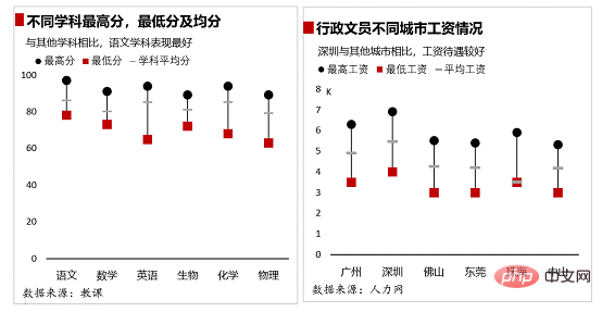
The ideas for making charts are as follows:
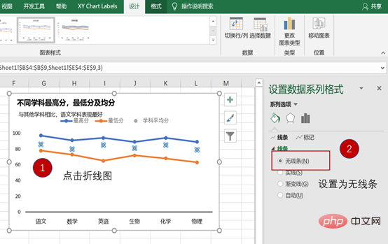
Prepare the drawing data, insert the "line chart with data markers", set the lines to None, and set the markers , then add high and low point connecting lines in the "Design" tab, and finally beautify the chart to complete the entire chart.

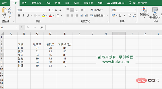
Step 01 Enter relevant data. Enter the plotting data we need in Excel, as shown in the figure below.
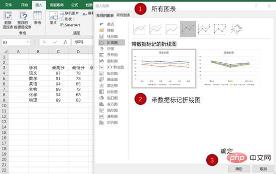
Step 02 Frame select the data, in the "Insert" tab - Insert chart - select "Line chart with data markers", and then click "OK" "Generate a chart, the operation is as shown in the figure below.

Step 03 Adjust the line chart
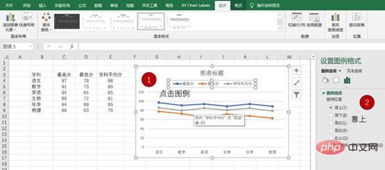
① Set the position of each element in the chart and delete unnecessary elements in the chart. Click the legend in the chart, set the legend format to display at the top, and delete the grid lines. The operation is as shown in the figure below.

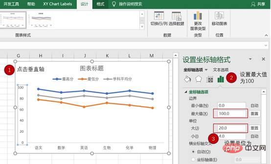
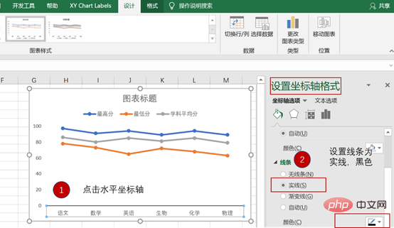
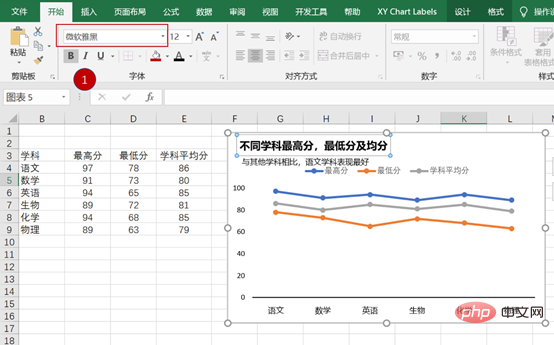
② Click on the vertical coordinate axis and set the maximum value of the vertical coordinate axis to 100 and the unit size to 20. Click on the horizontal axis, set the line to black, solid line, and set the font to Microsoft Yahei and the color to black. The operation is as shown in the figure below.
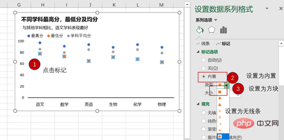
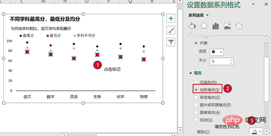
Step 04 Set up the line chart
① Click the chart, click the "Design" tab in the chart tool - "Add Chart Elements", drop down and select "Line" - add "High and Low Point Connecting Line", the operation is as shown in the figure below.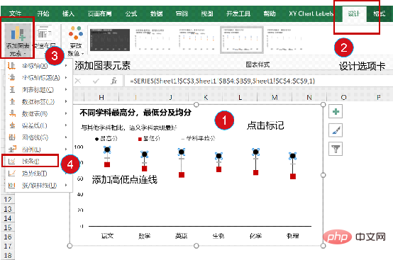
② Insert a text box at the bottom of the chart to indicate the data source to illustrate the reliability and accuracy of the data source. The operation is shown in the figure below.
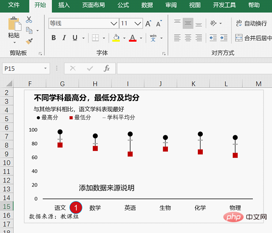
③ Insert a square-shaped red color block to attract readers’ attention. Then adjust the chart width. The specific effect is as shown in the figure below.
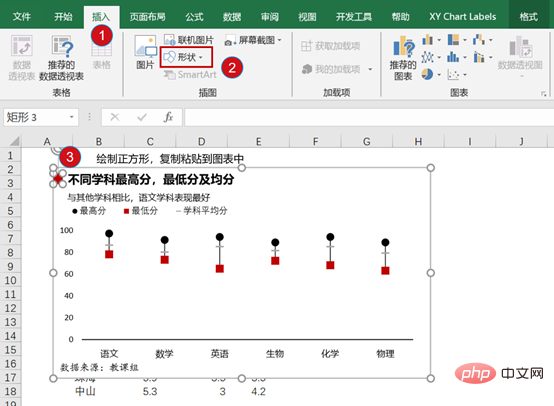
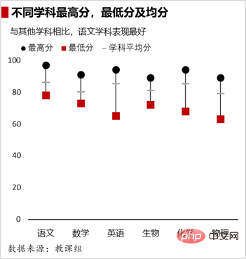
Step 05 Beautify the chart. At work, you can beautify charts according to the tones that you or your boss like. In this way, you can unknowingly cultivate your own aesthetic tones in the process of making charts.
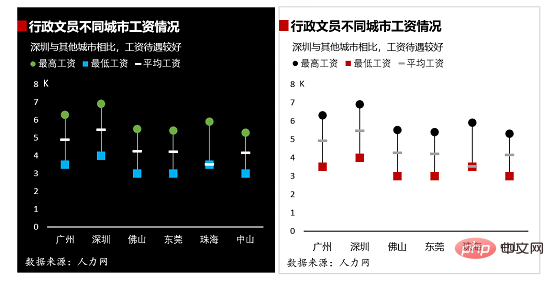
Okay, that’s it for today’s explanation. The best way to learn something is to try to do it again, so practice and consolidation after class is very important. . If you still have questions during the practice, you can watch the video below, so you don’t have to worry about not learning!
Related learning recommendations: excel tutorial
The above is the detailed content of Practical Excel skills sharing: 5 small steps to help you create a high-quality line chart. For more information, please follow other related articles on the PHP Chinese website!
 Compare the similarities and differences between two columns of data in excel
 excel duplicate item filter color
 How to copy an Excel table to make it the same size as the original
 Excel table slash divided into two
 Excel diagonal header is divided into two
 Absolute reference input method
 java export excel
 Excel input value is illegal


