Home > Topics > excel > Learning Excel charts through cases, let's talk about how to draw a graduated cylinder column chart

Learning Excel charts through cases, let's talk about how to draw a graduated cylinder column chart

青灯夜游
Release: 2022-07-29 10:18:05
forward
2875 people have browsed it

In the previous article "Excel chart learning: Creating a multi-series and multi-condition histogram with target values", we learned how to make a multi-series and multi-condition histogram. Today we will share another Excel chart tutorial and talk about a graduated cylinder-style chart case making tutorial, which can be said to express information clearly at a glance.

Learning Excel charts through cases, let's talk about how to draw a graduated cylinder column chart

What kind of chart can be called a good chart? I think at least people who look at the chart can understand the meaning of your chart at a glance without having to look at the original data. On this basis, we will do a good job in color matching and layout , and such a chart will be good!

The following table shows the sales completion status of an agent’s marketing and sales department. It includes the amount of sales completed and the amount of target planned sales. We need to make this information into a concise and easy-to-understand Excel chart for work reporting.
Learning Excel charts through cases, lets talk about how to draw a graduated cylinder column chart

Many students will think of dividing the completed sales data by the target sales to get the completion rate ratio, and finally express it through a line chart.

For example:

Calculate the completion rate in column F

Learning Excel charts through cases, lets talk about how to draw a graduated cylinder column chart

Then select the data in columns B and F to insert the line chart.

Learning Excel charts through cases, lets talk about how to draw a graduated cylinder column chart

In the above figure, you can only see the trend changes in the completion rate of each group. You cannot intuitively see how much the completed sales are, what the target sales are, and what the sales volume is. Not nearly finished yet.

If you want to express all the information, you must use the secondary coordinate axis, as shown below. If you make a secondary coordinate chart including a line chart and a column chart, the whole thing will be very messy, and almost no one can take a look at it. Understand what this chart is trying to express.

Learning Excel charts through cases, lets talk about how to draw a graduated cylinder column chart

In fact, we can change our thinking and use some techniques to make the entire chart more simple and beautiful, while accurately expressing the information that needs to be conveyed.

The final rendering is shown below. From the picture below, we can easily see the completion status of each group. We don’t even need to look at the original data. Which group has completed the most and what is left for each group? Information such as how much has not been completed can be clearly seen at a glance.

Learning Excel charts through cases, lets talk about how to draw a graduated cylinder column chart

Let me show you the detailed production steps.

1. Select the data in columns B, D, and E and click [Insert] to select [Histogram]

Learning Excel charts through cases, lets talk about how to draw a graduated cylinder column chart

2. After generating a simple histogram , right-click the yellow column bar and select [Format Data Series]

Learning Excel charts through cases, lets talk about how to draw a graduated cylinder column chart

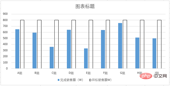
Open the [Format Data Series] dialog box and click [Line and Fill], Set the fill color to no fill and the border color to black.

Learning Excel charts through cases, lets talk about how to draw a graduated cylinder column chart

The effect is as follows:

Learning Excel charts through cases, lets talk about how to draw a graduated cylinder column chart

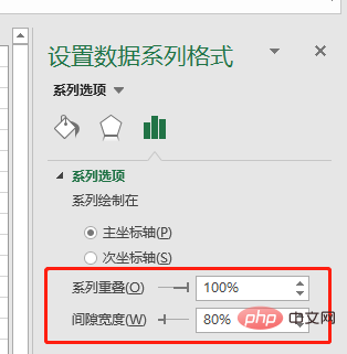
#3. Select the blue columnar bar, right-click and select [Set Data Series] Format], select the series option, set [Series Overlap] to 100%, and [Gap Width] to 80%.

Learning Excel charts through cases, lets talk about how to draw a graduated cylinder column chart

The effect is as follows:

Learning Excel charts through cases, lets talk about how to draw a graduated cylinder column chart

At this time, the chart has been scaled, but the round floating ball in the middle of the column bar It cannot be added directly. At this time, we need to change our thinking, add "Complete Sales" to the chart a second time, and set it as a line chart without lines, so as to achieve the effect we need.

4. Right-click the blank area of ​​the chart and select [Select Data] in the drop-down menu to open the [Select Data Source] dialog box.

Learning Excel charts through cases, lets talk about how to draw a graduated cylinder column chart

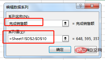
Click to add a chart series. In the pop-up dialog box, enter the series name "Completed Sales", and the series value is the data in column D.

1Learning Excel charts through cases, lets talk about how to draw a graduated cylinder column chart

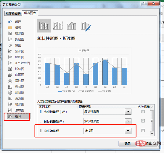
Right-click the newly added column bar, select [Change Chart Type], set the new series chart type to a line chart and click OK. (There is no "Combination" function in the old version of excel, just click "Line Chart")
1Learning Excel charts through cases, lets talk about how to draw a graduated cylinder column chart

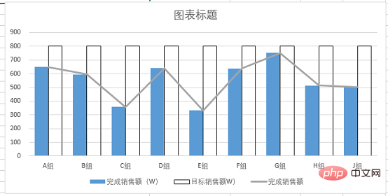
Note: If the following figure appears, the original two bar charts If the series overlap is not 100%, you need to manually right-click and reset.
1Learning Excel charts through cases, lets talk about how to draw a graduated cylinder column chart

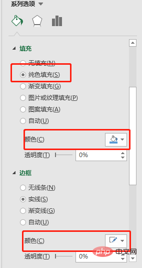
5. Select the line chart in the figure, right-click, select [Format Data Series], and set the line color through [Fill and Line]

It is colorless. Open the [Mark] option and set the data marker points to a built-in circle with a size of 25.

1Learning Excel charts through cases, lets talk about how to draw a graduated cylinder column chart

#Set the fill color of the marker points to blue, and the color is basically consistent with the histogram. The border color is set to white to create a hierarchical relationship with the histogram.
1Learning Excel charts through cases, lets talk about how to draw a graduated cylinder column chart

The effect is as follows:

1Learning Excel charts through cases, lets talk about how to draw a graduated cylinder column chart

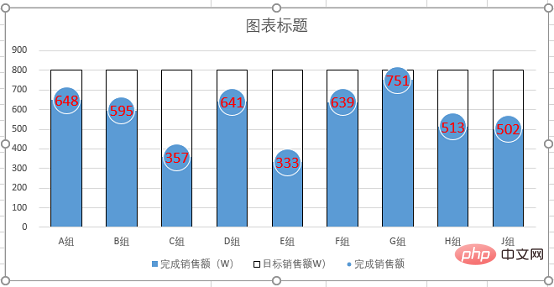
6. Right-click the circled part in the picture above and select [Add Data Label】. Then select the added data, right-click, select [Set Data Label Format], and select Center for the label position.

1Learning Excel charts through cases, lets talk about how to draw a graduated cylinder column chart

Set the font size to 14 and mark it red and bold.
Learning Excel charts through cases, lets talk about how to draw a graduated cylinder column chart

7. Right-click the abscissa axis, click [Set Coordinate Format], select the shadow in [Effect], and select the

appropriate preview mode .

Learning Excel charts through cases, lets talk about how to draw a graduated cylinder column chart

Select the Y-axis tick mark, auxiliary grid lines, and series legend in sequence, and press delete to delete. Then add the title content, and under the "Home" tab, set the title color to black and bold in the "Font Group", set the font size to 16, and add a border.

Learning Excel charts through cases, lets talk about how to draw a graduated cylinder column chart

Summary: In this example, we used the style of a chemical measuring cylinder to make a histogram, and at the same time set the line chart to a circular float, so that we can clearly see each Group completion status and overall ranking. Through the "Graduating Cylinder" chart, we can visually see the distance between each group and the target sales.

Key points for making this picture

1. After inserting two sets of data into a column chart and setting the series to 100% overlap, the two series will completely overlap. The above effect can be achieved by setting the color.

2. After inserting a line chart with data markers, hide the lines, retain the marker points, and set the marker points to circles. Cleverly convert the discount chart into a circular chart, and then match the entire histogram, like a marked floating ball on the horizontal surface!

In fact, we can also set the colors of column bars and floating balls to gradients. You can try it yourself and the charts will become more vivid!

Related learning recommendations: excel tutorial

The above is the detailed content of Learning Excel charts through cases, let's talk about how to draw a graduated cylinder column chart. For more information, please follow other related articles on the PHP Chinese website!

Related labels:
source:itblw.com
Statement of this Website
The content of this article is voluntarily contributed by netizens, and the copyright belongs to the original author. This site does not assume corresponding legal responsibility. If you find any content suspected of plagiarism or infringement, please contact admin@php.cn
Popular Tutorials
More>
Latest Downloads
More>
Web Effects
Website Source Code
Website Materials
Front End Template