css3 can realize triangles, and there are many ways to achieve it: 1. Use a container with zero height and width and a transparent border to draw triangles; 2. Use linear gradient linear-gradient to draw triangles; 3. Use conic-gradient Draw triangles; 4. Use clip-path to draw triangles, etc.

The operating environment of this tutorial: Windows 7 system, CSS3&&HTML5 version, Dell G3 computer.
There are many ways to implement triangles in css3.Let’s take a look:
1. Use border to draw triangles
Using border to realize triangles should be mastered by most people, and it can also be used in various aspects. What often appears in the classics is the use of containers with zero height and width and transparent borders.
html, body { width: 100%; height: 100%; display: flex; } div { width: 0px; height: 0px; margin: auto; } .top { border: 50px solid transparent; border-bottom: 50px solid deeppink; } .left { border: 50px solid transparent; border-right: 50px solid deeppink; } .bottom { border: 50px solid transparent; border-top: 50px solid deeppink; } .right { border: 50px solid transparent; border-bottom: 50px solid deeppink; }

2. Use linear-gradient to draw triangles
div { width: 100px; height: 100px; background: linear-gradient(45deg, deeppink, deeppink 50%, transparent 50%, transparent 100%); }
3 , use conic-gradient to draw triangles
or gradient, above we used linear gradient to implement triangles, interestingly, in the gradient family, angular gradientconic-gradientalso Can be used to implement triangles.
The method is that the center point of the angular gradient can be set, and the center point of the circle similar to the radial gradient can also be set.
We set the center point of the angular gradient at50% 0, which iscenter top, the middle of the top of the container, and then perform the angular gradient, gradient Within a certain angle range, they are all triangular shapes.
Suppose we have a200px x 100pxheight and width container, and set its angular gradient center point to50% 0:
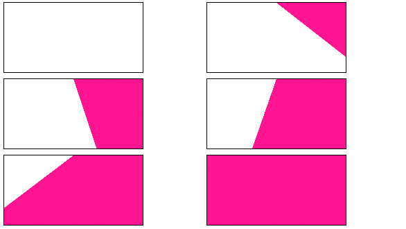
And set it to draw an angular gradient diagram starting from90°. The schematic diagram is as follows:

As you can see, in the initial When the angular gradient graphic reaches the second side, it is all a triangle. We select a suitable angle and we can easily get a triangle:
.normal { background: conic-gradient(from 90deg at 50% 0, deeppink 0, deeppink 45deg, transparent 45.1deg); } .acute { background: conic-gradient(from 90deg at 50% 0, transparent 0, transparent 45deg, deeppink 45.1deg, deeppink 135deg, transparent 1deg); }

##4. transform: rotate with overflow: hidden to draw triangles
This method is relatively conventional, usetransform: rotatewithoverflow: hidden. You can understand it at a glance and learn it as soon as you learn it. The simple animation diagram is as follows:
left bottomto rotate , withoverflow: hidden.
html, body { width: 100%; height: 100%; display: flex; } div { width: 141px; height: 100px; margin: auto; } .demo-opacity { overflow: hidden; } .demo, .demo-opacity { position: relative; border: 1px solid #000; background: unset; &::before { content: ""; position: absolute; top: 0; left: 0; right: 0; bottom: 0; animation: conicmove 3s infinite linear; background: deeppink; transform-origin: left bottom; z-index: -1; } } .triangle { position: relative; background: unset; overflow: hidden; &::before { content: ""; position: absolute; top: 0; left: 0; right: 0; bottom: 0; background: deeppink; transform-origin: left bottom; transform: rotate(45deg); z-index: -1; } } @keyframes conicmove { 100% { transform: rotate(45deg); } }
5. Use clip-path to draw triangles
##clip-pathA very interesting one CSS properties.
The CSS property creates a clipping region where only part of the element is visible. Parts within the area are displayed and parts outside the area are hidden. The clipping region is a path defined by a reference to an embedded URL or a path to an external SVG.In other words, using
we can clip a container into whatever we want.A polygon is realized through 3 coordinate points, and the excess space will be cut off. The code is also very simple:
div { background: deeppink; clip-path: polygon(0 0, 100% 0, 0 100%, 0 0); }
 (Learning video sharing :
The above is the detailed content of Can css3 implement triangles?. For more information, please follow other related articles on the PHP Chinese website!