
This article will share with you how to use css to achieve the smoke effect. I hope it will be helpful to everyone.

Look closely at the smoke effect, there are two important features:
Blur effect
Grainy feeling
First look at the blur effect. When thinking of blur, most students will first think of using filter: blur().
Of course that’s true, but in CSS, in addition to filters, we can also use a type of other means to simulate the blurring effect.
Pure CSS to implement smoke animation
Let’s first look at such an effect:

Suppose we have such a character:
<span>C</span>
We can simulate the effect of smoke just by changing the text-shadow opacity:
span {
  text-shadow: 0 0 0 whitesmoke;
  animation: smoky 5s;
}
@keyframes smoky {
  to {
    text-shadow: 0 0 20px whitesmoke;
    opacity: 0;
  }
}Based on the above, we can Add displacement, rotation, and scaling, slightly modify the above code, and add some transform transformations:
span {
  text-shadow: 0 0 0 whitesmoke;
  animation: smoky 5s;
}
@keyframes smoky {
  to {
    transform:
      translate3d(200px, -80px, 0)
      rotate(-40deg)
      skewX(70deg)
      scale(1.5);
    text-shadow: 0 0 20px whitesmoke;
    opacity: 0;
  }
}to get the following effect:
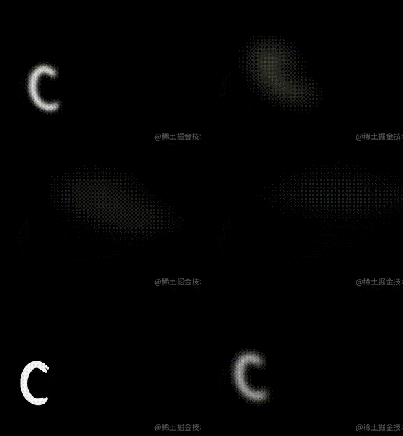
superimposed transform After that, it felt like a word was blown away and turned into smoke. On this basis, we only need to put multiple words together and use animation-delay to sequentially control each word to trigger the animation effect to get the complete smoke effect mentioned above.
The pseudo code is as follows:
    <span>C</span>
    S
    S
    // ...
// ... 上述所有 CSS 代码
@for $item from 1 through 21 {
  span:nth-of-type(#{$item}){
    animation-delay: #{(($item/10))}s;
  }
}Use the SVG feturbulence filter to achieve the smoke effect
The smoke of the above smoke animation is still the same Relatively rough. Mainly because it lacks a bit of graininess? Some of the smoke texture is missing.
To achieve a more refined smoke effect, we have to use SVG's
Next, we will use filter: blur() with the
For a simple example, suppose there are several words like this:
<div">SMOKE</div>
Simple CSS:
div {
    background: linear-gradient(#fff, #999, #ddd, #888);
    background-clip: text;
}Get several words with gradient colors like this:

We use the
<div>SMOKE</div>
<svg width="0">
  <filter id="filter">
    <feTurbulence id="turbulence" type="fractalNoise" baseFrequency=".03" numOctaves="20" />
    <feDisplacementMap in="SourceGraphic" scale="30" />
  </filter>
</svg>Use filter: url() in CSS to introduce this filter. In order to achieve better results here, I introduced this filter directly on the
:body {
filter: url('#filter');
}
div {
background: linear-gradient(#fff, #999, #ddd, #888);
background-clip: text;
} Our font is given a fluid feel by the

This effect can be said to have basically nothing to do with the smoke effect, but you only need to add a blur filter, and something magical will happen:
body {
    filter: url('#filter');
}
div {
    background: linear-gradient(#fff, #999, #ddd, #888);
    background-clip: text;
    filter: blur(5px);
}The entire effect will instantly become smoky:

Okay, add a looping animation effect to it, and simply use JavaScript to process it:
const filter = document.querySelector("#turbulence");
let frames = 1;
let rad = Math.PI / 180;
let bfx, bfy;
function freqAnimation() {
    frames += .2
    bfx = 0.03;
    bfy = 0.03;
    bfx += 0.005 * Math.cos(frames * rad);
    bfy += 0.005 * Math.sin(frames * rad);
    bf = bfx.toString() + " " + bfy.toString();
    filter.setAttributeNS(null, "baseFrequency", bf);
    window.requestAnimationFrame(freqAnimation);
}
window.requestAnimationFrame(freqAnimation);Look at the effect:
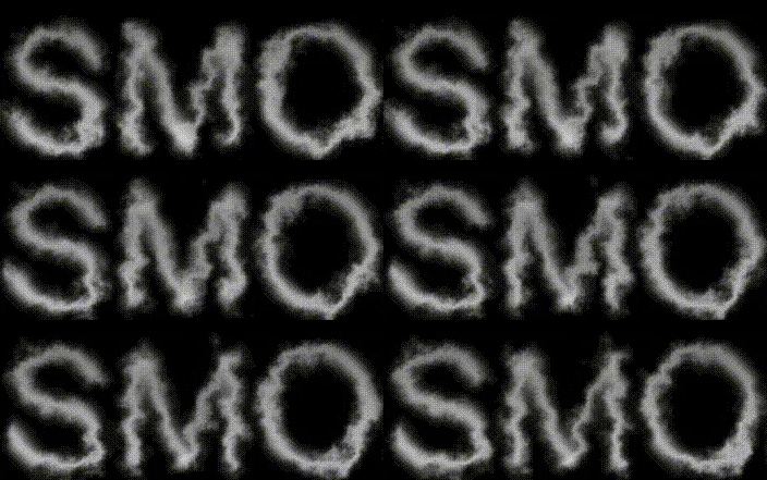
Of course, the above effects can be achieved by:
Control the baseFrequency attribute adjustment of
Control the numOctaves attribute adjustment of
Control the scale attribute adjustment of
Change the numOctaves attribute of

css video tutorial)
The above is the detailed content of Teach you how to use css to achieve smoke effects in ten minutes. For more information, please follow other related articles on the PHP Chinese website!