


Available js plug-in libraries: 1. Animation transition "transition.js"; 2. Modal pop-up window "modal.js"; 3. Drop-down menu "dropdown.js"; 4. Tab "tab" .js"; 5. Prompt box "tooltop.js"; 6. Warning box "alert.js" and so on.

The operating environment of this tutorial: Windows 7 system, bootsrap version 3.2, DELL G3 computer
One-time import:
Bootstrap provides a single file that contains all of Bootstrap's JavaScript plug-ins, namely bootstrap.js (compressed version: bootstrap.min. js).
The specific usage is as follows (or see lines 28-29 of the code editor on the right):
<!—导入jQuery版本库,因为Bootstrap的JavaScript插件依赖于jQuery -->
<script src="http://libs.baidu.com/jquery/1.9.0/jquery.js"></script>
<!—- 一次性导入所有Bootstrap的JavaScript插件(压缩版本) --><script src="js/bootstrap.min.js"></script>
Special statement: The jQuery version library can also load your local jQuery version.
Individual import:
In order to facilitate the independent import of special effects files, Bootstrap V3.2 provides 12 JavaScript plug-ins. They are:
☑ Animation transitions (Transitions):Corresponding plug-in file"transition.js"
☑ Modal pop-up window (Modal): Corresponding plug-in file "modal.js"
☑ Dropdown menu (Dropdown): Corresponding plug-in file"dropdown.js"
☑ Scroll detection (Scrollspy): Corresponding plug-in file" scrollspy.js"
☑ Tab: Corresponding plug-in file"tab.js"
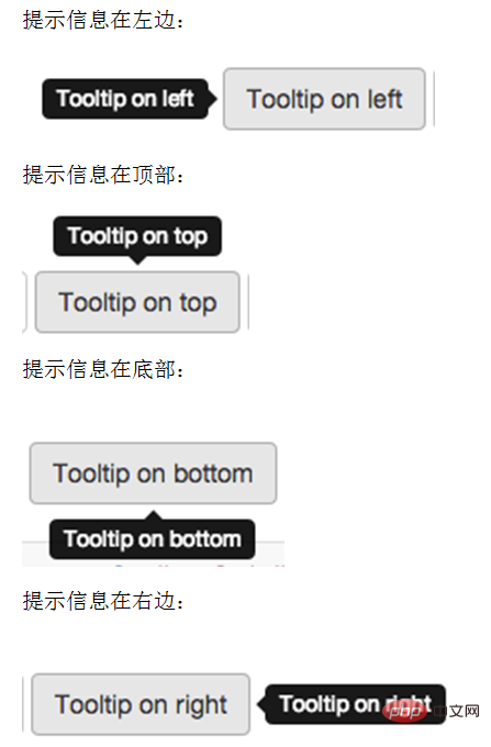
☑ Tooltips: Corresponding plug-in file"tooltop.js"
☑ Popover: Corresponding plug-in file "popover.js"
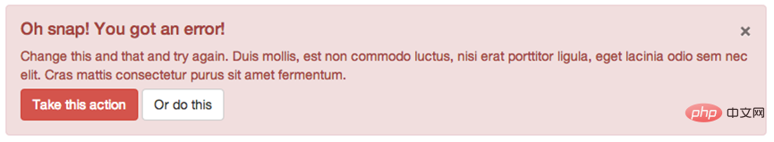
##☑ Alert:Corresponding plug-in file"alert.js"
☑ Buttons: Corresponding plug-in file"button .js”
☑ Folding/Accordion (Collapse): Corresponding plug-in file“collapse.js”
☑ Picture carousel Carousel: Corresponding plug-in file"carousel.js"
☑ Automatically locate buoy Affix: Corresponding plug-in file "affix.js"
The download of the above independent plug-in can be downloaded from github (https: //github.com/twbs/bootstrap).
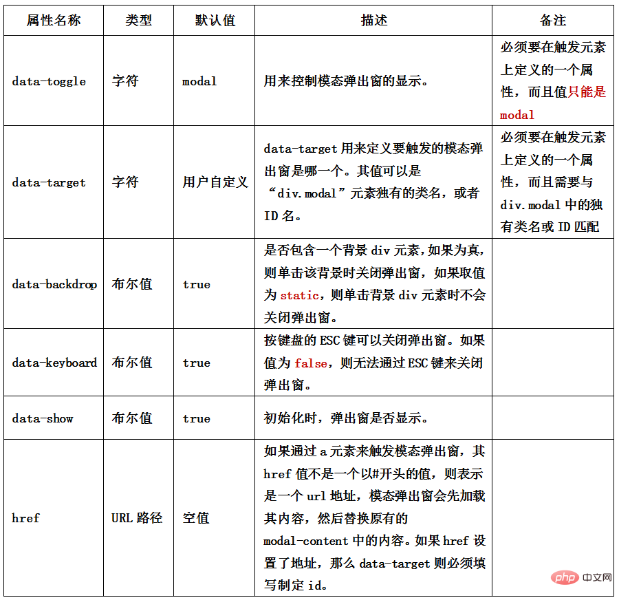
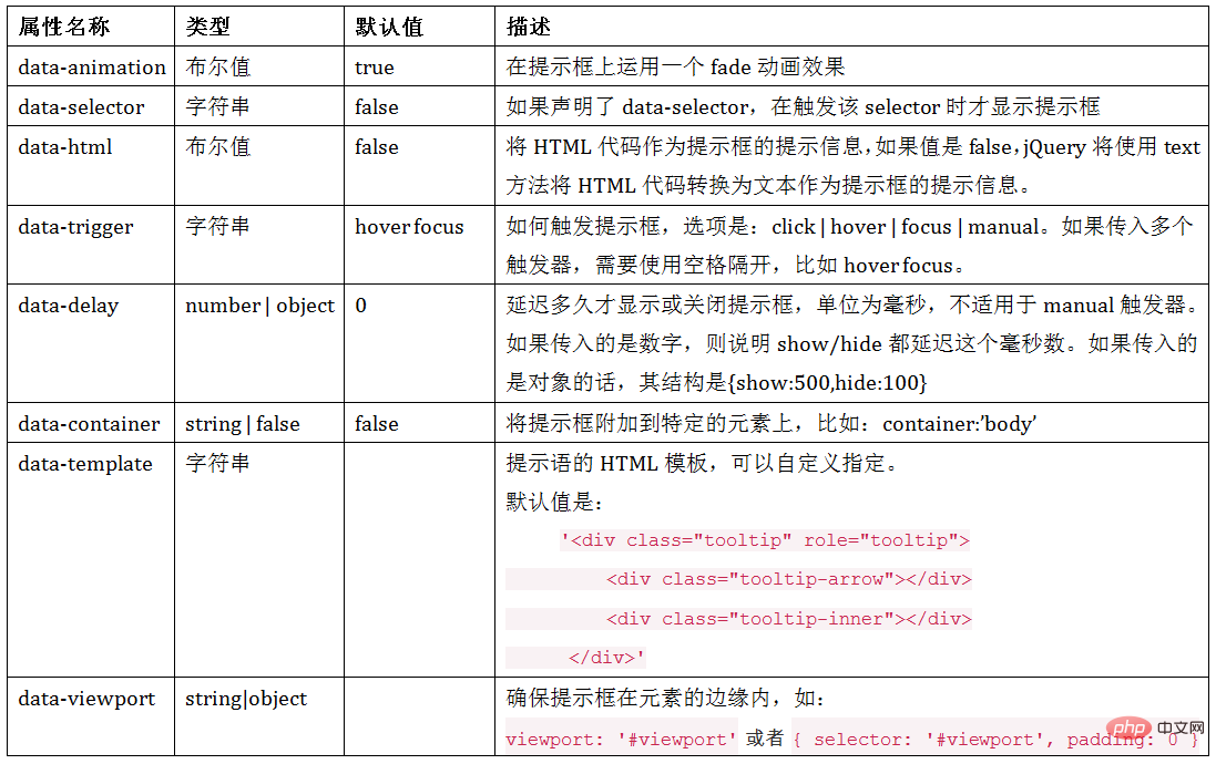
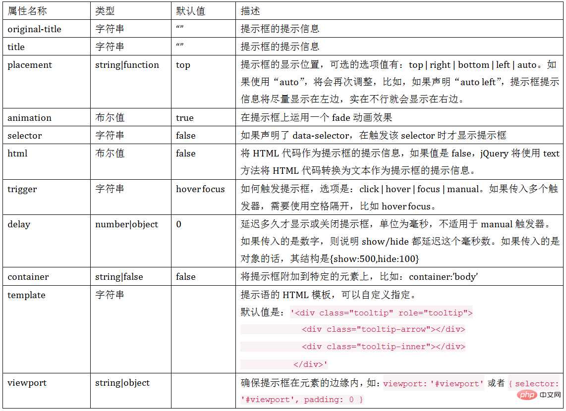
Modal pop-up box - the use of modal pop-up window (data-parameter description) In addition to controlling modal pop-up through data-toggle and data-target In addition to the window, the Bootstrap framework also provides other customdata-attributes for modal pop-up boxes to control modal pop-up windows. For example: whether there is a modal-backdrop with a gray background, and whether the modal pop-up window can be closed by pressing the ESC key. The relevant instructions about the custom properties of the Modal pop-up window are as follows:
$(function(){
  $(".btn").click(function(){
    $("#mymodal").modal();
  });
});attribute settings, parameter settings and Event settings.
Attribute settings
The custom attributes supported by the modal pop-up window by default are: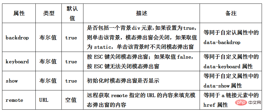
$(function(){
    $(".btn").click(function(){
        $("#mymodal").modal({            keyboard:false
        });
    });
});| Parameters | Usage method | describe |
| ##toggle | $(“#mymodal”).modal(“toggle”) | When triggered, invert the state of the modal pop-up window. If the modal pop-up window is displayed, close it; otherwise, if the modal pop-up window is closed, display |
| show | $(“#mymodal”).modal(“show”) | When triggered, display the modal pop-up window |
| hide | ##$(“#mymodal”).modal(“hide”)When triggered, Close the modal pop-up window |
The modal pop-up window also supports four types of events, They are before and after the modal pop-up window pops up, before closing and after closing. The specific description is as follows:
| Description | |||||||||||||||||||||||||||||||||
| Triggered immediately when the show method is called (not yet before showing); if an element is clicked, then that element will be used as the event's relatedTarget attribute | |||||||||||||||||||||||||||||||||
| This event is triggered after the modal pop-up window is fully displayed to the user (and after waiting for the CSS animation to complete); if an element is clicked, the element will be used as the relatedTarget event of the event | |||||||||||||||||||||||||||||||||
| Triggered immediately when the hide method is called (but not yet turned off hiding) | |||||||||||||||||||||||||||||||||
| This event is triggered after the modal pop-up window is completely hidden (and after the CSS animation is completed) |
属性名称 | 类型 | 默认值 | 描述 |
data-interval | number | 5000 | 幻灯片轮换的等待时间(毫秒)。如果为false,轮播将不会自动开始循环 |
data-pause | string | hover | 默认鼠标悬停留在幻灯片区域即停止播放,离开即开始播放 |
data-wrap | 布尔值 | true | 轮播是否持续循环
|
默认情况之下,如果 carousel 容器上定义了 data-ride="carousel" 属性,页面加载之后就会自动加载轮播图片切换效果。如果没有定义 data-ride 属性,可以通过 JavaScript 方法来触发轮播图片切换。具体使用方法如下:
$(".carousel").carousel();也可以通过容器的 ID 来指定:
$("#slidershow").carousel();在 carousel() 方法中可以设置具体的参数,如:
属性名称 | 类型 | 默认值 | 描述 |
interval | number | 5000 | 幻灯片轮换的等待时间(毫秒)。如果为false,轮播将不会自动开始循环 |
pause | string | hover | 默认鼠标悬停留在幻灯片区域即停止播放,离开即开始播放 |
wrap | 布尔值 | true | 轮播是否持续循环 |
使用时,在初始化插件的时候可以传关相关的参数,如:
$("#slidershow").carousel({
       interval: 3000
});实际上,当我们给carousel()方法配置参数之后,轮播效果就能自动切换。但 Bootstrap 框架中的 carousel 插件还给使用者提供了几种特殊的调用方法,简单说明如下:
插件文件:源文件 affix.js
地址:http://cdn.bootcss.com/bootstrap/2.3.1/js/bootstrap-affix.js
Affix 效果常见的有以下三种:
☑ 顶部固定
☑ 侧边栏固定
☑ 底部固定
Affix 插件可以对任何元素进行固定定位,其中比较简单的方法,就是通过自定义属性 data 来触发。其主要包括两个参数:
1、data-spy:取值 affix,表示元素固定不变的。
2、data-offset:整数值,比如 90,表示元素 top 和 bottom 的值都是 90px,其包括两种方式:data-offset-top 和 data-offset-bottom。
具体使用如下:
<p data-spy="affix" data-offset="90">affix元素</p>
分开设置 data-offset 值方式:
<p data-spy="affix" data-offset-top="90" data-offset-bottom="150">affix元素</p>
我们来看一个简单的示例:
<nav class="navbar navbar-default" role="navigation">
    …
</nav>
<p class="container">
    <p class="row">
        <p class="col-md-3" id="sidebarMenu">
            <ul class="navnav-pills nav-stacked" data-spy="affix" data-offset-top="20">
                     …
            </ul>
        </p>
        <p class="col-md-9">
                …
        </p>
    </p>
</p>注意,在 body 要声明滚动监控。
<body data-spy="scroll" data-target="sidebarMenu">
运行效果如下:
注意,请在宽屏模式下查看效果。据我测试下来,使用声明式,就算设置了 data-offset-top 的值也会失效,需要在样式中给 affix 设置一个top值,与 data-offset-top 值相等。data-offset-bottom一样。
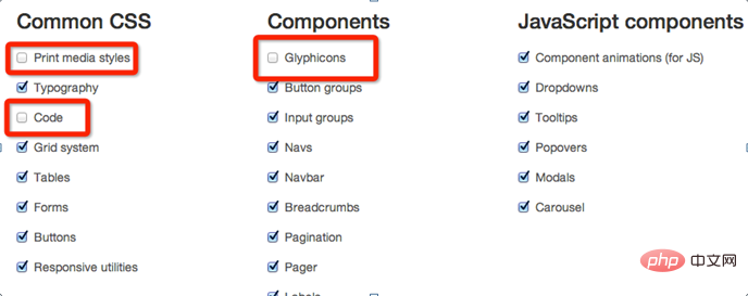
在 Bootstrap 组件设置这一部分,提供了公共样式(Common CSS),UI 组件(Components)和 JavaScript 组件(JavaScript components)三个部分,如下图所示:
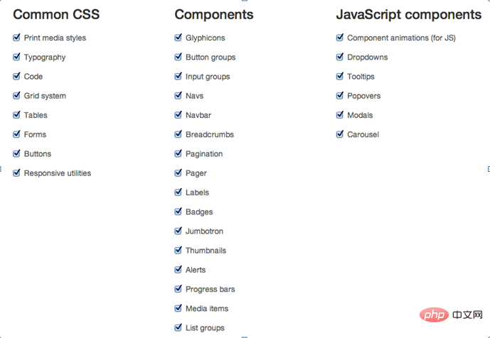
每个部分都有对应的列表清单,在自定义配置时候,可以根据自己需求进行选择,比如,我自己的 Bootstrap 框架中,不需要打印样式、code、Glyphicons、等等,那么只需要不选中它们:
For more knowledge about bootstrap, please visit: bootstrap basic tutorial! !
The above is the detailed content of Which js libraries can be used for bootstrap?. For more information, please follow other related articles on the PHP Chinese website!


![[Web front-end] Node.js quick start](https://img.php.cn/upload/course/000/000/067/662b5d34ba7c0227.png)


