


CSS3 supports a variety of filters. In CSS3, the filter attribute can be used to add filter effects to elements. This attribute has a variety of built-in filter functions: blur() sets the blur filter, brightness() sets the brightness filter, contrast() sets the contrast filter, grayscale() Set grayscale filters, etc.

The operating environment of this tutorial: Windows 7 system, CSS3&&HTML5 version, Dell G3 computer.
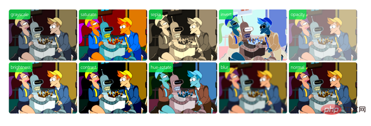
css3 supports many kinds of filters. Through the css3 filter filter attribute, we can create a filter effect similar to photoshop. For example, create blur effects, shadow effects, color filter effects, etc. for pictures.
| Filter | Description |
|---|---|
| blur(px) | Set Gaussian blur to the image. The "radius" value sets the standard deviation of the Gaussian function, or how many pixels are blended together on the screen, so the larger the value, the blurr it is; If no value is set, the default is 0; this parameter can Set css length value, but does not accept percentage value. |
| brightness(%) | Applies a linear multiplication to the image, making it appear brighter or darker. If the value is 0%, the image will be completely black. If the value is 100%, there will be no change in the image. Other values correspond to linear multiplier effects. Values above 100% are okay and the image will be brighter than before. If no value is set, the default is 1. |
| contrast(%) | Adjust the contrast of the image. If the value is 0%, the image will be completely black. The value is 100% and the image is unchanged. Values can exceed 100%, meaning a lower comparison will be used. If no value is set, the default is 1. |
| drop-shadow(h-shadow v-shadow blur spread color) | Sets a shadow effect to the image. Shadows are composited underneath the image and can be blurred, offset versions of the matte that can be painted in a specific color. The function accepts values of type
| grayscale(
| Convert the image to grayscale. The value defines the scale of the conversion. If the value is 100%, the image will be completely converted to grayscale, and if the value is 0%, the image will remain unchanged. Values between 0% and 100% are linear multipliers of the effect. If not set, the value defaults to 0; | |
| hue-rotate(deg) | Apply hue rotation to the image. The "angle" value sets the angle of the color circle by which the image will be adjusted. If the value is 0deg, there will be no change in the image. If the value is not set, the default value is 0deg. Although this value does not have a maximum value, a value exceeding 360deg is equivalent to going around again. |
| invert(%) | Invert the input image. The value defines the scale of the conversion. 100% of the value is a complete reversal. A value of 0% means there is no change in the image. Values between 0% and 100% are linear multipliers of the effect. If the value is not set, the value defaults to 0. |
| opacity(%) | Convert the transparency of the image. The value defines the scale of the conversion. A value of 0% means complete transparency, a value of 100% means no change to the image. Values between 0% and 100% are linear multipliers of the effect, equivalent to multiplying the number of image samples. If the value is not set, the value defaults to 1. This function is very similar to the existing opacity attribute, except that through filter, some browsers provide hardware acceleration to improve performance. |
| saturate(%) | Convert image saturation. The value defines the scale of the conversion. A value of 0% means the image is completely desaturated, and a value of 100% means the image has no change. Other values are linear multipliers of the effect. Values above 100% are allowed, with higher saturation. If the value is not set, the value defaults to 1. |
| sepia(%) | Convert the image to sepia. The value defines the scale of the conversion. A value of 100% is completely sepia, and a value of 0% leaves the image unchanged. Values between 0% and 100% are linear multipliers of the effect. If not set, the value defaults to 0; |
| url() | URL function accepts an XML file, which sets an SVG filter. Mirror, and can contain an anchor point to specify a specific filter element. For example: filter: url(svg-url#element-id)
Copy after login
|
Usage example
/* 使用SVG filter */ filter: url("filters.svg#filter-id"); /* 使用filter函数 */ filter: blur(5px); filter: brightness(0.4); filter: contrast(200%); filter: drop-shadow(16px 16px 20px blue); filter: grayscale(50%); filter: hue-rotate(90deg); filter: invert(75%); filter: opacity(25%); filter: saturate(30%); filter: sepia(60%); /* 多个filter */ filter: contrast(175%) brightness(3%); /* 不使用filter */ filter: none; /* 全局变量 */ filter: inherit; filter: initial; filter: unset;
(Learning video sharing:css video tutorial)
The above is the detailed content of Does CSS3 support filters?. For more information, please follow other related articles on the PHP Chinese website!


![[Web front-end] Node.js quick start](https://img.php.cn/upload/course/000/000/067/662b5d34ba7c0227.png)


