Gradient is a new image type in css3, used to replace images. CSS3 defines two types of gradients: 1. Linear gradient, defined using the "linear-gradient()" function; 2. Radial gradient, defined using the "radial-gradient()" function.

The operating environment of this tutorial: Windows 7 system, CSS3&&HTML5 version, Dell G3 computer.
As a new attribute of CSS3, gradients also have endless potential.
1. Introduction
Gradient is a new image type in CSS3, which is used to replace images. Its benefits are:
- Speed up page loading Speed, reducing bandwidth usage;
More flexible.
CSS3 defines two types of gradients:
2. Linear Gradient
In fact, the use of gradients is quite common, such as navigation bars:
background-image: linear-gradient(90deg,#0af,#0085ff)
Copy after login
Obviously, this looks much better than a solid color background.
Of course, sometimes we don’t need transition effects:
background-image: linear-gradient(90deg,blue 100px,#FFF 100px,#FFF 200px,red 200px);
Copy after login
## # For linear gradients, in addition to linear-gradient, there are also repeating-linear-gradient:
    $c1: #fff;
    $c2: #DF5646;
    $c3: #1C78A4;
    background-image: repeating-linear-gradient(45deg, $c1, $c1 10px, $c2 10px, $c2 40px, $c1 40px, $c1 50px, $c3 50px, $c3 80px);
Copy after login
Hence It can be seen that gradient is not that simple.
Some people must ask here, what other tricks can be played? First of all, we need to understand that gradient is a kind of picture, then think about what other CSS properties are used with pictures?
    $color: #122556;
    background-image: linear-gradient(45deg, $color 25%, transparent 25%, transparent 75%, $color 75%),
                      linear-gradient(-45deg, $color 25%, transparent 25%, transparent 75%, $color 75%);
    background-size: 30px 30px;
Copy after login
Through this example, the idea of using gradients becomes more open. However, there is one more thing to note here:
When you declare multiple gradients, the one declared first is closer to the user. (Here we need to consider the issue of covering, generally using transparent);-
Similarly, gradients can also be animated
    @mixin menuaction($color) {
        background: linear-gradient($color 100%, transparent 100%) no-repeat center bottom / 100% 10%;
        &:hover {
            background-size: 100% 100%;
            color: #fff;
        }
    }
Copy after login
3. Radial gradient
radial A gradient is defined by its center.
In order to create a radial gradient, you must also define at least two color nodes. The color node is the color you want to show a smooth transition. At the same time, you can also specify the center, shape (circle or oval), and size of the gradient. By default, the center of the gradient is center (meaning at the center point), the shape of the gradient is ellipse (meaning an ellipse), and the size of the gradient is farthest-corner (meaning to the farthest corner).
Syntax
background-image: radial-gradient(shape size at position, start-color, ..., last-color);
Copy after login
Value | Description |
shape | Determine the type of circle:ellipse (default): Specifies the radial gradient of the ellipse. circle: Specify the radial gradient of the circle |
size | Define the size of the gradient, possible values: farthest-corner (default): specifies the radius length of the radial gradient from the center of the circle to the corner farthest from the center closest-side: specifies the radius length of the radial gradient from the center of the circle to the corner farthest from the center The side closest to the center of the circle closest-corner: Specifies the radius length of the radial gradient from the center of the circle to the corner closest to the center of the circle farthest-side: Specifies the radius length of the radial gradient from the center of the circle To the edge farthest from the center of the circle |
position | defines the position of the gradient. Possible values: - center (default): Set the middle ordinate value of the center of the radial gradient circle.
- top: Set the top to the ordinate value of the center of the radial gradient circle.
- bottom: Set the bottom to the ordinate value of the center of the radial gradient circle.
|
start-color, ..., last-color | is used to specify the starting and ending colors of the gradient. |
Example:
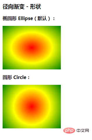
径向渐变 - 形状
椭圆形 Ellipse(默认):
圆形 Circle:
注意: Internet Explorer 9 及之前的版本不支持渐变。
Copy after login
4. Summary
What will it end with, haha Recently Various coupons, let’s use the knowledge of gradients to get a coupon:

(Learning video sharing:
css video tutorial)
The above is the detailed content of Are gradients new to css3?. For more information, please follow other related articles on the PHP Chinese website!


![[Web front-end] Node.js quick start](https://img.php.cn/upload/course/000/000/067/662b5d34ba7c0227.png)


