How to write hexagons in css: 1. Divide the regular hexagon into three parts, and then set the before part, p part and after part; 2. Divide the regular hexagon into three p parts with the same width and height. Then use positioning and css3 transform:rotate to rotate 60deg left and right to form a regular hexagon.

The operating environment of this article: Windows7 system, HTML5&&CSS3 version, Dell G3 computer.
How to write hexagons in css?
Teach you how to draw a regular hexagon with CSS
Tell me two ways to create a regular hexagon with CSS.
Let’s take a look at the results first:

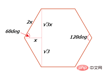
Before we need to understand the relationship between the interior angles and sides of a regular hexagon, regular hexagon Each interior angle of is 60deg, as shown in the figure (√3 is actually the root number 3):

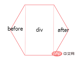
Method 1: Principle: Divide the regular hexagon into three parts, left, middle and right respectively They are: before part, p part, and after part, as shown in the figure:

The before triangle part is the before pseudo-element of p, and the after triangle part is the after pseudo-element of p.
html code:
css code:
.p { position: relative; width: 50px; height: 86.6px; margin: 50px auto; background-color: red; } .p:before { content: ''; display: block; position: absolute; width: 0; height: 0; right:50px; border-width: 43.3px 25px; border-style: solid; border-color: transparent red transparent transparent; } .p:after { content: ''; display: block; position: absolute; width: 0; height: 0; left:50px; border-width: 43.3px 25px; border-style: solid; border-color: transparent transparent transparent red; top:0; }
Note that the width and height of p and pseudo elements need to be calculated according to the above formula.
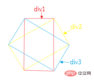
Method 2: Divide the regular hexagon into three p's with the same width and height, and then use positioning and css3 transform:rotate to rotate 60deg left and right to form a regular hexagon, as shown in the figure:

html code:
css code:
1 .one { 2 width: 50px; 3 height: 86.6px; 4 margin: 0 auto; 5 border-top: 1px solid red; 6 border-bottom: 1px solid red; 7 } 8 .two { 9 position: absolute; 10 width: 50px; 11 height: 86.6px; 12 left: 25px; 13 top: 0; 14 transform: translate(-50%,-50%); 15 transform: rotate(60deg); 16 border-top: 1px solid red; 17 border-bottom: 1px solid red; 18 } 19 .three { 20 position: absolute; 21 width: 50px; 22 height: 86.6px; 23 left: 25px; 24 top: 0; 25 transform: translate(-50%,-50%); 26 transform: rotate(300deg); 27 border-top: 1px solid red; 28 border-bottom: 1px solid red; 29 }
For the above two methods, the width, height, size and left and right displacement of the element need to be calculated according to the above formula and cannot be arbitrary Fill in
Recommended study: "css video tutorial"
The above is the detailed content of How to write hexagon in css. For more information, please follow other related articles on the PHP Chinese website!