In the previous article "Using CSS to create interesting text swing animation special effects", we introduced the method of using CSS to create interesting text swing animation special effects. This time we will introduce to you how to dynamically draw an elephant using HTML5 CSS3. If you are interested, you can learn about it~
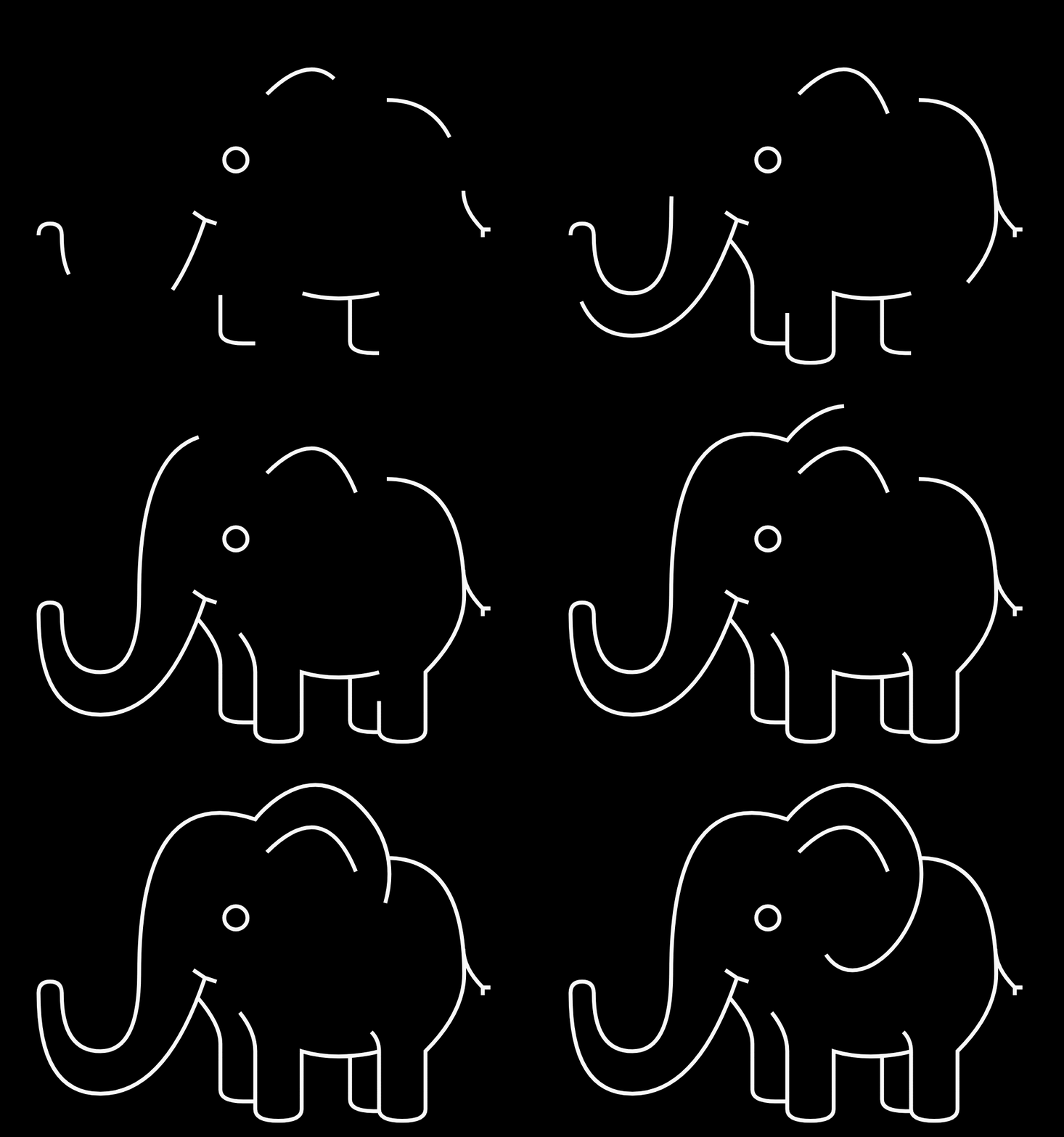
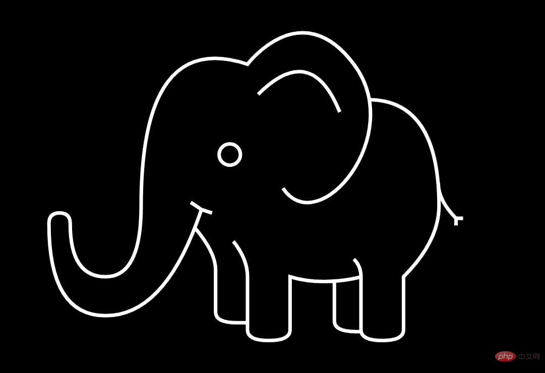
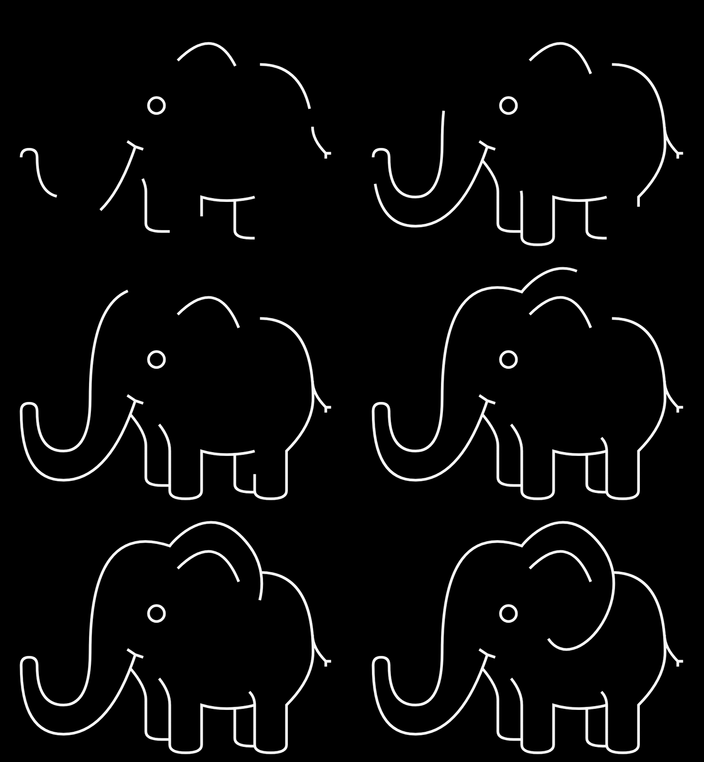
The main content of today’s article is: use HTML5 svg to draw a line elephant, and then Add animation to it so that it can be drawn slowly. Just saying that you may not understand what the effect is, let’s take a look at the rendering directly:

Let’s study how to achieve this effect:
First set the background color of the entire page, the color of the lines, and the size of the svg canvas
body {
  margin: 0;
  height: 100vh;
  display: flex;
  justify-content: center;
  align-items: center;
  background: #000000;
  color: #fff
}

 svg {
  display: block;
  width: 90vmin;
  height: 90vmin;
}Then use svg to draw a line elephant
<svg role="img" aria-label="A stroke illustration of an elephant" viewBox="0 0 120 120">
  <g fill="none" stroke="currentColor" line-join="round" stroke-width="1">
	<path class="stroke" d="M2 66
			 q0 -3 3 -3 q3 0 3 3
			 q0 15 10 15 q10 0 10 -20 q0 -50 30 -40
			 s 15 -20 30 0 s -10 50 -20 35 m24 -25
			 q 20 0 20 30 q0 10 -10 20
			 l 0 15 q 0 3 -6 3 q -6 0 -6 -3l0 -15
			 q 0 -3 -2 -5 m 2 5
			 s -10 3 -20 0
			 l 0 15 q 0 3 -6 3 q -6 0 -6 -3l0 -15
			 q 0 -5 -4 -10 m 4 23
			 h-3 q -6 0 -6 -3
			 l0 -12
			 q 0 -5 -6 -12
			 m 2 -5
			 l 3 1 m -3 -1
			 l -3 -2 m 3 2
			 q -10 30 -27 30
			 q -16 0 -16 -26
			 m 80.5 16.5
			 v11 q0 3 6 3 h1.5
			 m-40 -50
			 a 3 3 0 0 1 6 0 a 3 3 0 0 1 -6 0
			 m 11 -17
			 q 15 -15 23 5
			 m 27.8 20
			 q 0 5 5 10
			 h2 m-2 0 v2
			 ">
  </g>
</svg>

Finally realize the animation effect:
First use the stroke-dasharray attribute to control the pattern paradigm of the dotted lines used for strokes , stroke-dashoffset controls the distance from the dash pattern to the beginning of the path. The values of these two properties need to be consistent.
.stroke {
  stroke-dasharray: 300;
  stroke-dashoffset: 300;
}After setting these two properties, the line elephant pattern will be hidden, and then bind an animation to the .stroke element
.stroke {
  animation: stroke-anim 4s linear forwards;
}Use @ keyframes rules, set the action for the animation, set the value of the stroke-dashoffsets attribute to 0
@keyframes stroke-anim {
  to {
	stroke-dashoffset: 0;
  }
}
ok! The complete code is given below:
<!DOCTYPE html>
<html>
	<head>
		<meta charset="utf-8">
		<style>
			body {
				margin: 0;
				height: 100vh;
				display: flex;
				justify-content: center;
				align-items: center;
				background: #000000;
				color: #fff
			}

			svg {
				display: block;
				width: 90vmin;
				height: 90vmin;
			}

			.stroke {
				stroke-dasharray: 300;
				stroke-dashoffset: 300;
				animation: stroke-anim 4s linear forwards;
			}

			@keyframes stroke-anim {
				to {
					stroke-dashoffset: 0;
				}
			}
		</style>
	</head>
	<body>
		<svg role="img" aria-label="A stroke illustration of an elephant" viewBox="0 0 120 120">
			<g fill="none" stroke="currentColor" line-join="round" stroke-width="1">
				<path class="stroke" d="M2 66
			 q0 -3 3 -3 q3 0 3 3
			 q0 15 10 15 q10 0 10 -20 q0 -50 30 -40
			 s 15 -20 30 0 s -10 50 -20 35 m24 -25
			 q 20 0 20 30 q0 10 -10 20
			 l 0 15 q 0 3 -6 3 q -6 0 -6 -3l0 -15
			 q 0 -3 -2 -5 m 2 5
			 s -10 3 -20 0
			 l 0 15 q 0 3 -6 3 q -6 0 -6 -3l0 -15
			 q 0 -5 -4 -10 m 4 23
			 h-3 q -6 0 -6 -3
			 l0 -12
			 q 0 -5 -6 -12
			 m 2 -5
			 l 3 1 m -3 -1
			 l -3 -2 m 3 2
			 q -10 30 -27 30
			 q -16 0 -16 -26
			 m 80.5 16.5
			 v11 q0 3 6 3 h1.5
			 m-40 -50
			 a 3 3 0 0 1 6 0 a 3 3 0 0 1 -6 0
			 m 11 -17
			 q 15 -15 23 5
			 m 27.8 20
			 q 0 5 5 10
			 h2 m-2 0 v2
			 ">
			</g>
		</svg>
	</body>
</html>You can copy the above code directly and run the demonstration locally.
Here are some key tags and attributes:
HTML5 <SVG> Tags are used to draw images
< ;g> Container element used to combine related elements,

##: Define a path

animation attribute is a shorthand attribute:
animation-name:规定需要绑定到选择器的 keyframe 名称。。
animation-duration:规定完成动画所花费的时间,以秒或毫秒计。
animation-timing-function:规定动画的速度曲线。
animation-delay:规定在动画开始之前的延迟。
animation-iteration-count:规定动画应该播放的次数。
animation-direction:规定是否应该轮流反向播放动画。
@keyframes rules. The
/* 定义动画*/
@keyframes 动画名称{
    /* 样式规则*/
}

/* 将它应用于元素 */
.element {
    animation-name: 动画名称(在@keyframes中已经声明好的);

    /* 或使用动画简写属性*/
    animation: 动画名称 1s ...
}stroke-dasharray property controls the pattern pattern of dotted lines used for strokes. As an appearance property, it can also be used directly as a property inside a CSS style sheet.
stroke-dashoffset The attribute specifies the distance from the dash mode to the beginning of the path. If a <percentage> value is used, then this value represents a percentage of the current viewport. The value can be negative. </percentage>
css video tutorial" and "HTML video tutorial"!
The above is the detailed content of HTML5+CSS3 dynamically draws an elephant. For more information, please follow other related articles on the PHP Chinese website!