css3 declares the box elasticity by setting the value of the display attribute to flex or inline-flex. The flexible box is composed of a flexible container (Flex container) and a flexible sub-element (Flex item). The flexible container contains one or more flexible sub-elements.

The operating environment of this tutorial: Windows 7 system, CSS3&&HTML5 version, Dell G3 computer.
The flexible box is composed of a flexible container (Flex container) and a flexible sub-element (Flex item).
A flexible container is defined as a flexible container by setting the value of the display property to flex or inline-flex. A flex container contains one or more flex child elements.
Note: The outside of the flexible container and inside the flexible sub-element are rendered normally. The flex box only defines how the flex child elements are laid out within the flex container.
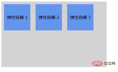
Flexible sub-elements are usually displayed in one line within the flexible box. By default there is only one row per container.
Example:
<!DOCTYPE html>
<html lang="en">
  <head>
    <meta charset="UTF-8" />
    <meta http-equiv="X-UA-Compatible" content="IE=edge" />
    <meta name="viewport" content="width=device-width, initial-scale=1.0" />
    <title>Document</title>
  </head>
  <!DOCTYPE html>
<html>
<head>
<style>
.flex-container {
    display: -webkit-flex;
    display: flex;
    width: 400px;
    height: 250px;
    background-color: lightgrey;
}

.flex-item {
    background-color: cornflowerblue;
    width: 100px;
    height: 100px;
    margin: 10px;
    text-align: center;
    line-height: 100px;
}
</style>
</head>
<body>

<div class="flex-container">
  <div class="flex-item">弹性容器 1</div>
  <div class="flex-item">弹性容器 2</div>
  <div class="flex-item">弹性容器 3</div>
</div>

</body>
</html>
</html>Effect:

Recommended learning: css video tutorial
The above is the detailed content of How to declare box elasticity in css3. For more information, please follow other related articles on the PHP Chinese website!