
In CSS, you can use the "border-radius" attribute to add a rounded border to the div element and set the rounded effect. This property sets the rounded corner values in the order of upper left corner, upper right corner, lower right corner, and lower left corner. If the four values are the same, the remaining three values can be omitted.
The operating environment of this tutorial: Windows7 system, CSS3&&HTML5 version, Dell G3 computer.
Method 1:
Basic usage of rounded border (border-radius):
The best way to use rounded border The basic usage is to set four rounded corners with the same arc
boder-top-left-radius:30px; //左上角 boder-top-right-radius:30px; //右上角 boder-bottom-left-radius:30px; //右下角 boder-bottom-right-radius:30px; //左下角
If the four rounded corners are the same, it can be written as:
border-radius:30px;
Example:
css part:
.div1{ margin:0 auto; background: darkcyan; width:200px; height:200px; border:2px solid darkslategray; border-radius:30px; text-align: center; line-height: 200px; }
The effect is as shown:

Method 2:
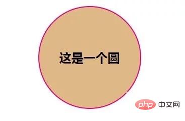
The rounded border can also use percentage as the unit. For example: setting the rounded border of a square to 50% will form a circle, but using percentages and pixels is not equivalent.
Note: After the percentage is greater than 50%, the shape will no longer change, and the radius of the fillet cannot exceed half of the width/height
Example:
css part:
.box1{ width:200px; height:200px; margin: 30px auto; border: 2px solid #e4007e; text-align: center; line-height: 200px; font-weight: bold; font-size: 24px; background: burlywood; border-radius: 50%;//圆角百分比 }
The effect is as shown:
Method 3:
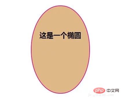
Since a circle can be drawn using a rounded border, the same You can also draw an ellipse.
Example:
css part:
.box2{ width:200px; height:300px; margin: 30px auto; border: 2px solid #e4007e; text-align: center; line-height: 200px; font-weight: bold; font-size: 24px; background: burlywood; border-radius: 100px/150px; }
The effect is as shown:
Method 4:
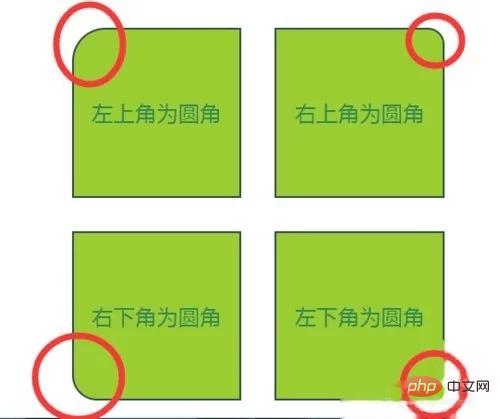
Set rounded corners with different radians
Example:
css part:
#box4{ width:500px; position: relative; margin:30px auto; } .div4,.div5,.div6,.div7{ width:200px; height:200px; text-align: center; color:seagreen; font-size: 26px; line-height: 200px; background: yellowgreen; border:2px solid darkslategray; float:left; margin:20px; } .div4{border-top-left-radius: 40px;} .div5{border-top-right-radius: 20px;} .div6{border-bottom-left-radius: 30px;} .div7{border-bottom-right-radius: 10px;}
The effect is as shown:
Notes
After the percentage is greater than 50%, the shape will no longer change. The radius of the fillet cannot exceed half of the width/height.
【Recommended learning:css video tutorial】
The above is the detailed content of How to set rounded corners in css. For more information, please follow other related articles on the PHP Chinese website!