This article will take you through the media objects in Bootstrap. It has certain reference value. Friends in need can refer to it. I hope it will be helpful to everyone.

Related recommendations: "bootstrap tutorial"
In a web page, it is very common for pictures to be on the left and content to be on the right. The effect is a media object. It is an abstract style that can be used to build different types of components. In the bootstrap framework, its corresponding version file is as follows:
LESS: media.less
SASS: _media.scss
Media objects generally appear in groups. A group of media objects generally includes the following parts:
1. Media object container: used to hold media For all contents of the object, the class name .media
must be used on the container. 2. The object of the media object: usually a picture, the class .media-object
3 must be used. 3. The body of the media object: It is the main content of the media object, which can be any element. You need to use the class .media-body
4. The title of the media object: a title used to describe the media object. You need to use the class .media-heading
In addition, the classes .pull-left and .pull-right are often used in the bootstrap framework to control the floating mode of objects in media objects.
The following is their css source code:
.media,
.media-body {
  overflow: hidden;
  zoom: 1;
}
.media,
.media .media {
  margin-top: 15px;
}
.media:first-child {
  margin-top: 0;
}
.media-object {
  display: block;
}
.media-heading {
  margin: 0 0 5px;
}
.media > .pull-left {
  margin-right: 10px;
}
.media > .pull-right {
  margin-left: 10px;
}Media The style is relatively simple, just set the spacing between them;
Let’s take a look at the use of media objects:
<h1>默认媒体对象</h1>
    <div>
        <a>
            <img  class="media-object lazy" src="/static/imghw/default1.png" data-src="img/1.jpg" alt="A closer look at media objects in Bootstrap" >
        </a>
        <div>
            <h4>荷塘月色</h4>
            <div>这几天心里颇不宁静。今晚在院子里坐着乘凉,忽然想起日日走过的荷塘,在这满月的夜里,总该另有一 番样子吧。月亮渐渐地升高了,墙外马路上孩子们的欢笑……</div>
        </div>
    </div>

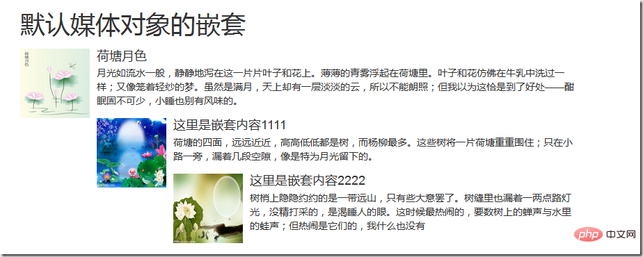
Media Nesting of Objects
Bootstrap media object nesting, simply place another media object structure in the body of the media object (.media-body). Let’s take a look at the application of media object nesting
<h1>默认媒体对象的嵌套</h1>
    <div>
        <a>
            <img  class="media-object lazy" src="/static/imghw/default1.png" data-src="img/3.jpg" alt="A closer look at media objects in Bootstrap" >
        </a>
        <div>
            <h4>荷塘月色</h4>
            <div>月光如流水一般,静静地泻在这一片片叶子和花上。薄薄的青雾浮起在荷塘里。叶子和花仿佛在牛乳中洗过一样;又像笼着轻纱的梦。虽然是满月,天上却有一层淡淡的云,所以不能朗照;但我以为这恰是到了好处——酣眠固不可少,小睡也别有风味的。</div>
            <div>
                <a>
                    <img  class="media-object lazy" src="/static/imghw/default1.png" data-src="img/4.jpg" alt="A closer look at media objects in Bootstrap" >
                </a>
                <div>
                    <h4>这里是嵌套内容1111</h4>
                    <div>荷塘的四面,远远近近,高高低低都是树,而杨柳最多。这些树将一片荷塘重重围住;只在小路一旁,漏着几段空隙,像是特为月光留下的。</div>
                    <div>
                        <a>
                            <img  class="media-object lazy" src="/static/imghw/default1.png" data-src="img/5.jpg" alt="A closer look at media objects in Bootstrap" >
                        </a>
                        <div>
                            <h4>这里是嵌套内容2222</h4>
                            <div>树梢上隐隐约约的是一带远山,只有些大意罢了。树缝里也漏着一两点路灯光,没精打采的,是渴睡人的眼。这时候最热闹的,要数树上的蝉声与水里的蛙声;但热闹是它们的,我什么也没有</div>
                        </div>
                    </div>
                </div>
            </div>
        </div>
    </div>
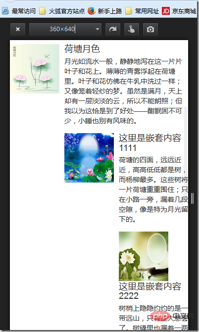
The effect is as follows:


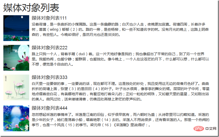
##Media object list
The bootstrap framework provides a media object list display effect. When writing the structure, you can use the tag ul, add the class name .media-list to the tag ul, and use the class name on the tag li .mediaFor example:<h1>媒体对象列表</h1>


 ##For more programming-related knowledge, please visit:
The above is the detailed content of A closer look at media objects in Bootstrap. For more information, please follow other related articles on the PHP Chinese website!