How to draw a hexagon in css: 1. Divide the regular hexagon into three parts, then calculate and set the width and height of the div and pseudo elements; 2. Divide the regular hexagon into three widths and heights For the same div, use positioning and css3 transform:rotate to rotate 60deg left and right to form a regular hexagon.

The operating environment of this tutorial: windows7 system, css3 version, Dell G3 computer.
Recommended:css video tutorial
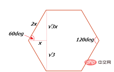
First understand the relationship between the internal angles and sides of a regular hexagon. Each internal angle of a regular hexagon is 60deg, as shown in the figure (√3 In fact, it is the root number 3):

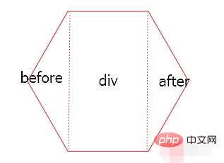
Method 1: Principle: Divide the regular hexagon into three parts. The left, middle and right parts are: before part, div part, and after part, such as Figure:

The before triangle part is the before pseudo-element of the div, and the after triangle part is the after pseudo-element of the div.
html code:
css code:
.div { position: relative; width: 50px; height: 86.6px; margin: 50px auto; background-color: red; } .div:before { content: ''; display: block; position: absolute; width: 0; height: 0; right:50px; border-width: 43.3px 25px; border-style: solid; border-color: transparent red transparent transparent; } .div:after { content: ''; display: block; position: absolute; width: 0; height: 0; left:50px; border-width: 43.3px 25px; border-style: solid; border-color: transparent transparent transparent red; top:0; }
Note that the width and height of div and pseudo elements need to be calculated according to the above formula.
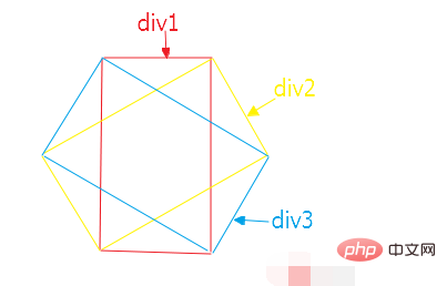
Method 2: Divide the regular hexagon into three divs with the same width and height, and then use positioning and css3 transform:rotate to rotate 60deg left and right to form a regular hexagon, as shown in the figure:

html code:
css code:
.one { width: 50px; height: 86.6px; margin: 0 auto; border-top: 1px solid red; border-bottom: 1px solid red; } .two { position: absolute; width: 50px; height: 86.6px; left: 25px; top: 0; transform: translate(-50%,-50%); transform: rotate(60deg); border-top: 1px solid red; border-bottom: 1px solid red; } .three { position: absolute; width: 50px; height: 86.6px; left: 25px; top: 0; transform: translate(-50%,-50%); transform: rotate(300deg); border-top: 1px solid red; border-bottom: 1px solid red; }
The above is the detailed content of How to draw hexagon in css. For more information, please follow other related articles on the PHP Chinese website!