
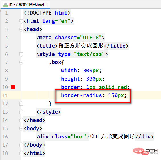
Css method to turn a square into a circle: You can use the border-radius attribute, such as [border-radius:150px]. The border-radius property allows us to add rounded borders to elements.

The operating environment of this tutorial: Windows 10 system, CSS3, this article is applicable to all brands of computers.
Attribute introduction:
The border-radius attribute is a composite attribute that can specify up to four border -*- radius attributes. This attribute allows you to add a rounded border to an element.
(Learning video sharing: css video tutorial)
Grammar:
border-radius: 1-4 length|% / 1-4 length|%;
Code implementation:
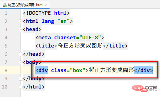
Create a new html file, Enter the div tag in the body tag, and add a class name (box) to the div tag, as shown in the figure:
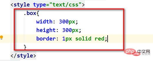
Add CSS attributes to the class name (box), Let it become a square, as shown in the picture:

Add a CSS attribute, code: border-radius:150px, such as As shown in the picture:
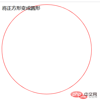
When you run the web page, you can see that the square has turned into a circle, as shown in the picture:
Related recommendations: CSS tutorial
The above is the detailed content of How to turn a square into a circle with css. For more information, please follow other related articles on the PHP Chinese website!