
Why should we adapt?
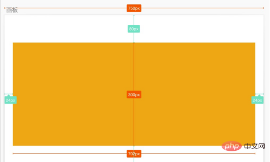
For example, for a mobile page, the visual draft given by the designer has a canvas width of 750, and the size of a yellow area in the visual draft is 702 x 300, and is centered in the artboard. We hope that the presentation ratio in any device is the same as in the mockup, scaling proportionally according to the width of the layout viewport.

On the mobile side, we generally set the layout viewport width = device width, that is, the area where the content is presented is within the device screen.
<meta name="viewport" content="width=device-width, initial-scale=1.0">
But different devices have different widths, so the width of the layout viewport is also different. For example, the layout viewport width of iPhone 6 is 375, and the layout viewport width of iPhone6 Plus is 414.
(Related video tutorial recommendation: css video tutorial)
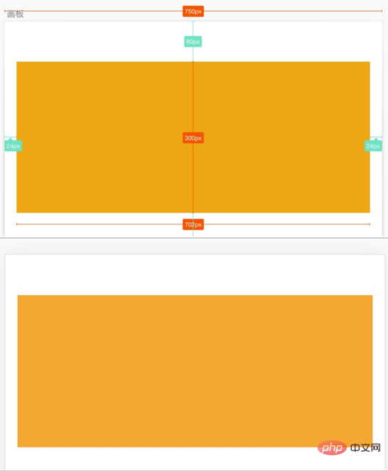
For a given visual draft with a canvas width of 750, if the layout viewport width is 375 on an iPhone 6 To render on the device, we can divide the pixel value of the element in the visual draft by 2. The code is as follows:
.box{
    width: 351px;
    height: 150px;
    margin-top: 40px;
    background: #F5A623;
}Then the rendering on the iPhone 6 is as shown on the right, which is consistent with the layout of the visual draft on the left.

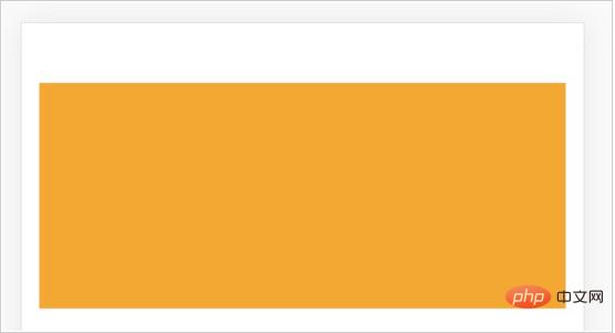
But the same code appears differently on the iPhone 6 Plus, and the distance between the two sides becomes larger. Because the layout viewport of iPhone 6 Plus is wider than that of iPhone 6, the size of the rectangular frame has not changed, it is still 315 x 150.

For a given mockup with a canvas width of 750, if rendered on an iPhone 6 Plus device with a layout viewport width of 414, we can change the size of the elements in the mockup The pixel value is divided proportionally by (750 / 414), that is:
.box{
    width: 387.5px;
    height: 165.6px;
    margin-top: 44.2px;
    background: #F5A623;
}The page rendering effect can also be the same as the visual draft.

In order to render the same effect as the visual draft on pages with different device widths (different viewport widths), different CSS pixel values need to be written. Our goal is to use the same CSS code to display the same effect as the visual draft on devices of different widths. In layman's terms, it means scaling equally on different devices according to the size ratio of the elements in the visual draft to the canvas, so as to achieve the same effect on different devices. Adaptive effects on the device.
Use Rem layout to solve adaptive problems
How to use the same CSS code to make the element size change with the width of the layout viewport according to the proportion in the visual draft, etc. Than Zoom?
We combine the characteristics of the relative unit rem in CSS. The pixel value of the rem unit is relative to the font-size of the root element (HTML element). For example: if the font-size of HTML is 100px, and the width of an element is set to 2rem in the CSS style, then the width of this element on the page will be 200px.
Find such a relationship based on the proportional scaling of the elements in the visual draft:
视觉稿元素尺寸 / 视觉稿画布宽度
= (rem 值 * HTML 元素的 font-size) / 布局视口宽度
= rem 值 * (HTML 元素的 font-size / 布局视口宽度)
= rem 值 / (布局视口宽度  /  HTML 元素的 font-size)
If:
布局视口宽度 / HTML 元素的 font-size = 定值 N
It can be achieved with the same CSS code Adaptable in any device.
rem 值 = N * (视觉稿元素尺寸 / 视觉稿画布宽度 )
So, we only need to determine an N value and complete two more steps to achieve self-adaptation:
Step 1: Dynamically set the font-size of the HTML element = layout viewport width / N
Step 2: Convert the CSS pixel value of the element exported in the visual draft into rem unit: rem value = N * (visual draft element size / visual draft canvas width)
If The canvas width of your mockup is 750. In order to facilitate the calculation of the rem value, you can choose to set N = 7.5. In this way, you only need to divide the size value in the mockup by 100 to get the CSS pixel value in rem units.
Recommended tutorial: CSS introductory tutorial
The above is the detailed content of How to use Rem layout to achieve adaptive effects in css. For more information, please follow other related articles on the PHP Chinese website!