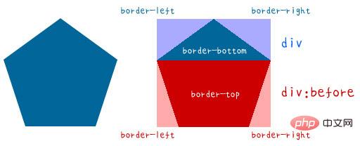
This article purely uses CSS to transform a "single" div from a regular triangle to a regular octagon (a single div can only be a regular octagon at most), and finally uses the effect of animation to transform it into a regular polygon. Animation, and because regular polygons require a lot of trigonometric function calculations, for the sake of convenience, the sides of regular polygons are set to 100px.
The equilateral triangle does not need to use pseudo elements. It only needs to set the border width of p itself to generate it. First, let’s take a look at the side length and center line of the equilateral triangle. , if the side length is 100px, the center line is rounded to 87px (100 x sin (60) = 87).
So we need to set the length and width of p to 0, then set the width of the bottom border to 87px, and the left and right borders Set the width to 50px (and the color to transparent) to make a beautiful triangle.
width:0;
height:0;
border-width:0 50px 87px ;
border-style:solid;
border-color:transparent transparent #095;
The square should be the simplest, just set the length and width to the same value. But there are actually two other methods. The first one is to set the length and width to 0, and set the top, bottom, left and right borders to 50px. The second one is to set the height to 0 and the width to 100px, and then a certain The side width is also set to 100, which is fine.
.a{
width:100px;
height:100px;
background:#c00;
}
.b{
width:0;
height:0;
border-width:50px;
border-style:solid;
border-color:#095;
}
.c{
width:100px;
height:0;
border-width:0 0 100px;
border-style:solid;
border-color:#069;
} Regular pentagon needs to enter the field of basic trigonometric functions. Let us first Decompose the regular pentagon, use the original p as the upper triangle, and then use a pseudo element to create the lower trapezoid. Because the angle between each side of the regular pentagon is 108 degrees, you can calculate the upper triangle through trigonometric functions. The height is 59px (100 x cos(54)), the width is 192px (100x sin(54) x 2), the height of the lower trapezoid is 95px (100 x sin(72)), and the width of the long side is the same as the triangle above It's 192px.
After understanding the principle, you can use pseudo elements to match and create!
.a{
      position:relative;
  width:0;
  height:0;
  border-width:0 81px 59px;
      border-style:solid;
  border-color:transparent transparent #069;
}
.a:before{
  position:absolute;
  content:"";
  top:59px;
  left:-81px;
  width:100px;
  height:0;
  background:none;
  border-width:95px 31px 0;
  border-style:solid;
  border-color:#069 transparent transparent;
    }
Each angle of a regular hexagon is 120 degrees, if viewed in the direction of pure CSS If so, just change the triangle on the regular pentagon to make a regular hexagon, which is just a combination of the upper and lower trapezoids. The long side of the trapezoid is 200px (100 x cos (60) x 2 100 ), the height of the trapezoid is 87px (100 x sin(60)).
So you can make a regular hexagon by slightly modifying the CSS of the regular pentagon.
.a{
      position:relative;
    width:100px;
    height:0;
    border-width:0 50px 87px;
      border-style:solid;
    border-color:transparent transparent #f80;
}
.a:before{
  position:absolute;
  content:"";
    top:87px;
    left:-50px;
    width:100px;
    height:0;
  background:none;
    border-width:87px 50px 0;
  border-style:solid;
    border-color:#f80 transparent transparent;
}The after pseudo-element must be used at the beginning of the regular heptagon, because the regular heptagon must It needs to be disassembled into three memory blocks, using the original p as the upper triangle, a pseudo element as the middle trapezoid, and then another pseudo element as the bottom trapezoid. The angles of the regular heptagons are not integers. It is 128 and 4/7 degrees, and the second decimal place is approximately 128.57, so the calculated result is as shown in the figure below. The key point is that you must clearly know what the length and width are.
After you have the length and width, start writing with CSS!
.a{
      position:relative;
    width:0;
    height:0;
    border-width:0 90px 43px;
      border-style:solid;
    border-color:transparent transparent #09c;
}
.a:before{
  position:absolute;
  content:"";
    top:140px;
    left:-112px;
    width:100px;
    height:0;
    border-width:78px 62px 0;
  border-style:solid;
    border-color:#09c transparent transparent;
    }
  .a:after{
    position:absolute;
    content:"";
    top:43px;
    left:-112px;
    width:180px;
    height:0;
    border-width:0 22px 97px;
    background:none;
    border-style:solid;
    border-color:transparent transparent #09c;
}The regular octagon actually turns the triangle on the regular heptagon into a trapezoid. Then the trapezoid in the middle becomes a rectangle. The angle between the regular octagon is 135 degrees. The calculated length and width of each area are as follows.
If you understand the same principle, it will be much easier to do it with CSS!
.a{
      position:relative;
    width:100px;
      height:0;
      border-width:0 71px 71px;
      border-style:solid;
    border-color:transparent transparent  #f69;
}
.a:before{
  position:absolute;
  content:"";
    top:171px;
      left:-71px;
      width:100px;
      height:0;
      border-width:71px 71px 0;
  border-style:solid;
      border-color: #f69 transparent transparent;
    }
  .a:after{
      position:absolute;
      content:"";
      top:71px;
      left:-71px;
      width:242px;
      height:0;
      border-width:0 0 100px;
      background:none;
      border-style:solid;
      border-color:transparent transparent #f69;
}小结
以上就是纯粹利用CSS做出来的单一div的正多边形变换,如果熟练的话,其实加上动画效果,就可以做出像下面示例这个样子的变换动画啰!

相关教程:css视频教程
The above is the detailed content of How to perform regular polygon transformation of a single div with CSS. For more information, please follow other related articles on the PHP Chinese website!


