This article brings you a detailed introduction to the basic syntax of flex layout. It has certain reference value. Friends in need can refer to it. I hope it will be helpful to you.
In 2009, W3C proposed a new solution - Flex layout, which can realize various page layouts simply, completely and responsively. At present, it has been supported by all browsers, which means that it is safe to use this feature now
1. What is flex layout?
Flex is the abbreviation of Flexible Box, which means "flexible layout" and is used to provide maximum flexibility for box-shaped models.
flex layout: .box{display:flex;}
Inline elements can also use flex layout: .box{display:inline-flex;}
Browsers with Webkit core must add the -webkit prefix: .box{display:-webkit-flex; display:flex ;}
Note that after setting to Flex layout, the float, clear and vertical-align attributes of child elements will be invalid.
2. Basic concepts
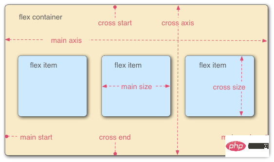
Flex container (flex container): Elements that adopt Flex layout are called flex containers.
Flex project (flex item): All child elements of the flex container automatically become container members, that is, flex items.
The two axes of the container: the horizontal main axis (main axis), the vertical cross axis (cross axis).
Main axis: start position->main start, end position->main end, projects are arranged along the main axis by default.
Cross axis: start position-> cross start, end position->cross end
The main axis space occupied by a single item in the container is called->main size, and the cross-axis space is called->cross size

flex attributes are divided into container attributes and project attributes.
Container properties: flex-direction, flex-wrap, flex-flow, justify-content, align-items, align-content
Item properties: order, flex-grow, flex-shrink, flex-basis, flex , align-self
flex-direction: Determine the direction of the main axis (i.e. the direction of item arrangement)
Row: Horizontal direction, from left to right. (Default attribute)
Row-reverse: Horizontal direction, from right to left.
Column: Vertical direction, from top to bottom.
column-reverse: Vertical direction, from bottom to top.
flex-wrap: Specifies how to wrap if an axis cannot fit.
nowrap: No line wrapping (default attribute)
Wrap: Line wrapping, the first line is at the top
wrap-reverse: Line wrapping, the first line is at the bottom, (only the number of lines is reversed, the single line still starts from Arranged from left to right, each row is).
flex-flow: Combining flex-direction and flex-wrap, the writing is as follows
.box{flex-flow :column wrap-reverse}
justify-content: Define the alignment of the item on the main axis
flex-start: Left-aligned (default value), the item is aligned on the main axis Align the starting point of
flex-end: right-aligned, the items are aligned with the end point of the main axis
center: centered
space-between: aligned at both ends, the intervals between items are equal
Space-around: The space on both sides of each item is equal. Therefore, the distance between items is twice as large as the distance between items and borders
align-items: Define the alignment of items on the cross axis (Only single line, multi-line alignment Defined by align-content)
stretch: If the item does not set a height or is set to auto, it will occupy the height of the entire container (default value)
flex-start: from top Go to the bottom, take the starting point of the cross axis as the baseline, and extend to the end point
flex-end: From bottom to top, take the end point of the cross axis as the baseline, and extend toward the starting point
center: Cross axis Align the midpoint of the item, and place the midpoint of the item on the midpoint of the cross axis
baseline: Align with the first line of text of each item in a line.
align- content: Defines the alignment along the cross axis when there are multi-line items in the container. If the item has only one axis, this property has no effect
stretch: The axis is full The entire cross axis (each row has an axis), default attribute
flex-start: align with the starting point of the cross axis
flex-end: align with the end point of the cross axis
Center: Align with the midpoint of the cross axis
Space-between: Multi-line items are evenly spaced on the cross axis
Space-around: Multi-line items are on both sides of the cross axis intervals are equal. Therefore, the distance between items on the cross axis is twice as large as the distance between items and borders
Note: justify-content, align-items and align-content are properties of the container, not the properties of the item. They are to set the items in a container to be aligned at a certain position on the axis
3.2 Project attributes
order: Define the order of items. The smaller the value, the higher the arrangement. The default value is 0, written as follows
.item{order:5}
flex-grow: Define the attribute item magnification ratio, the default is 1
If All items with a flex-grow property of 1 will equally divide the remaining space (if any). If the flex-grow property of an item is 2 and the other items are all 1, the former will occupy twice as much remaining space as the other items
flex-shrink: Define the shrinkage ratio of the item , the default is 1
If the flex-shrink property of all items is 1, when there is insufficient space, they will all be reduced proportionally. If the flex-shrink property of one item is 0 and the other items are 1, the former will not shrink when there is insufficient space. Negative values are invalid for this property
flex-basis : Defines the main axis space (main size) occupied by the project before allocating excess space. The browser calculates whether there is excess space on the main axis based on this attribute. Its default value is auto, which is the original size of the project
It can be set to the same value as the width or height attribute (such as 350px), then the project will occupy a fixed space
flex: Combining the properties of flex-grow, flex-shrink and flex-basis, the default value is 0 1 auto, it is recommended to use
This attribute has two shortcut values: auto (1 1 auto) and none (0 0 auto
align-self: allows a single item to be aligned with other items Different alignment methods can override the align-items attribute. The default value is auto, which means inheriting the align-items attribute of the parent element. If there is no parent element, it is equivalent to stretch
. This attribute may take 6 values. , except auto, everything else is exactly the same as the align-items attribute
[Related recommendations: CSS video tutorial]
The above is the detailed content of Detailed introduction to the basic syntax of flex layout. For more information, please follow other related articles on the PHP Chinese website!


