Use JS to determine the current screen size. We can use the Window matchMedia() method to match the specified size element, and then judge it with the current screen size.

Now we will introduce the JS method to determine the current screen size with a simple code example.
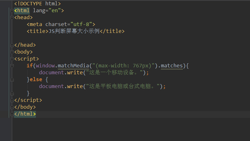
The code example is as follows:
<!DOCTYPE html>
<html lang="en">
<head>
    <meta charset="utf-8">
    <title>JS判断屏幕大小示例</title>

</head>
<body>
<script>
 if(window.matchMedia("(max-width: 767px)").matches){
        document.write("这是一个移动设备。");
 }else {
        document.write("这是平板电脑或台式电脑。");
 }
</script>
</body>
</html>Here we write a screen size judgment to match the given maximum width size (767px) through the matchMedia method. When the obtained current screen, that is, the window size, is less than 767 pixels, it is determined that "this is a mobile device." On the contrary, when it is larger than 767 pixels, it is judged as "this is a tablet or desktop computer."
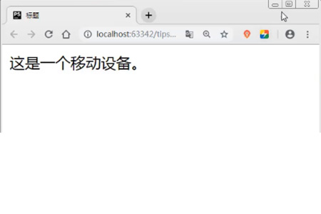
The judgment results are as follows:
When the current screen width is greater than 767px:

When the current screen width is less than 767px:

matchMedia() Returns a new MediaQueryList object, representing the parsed result of the specified media query string. The value of the matchMedia() method can be any characteristic of the CSS @media rule, such as min-height, min-width, orientation, etc.
The MediaQueryList object has the following two properties:
media: The content of the query statement.
matches: Used to detect query results. If the document matches the media query list, the value is true, otherwise it is false.
This article is an introduction to the JS method of judging screen size. It is simple and easy to understand. I hope it will be helpful to friends in need!
The above is the detailed content of How to determine screen size in JS. For more information, please follow other related articles on the PHP Chinese website!
 what is mysql index
 What is highlighting in jquery
 Ethereum browser blockchain query
 How to retrieve Douyin flames after they are gone?
 How to solve the problem of 400 bad request when the web page displays
 Commonly used search tools
 Free software for building websites
 What is the basic concept of artificial intelligence