The content of this article is about CSS filter:hue-rotate hue rotation filter to realize mass production of buttons, which has certain reference value. Friends in need can refer to it, I hope it will be helpful to you.
//zxx: Many effects are rendered in real time by CSS3 filters, so this article needs to be viewed under modern browsers such as Chrome
1. Traditional color value button
Traditional buttons are assigned colors through specific color values. For example, the following buttons and their corresponding color values (from LuLu UI):
Color value: #2486ff Color value: #01cf97 Color Value: #f4615c
has the following shortcomings:
Each button also has different hover and active colors that require additional settings. The button CSS code is large and there are many colors;
If a new status button appears, such as purple, which is popular this year, a purple button is needed. Developers need to ask designers for help, because the brightness and saturation of the purple they choose often doesn’t match the existing buttons.
In fact, there is a simpler way to colorize buttons, which can avoid the above shortcomings, which is to use the hue-rotate() hue rotation filter in the CSS3 filter.
2. Buttons under the Hue Rotation Filter
In fact, we only need to write a button style, and there is no need to write all other color buttons. A lot of CSS code. For example, the existing blue main button is as follows:
Main button
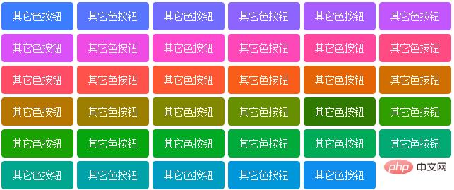
The following are 35 buttons of other colors that I implemented in minutes:

Hover and click the button, you can see that the pseudo-class states including: hover and: active are also copied.
The implementation is very simple, just add the following line of CSS to the button that has been implemented:
.btn { filter: hue-rotate(60deg); }Comparison indication
Compare the real seal, it is known that a blue color has been written Main button CSS, now we need to write a red button style.
First of all, the HTML used by the color value method and the hue method are the same, as follows:
<button class="ui-button ui-button-warning">红按钮</button>
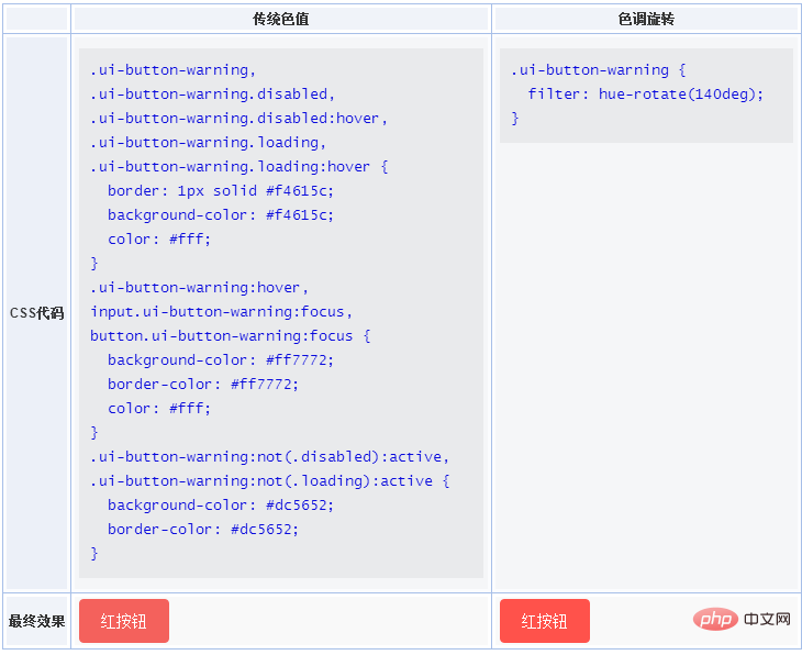
But the difference in CSS is amazing, see the table below:

You can see the comparison of the amount of CSS code above. The left side is your wallet before Double Eleven, and the right side is your wallet after Double Eleven. Isn’t the difference huge?
It can be seen that the first advantage of the hue rotation filter implementation button is that it saves a lot of code and develops very quickly!
The front-end will also be designed
By rotating the colors, I discovered many unscientific aspects of the original button design of LuLu UI.
The design of buttons with different hover states is inconsistent. The color of the main color button is darker when hovering, but the red button is lightened when hovering. It fails.
From this perspective, our front-end designers are better at designing than designers who rely purely on visual perception and rely on color picking tools to select several similar colors on the color board. So, when we need a new purple button, we just do it ourselves, rotate the hue to the purple column and bingo, button done! If you ask a designer to help find colors (a total of 3 colors including interactive states), yes, according to my experience of so many years of cooperation, saturation and brightness are 100% inconsistent, although they appear to be the same visually. Because choosing colors purely based on visual perception will inevitably lead to bias.
This is the second advantage of the hue rotation filter implementation button: the color value is more accurate, more accurate than the designer!
3. hue-rotate filter syntax
In addition to supporting deg, the hue-rotate filter also supports other CSS3 units, such as turns and radians.
For example:
hue-rotate(90deg) /* 90 degree rotation*/
hue-rotate(.5turn) /* 180 degree rotation*/
hue-rotate (3.142rad) /* 3.142 radians of rotation, approximately one circle, which is 360 degrees*/
4. hue-rotate filters and animations
The hue-rotate filter can also be used to achieve cool animation effects, such as the color-changing effect of the image below (GIF screenshot):
The implementation code is actually very simple:

.bird {
animation: pulse 5s linear infinite;
}
@keyframes pulse {
from { filter: hue-rotate(0); }
to { filter: hue-rotate(360deg); }
}is a hue that keeps rotating 360 degrees.
This animation method is particularly suitable for colorful graphics or images.
5. Conclusion
Compatibility
IE does not support it, Edge13 supports it, and other browsers support it.
Therefore, this technology is suitable for projects that do not need to consider compatibility, such as mid- and back-end management pages, internal projects, mobile projects, etc. If you play with filters, you can achieve many amazing effects.
I’ve seen an animation before that uses an inverter filter to achieve a flame effect. After watching it for a while, I didn’t understand it. I don’t have enough control over colors and filters. Don’t rush and accumulate it slowly. , you will always understand.
The above is the complete introduction to the CSS filter:hue-rotate hue rotation filter to achieve button mass production. If you want to know more about CSS3 tutorial, please pay attention to the PHP Chinese website.
The above is the detailed content of CSS filter:hue-rotate hue rotation filter realizes mass production of buttons. For more information, please follow other related articles on the PHP Chinese website!