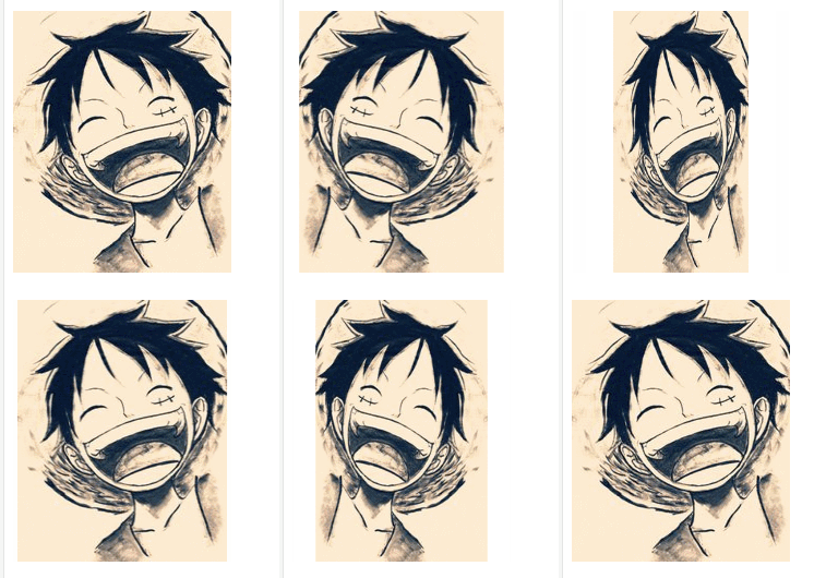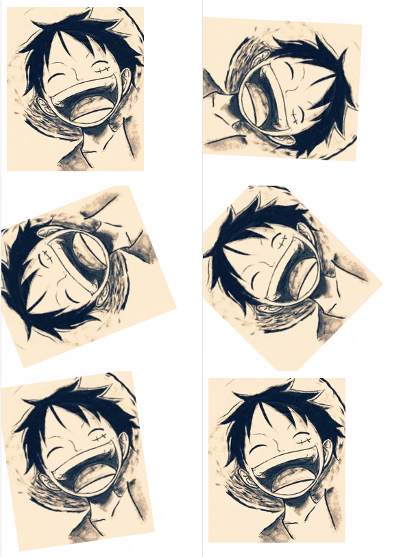
To achieve rotation animation in CSS, you need to use rotate() in the transform attribute to set it. You can rotate in the X-axis direction, Y-axis direction, and Z-axis direction.
Rotate along the X-axis direction
Specify the rotation direction in the code. This time the starting point is 0 degrees, the end point is 360 degrees (one rotation), and the rotation is specified in the X-axis direction. Then use mouse hover to rotate the image.
animation-duration is the animation processing time, animation-iteration-count is the number of animation processing.
@keyframes turnX{
  0%{transform:rotateX(0deg);}
  100%{transform:rotateX(360deg);}
}

#rX:hover{
  animation-name:turnX;
  animation-duration:3s;
  animation-iteration-count:1;
}When you place the mouse on the image, rotate along the X-axis direction. The effect is as follows:

Rotate along the Y-axis direction
Basically the same as the rotation of the X-axis. Only the rotation is changed to a rotation in the Y-axis direction.
@keyframes turnY{
  0%{transform:rotateY(0deg);}
  100%{transform:rotateY(360deg);}
}

#rY:hover{
  animation-name:turnY;
  animation-duration:3s;
  animation-iteration-count:1;
}When you hover the mouse over the image, it will rotate along the Y-axis direction, with the following effect:

Rotate along the Z-axis direction
is also basically the same as the rotation of the X-axis. Only changes the rotation to the Z axis direction.
@keyframes turnZ{
  0%{transform:rotateZ(0deg);}
  100%{transform:rotateZ(360deg);}
}

#rZ:hover{
  animation-name:turnZ;
  animation-duration:3s;
  animation-iteration-count:1;
}When you place the mouse on the image, the rotation effect along the Z axis is as follows:

The above is all the content of the CSS image rotation effect. For more information about CSS animation, you can refer to the CSS3 Video Tutorial column! ! !
The above is the detailed content of How to implement CSS rotation animation. For more information, please follow other related articles on the PHP Chinese website!